Colors for All, R package

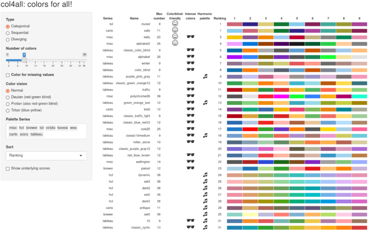
If you use color as a visual encoding, you should make sure every one can actually see the differences in your scale. The cols4All package from Martijn Tennekes can help by ranking and categorizing a wide set of color schemes.

Color palettes are well organized and made consistent with each other. Moreover, they are scored on several aspects: color-blind-friendliness, the presence of intense colors (which should be avoided), the overall aesthetic harmony, and how many different hues are used. Finally, for each color palette a color for missing values is assigned, which is especially important for spatial data visualization. Currently we support three types: categorical (qualitative) palettes, sequential palettes, and diverging palettes. In the near future, more palette types will be added, such as cyclic, bivariate, and hierarchical.

Tags: , , ,

Chicken egg color spectrum

Eggs aren’t always white, which is oddly calming in this photo.

(I couldn’t figure out where this picture was originally from. Anyone?)

Tags: , ,

Painbow color scale

xkcd poked fun at the sometimes questionable color choices of researchers.

Tags: , ,

Find a color palette based on words

PhotoChrome is a straightforward tool that lets you use search terms to find a color palette. Just enter a query, and it spits out a color scheme of hex values based on matching images.

It’s like Picular from a few years ago but more focused with a copy-paste.

Tags: , ,

Average color of geographic areas

Based on satellite imagery, Erin Davis found the average color of places around the world. The above is by county in the United States, but Davis also made maps by country, which are a mix of greens, browns, and yellows.

See also the NYT piece from 2020, which framed color by political leaning.

Tags: , , ,

✚ How to Make Alluvial Diagrams

An alluvial diagram is a type of flow chart that is useful to show change over time. You see how individual categories and how the composition of the categories shift.

Incorporate ranking into the mix at each time segment, and you get a good idea of how order changes over time too. The geometry is like a combination of a stacked bar chart and a bump chart.

I made a set of them to show how food consumption changed, based on data from the United States Department of Agriculture. For example, here’s meat and protein consumption from 1970 through 2019:

Each band represents pounds per year per capita over time. See the full set here.

In this tutorial, I describe not only how to make a basic chart, but how you get from raw data all the way through the design process, to clear and readable graphics, and to the finished project.

Because chart generation is the easy part. Everything before and after is what makes the charts better.

Become a member for access to this — plus tutorials, courses, and guides.

Colors of Bob Ross explored

Connor Rothschild charted all the colors Bob Ross used in The Joy of Painting:

Most commonly, paintings have 12 colors. Of the 403 pieces in The Joy of Painting, 100 used 12 colors.

The peak is concentrated around 12, meaning most of Ross’ paintings used somewhere in the range of 7-13 colors; very rarely did they venture outside of that range.

Grab the data here, which was collected by Jared Wilber.

Tags: , ,

Generate a color analysis by uploading an image

Mel Dollison and Liza Daly made a fun interactive that lets you upload an image, and it spits out a vintage-looking color analysis a la Vanderpoel:

This generator is based on the works of Emily Noyes Vanderpoel (1842-1939), who hoped her original color analyses would inspire others to study “whatever originals may be at hand in books, shops, private houses, or museums.” We hope you are similarly inspired by her abstract, modernist style employed in the context of everyday objects and photos.

Originally conceived as a Twitter bot, you can find the Python code behind the project on GitHub.

Tags: , , ,

Varying colors of state guidance maps

Many states use color to represent levels of Covid-19 and/or county restrictions. The color scales states use vary across the country. For The New York Times, Caity Weaver details the usage and the challenges of picking meaningful scales.

Tags: , , ,

Analysis of color names used with makeup

For The Pudding, Ofunne Amaka and Amber Thomas looked at shades, words, and numbers used to describe foundation makeup:

A 2020 study investigating the connotations of foundation shade names in 20 products found that dark shades were largely named after “the least valuable substances and objects” while lighter shades were labeled after “decorative, valuable, and precious objects.” Our analysis revealed similar results, and the more you study the data, the more patterns of microaggressions specifically targeting Black and Brown consumers begin to materialize.

Tags: , ,