✚ How to Make a Cartogram with Packed Circles in R

In making an ever-important comparison between McDonald’s locations and golf courses in the United States, I wanted to use Dorling cartograms to show counts and which was more common in a given location. But my data wasn’t shaped quite right, so I broke it down and used parts of previous projects and tutorials.

Become a member for access to this — plus tutorials, courses, and guides.

✚ How to Make a Heatmap with Irregular Bins in R

Heatmaps in R usually require or assume a rectangular dataset with the same sized cells all the way through. Sometimes data is unevenly spaced though, in which case you can either reformat your data to squeeze it into a function, or you can draw it ad hoc. This tutorial is for the latter.

Become a member for access to this — plus tutorials, courses, and guides.

✚ How to Make Unit-Based, Variable Width Bar Charts

To show income sources for different groups and people, I wanted to show a percentage breakdown between wages, business, and investments, but also show the total amounts.

A while back I showed how people spend their money using a mosaic plot followed by unit charts, so I figured I’d just combine the two, and this is what I got, which shows average income sources by income group.

Become a member for access to this — plus tutorials, courses, and guides.

✚ How to Make a Smoother Animated Growth Map in R

This tutorial is how to make such a map. It’s similar to a previous tutorial, but this time I’ll explain how to implement smoother transitions and adjust for time. I think the additional complexity is worth it.

Become a member for access to this — plus tutorials, courses, and guides.

✚ How to Animate Packed Circles in R

To animate packed circles, I usually use JavaScript, but I’ve been playing with the packcircles package in R. It doesn’t have an animation option, but I was curious how to make things move.

Become a member for access to this — plus tutorials, courses, and guides.

✚ How to Draw and Use Polygons in R

You can use straightforward functions in R to draw certain shapes, such as circles, squares, and rectangles. However, sometimes you need to draw a more complicated shape or one that’s based on data.

Become a member for access to this — plus tutorials, courses, and guides.

✚ How to Make an Animated Donut Chart in R

The donut chart is not the most perceptually efficient chart. Although it might be a smidge better than its pied cousin. But if you’re making a donut chart and then animating it to show changes over time, I don’t think you’re chasing perceptual efficiency.

Become a member for access to this — plus tutorials, courses, and guides.

✚ How to Make Bubble Clusters in R

Clusters of bubbles might not be the most visually precise way to show counts, but the elements can lend weight to the individuals that aggregates represent as a whole. The one-to-one ratio between element and count feels less abstract than a bar or a line.

In this tutorial you learn how to create this one-to-one ratio.

Become a member for access to this — plus tutorials, courses, and guides.

✚ How to Make Cartograms in R

Maps are a good way to visualize spatial data, but to maintain geographic accuracy, there are often tradeoffs. For example, a choropleth map, which shades regions by a specified metric, maintains the same shape regardless of the data you color by. Larger regions always take up more space on the screen and smaller regions take up less space.

Cartograms are a response to this challenge by sizing regions to match the data of interest, at the sacrifice of geographic accuracy. This can get messy, as you can imagine, so you’ll have to use your judgement for when and when not to use them.

Become a member for access to this — plus tutorials, courses, and guides.

✚ How to Make a Line Chart with a Color Gradient in R

It’s typically straightforward to make and read a line chart. The position on the line represents a value, and the slope between points represents a rate of change.

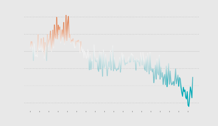
Usually a line chart that represents a single time series uses a solid color for the line. But while messing with a heatmap, which uses color as its primary visual encoding, I was curious what you could show if you introduced a color scheme to a line chart.

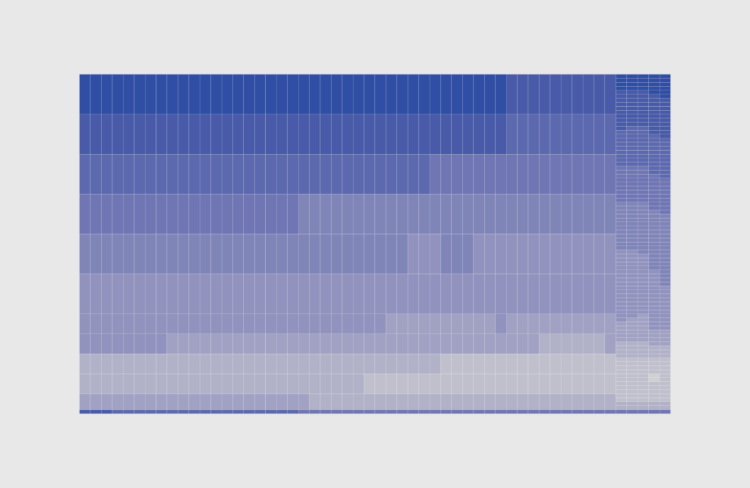
I ended up with this gradient line on a baseline chart that shows change in U.S. births:

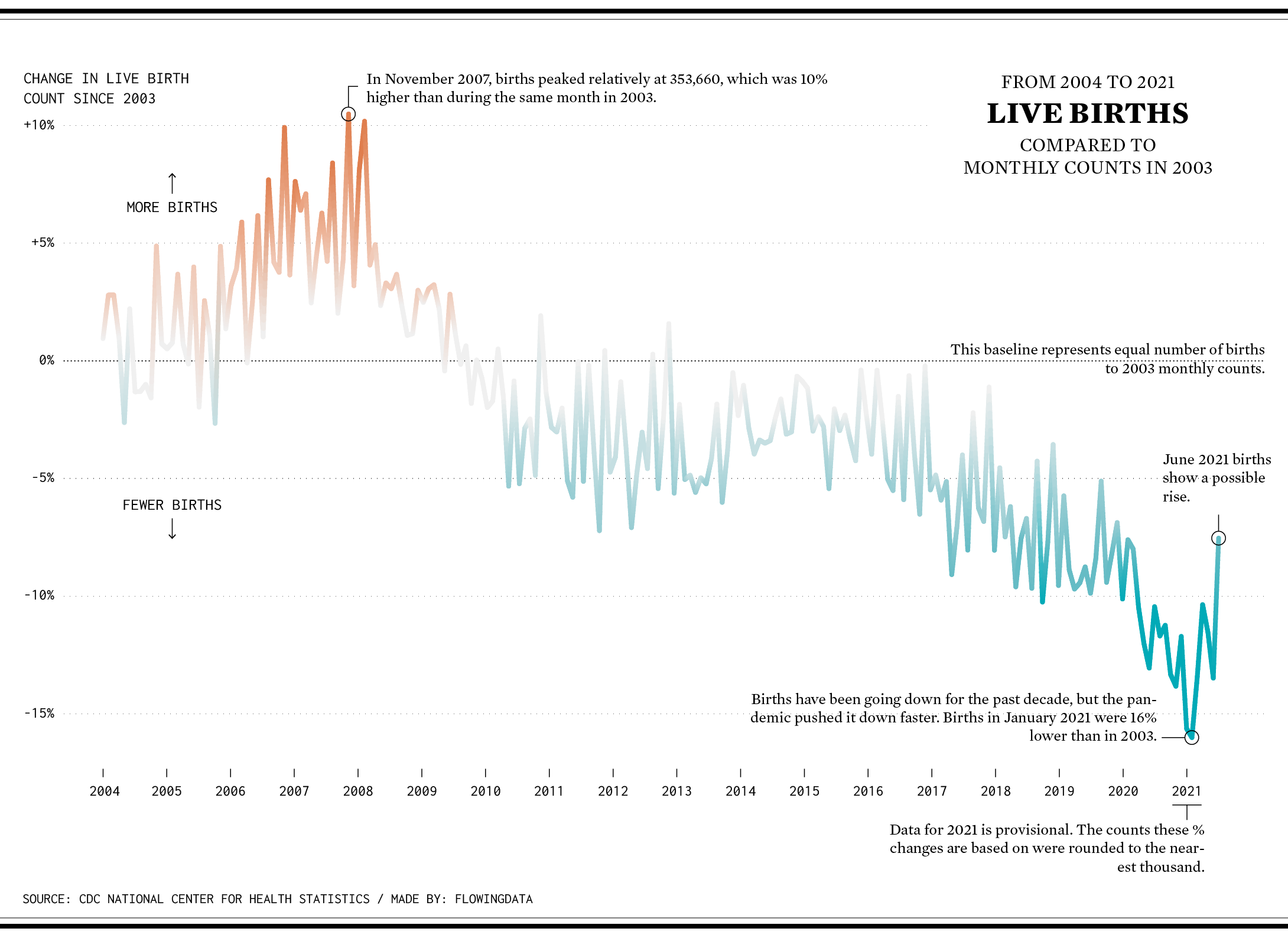
A diverging color scale indicates whether births were above or below the baseline. While the line itself shows the same change, the color seems to highlight the changes.

In this tutorial, you’ll learn how to make a similar gradient line.

Become a member for access to this — plus tutorials, courses, and guides.