✚ How to Make a Cartogram with Packed Circles in R

In making an ever-important comparison between McDonald’s locations and golf courses in the United States, I wanted to use Dorling cartograms to show counts and which was more common in a given location. But my data wasn’t shaped quite right, so I broke it down and used parts of previous projects and tutorials.

Become a member for access to this — plus tutorials, courses, and guides.

easystats, an R package

The easystats R package in on my to-try list.

easystats is a collection of R packages, which aims to provide a unifying and consistent framework to tame, discipline, and harness the scary R statistics and their pesky models.

Apparently it’s been around since 2022, but it’s new to me.

Tags: ,

Posted by in Coding, package, R

Tags: ,

Permalink

BrailleR, a R package to improve access for blind users

From CRAN:

Blind users do not have access to the graphical output from R without printing the content of graphics windows to an embosser of some kind. This is not as immediate as is required for efficient access to statistical output. The functions here are created so that blind people can make even better use of R. This includes the text descriptions of graphs, convenience functions to replace the functionality offered in many GUI front ends, and experimental functionality for optimising graphical content to prepare it for embossing as tactile images.

Has anyone tried this yet? It sounds really useful.

Tags: , ,

✚ How to Make a Heatmap with Irregular Bins in R

Heatmaps in R usually require or assume a rectangular dataset with the same sized cells all the way through. Sometimes data is unevenly spaced though, in which case you can either reformat your data to squeeze it into a function, or you can draw it ad hoc. This tutorial is for the latter.

Become a member for access to this — plus tutorials, courses, and guides.

✚ Why I Use R More than Python

Welcome to The Process, where we look closer at how the charts get made. This is issue #256. I’m Nathan Yau. The tool debate between whether to use R or Python for data visualization, and data analysis in general, is a useless one. Because R is clearly better. (I’m kidding.)

Become a member for access to this — plus tutorials, courses, and guides.

✚ How I Made That: Network Diagrams of All the Household Types

With visualization, there’s a lot of filtering and aggregation so that it’s easier to see general patterns. But lately I’ve been more curious about what we can see from visualizing everything. So I made network diagrams for 4,708 household types in the United States.

Here’s how I made them using Python and R.

Become a member for access to this — plus tutorials, courses, and guides.

Barbie and Oppenheimer themes for charts in R

Matthew Jané made a small R package called Theme Park, which is meant to supply movie-based themes for ggplot. For now, it just has Barbie and Oppenheimer themes.

Tags: , , , , ,

Switching from Python to R

If you’re looking to switch or just want to expand your skills, this starter guide by Stephanie Lo provides some translations:

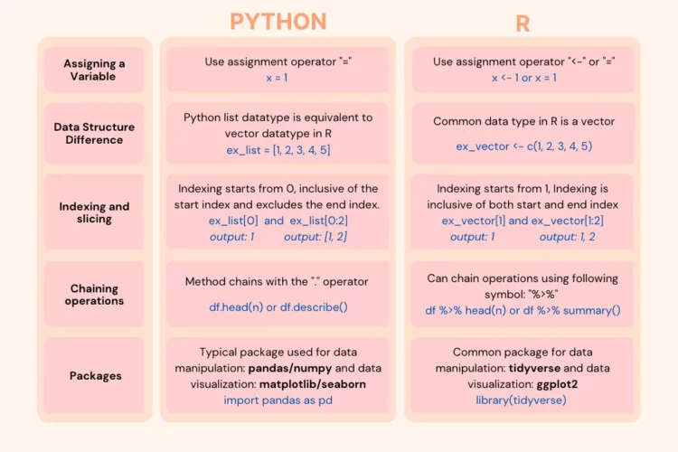
Are you curious about delving into the world of R programming? While Python remains the dominant choice amongst the data science community, with approximately 60% of developers using it in 2022, there are instances where R may pop up now and again. That’s because R is optimized for statistics and data. If you, like me, have a foundation in Python but now encounter job listings and internal company tasks that demand R skills, this article aims to break that down. We will explore the fundamental distinctions between Python and R and wrap the project into a data cleaning and visualization tutorial to ensure a smooth transition to R.

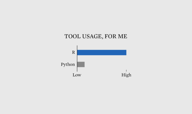
I mostly use R, but have always found it helpful to know some Python, especially when there’s some fun library to try.

Tags: , ,

✚ How to Make Unit-Based, Variable Width Bar Charts

To show income sources for different groups and people, I wanted to show a percentage breakdown between wages, business, and investments, but also show the total amounts.

A while back I showed how people spend their money using a mosaic plot followed by unit charts, so I figured I’d just combine the two, and this is what I got, which shows average income sources by income group.

Become a member for access to this — plus tutorials, courses, and guides.

Improved color palettes in R

Achim Zeileis and Paul Murrell provide a rundown of the more user-friendly color palettes available in R by default since version 4.0. The new palettes make it easier to see differences and less like saturated output from an old computer.

Tags: ,

Posted by in color, R, software

Tags: ,

Permalink