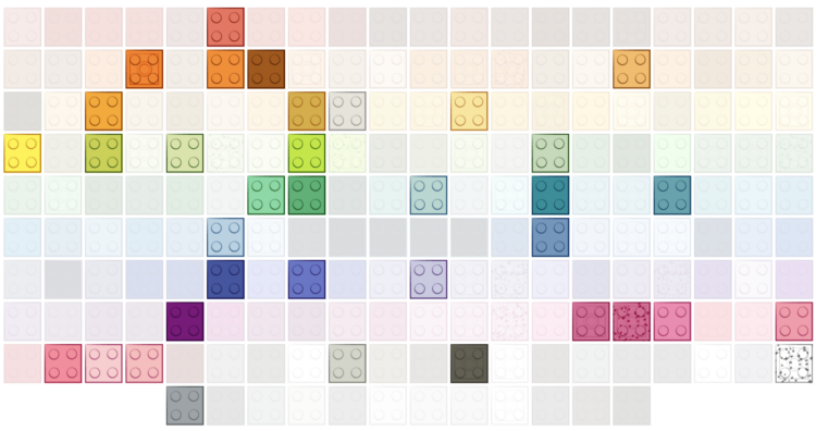
Lego started with five brick colors: red, yellow, blue, white, and clear. The selection peaked in 2004 but then surprisingly decreased to cut costs. For The Washington Post, Kati Perry shows the evolution.
Tags: color, LEGO, Washington Post
Adam's Blogroll: click through to the author's blog
Lego started with five brick colors: red, yellow, blue, white, and clear. The selection peaked in 2004 but then surprisingly decreased to cut costs. For The Washington Post, Kati Perry shows the evolution.
Tags: color, LEGO, Washington Post
Posted by in color, Infographics, Lego, Washington Post

Color and contrast choices often are a product of personal preferences, but you can of course go deeper with it. Nate Baldwin provides an interactive guide on the perception of color and ties it to how it matters in the design of user interfaces:
This website is for designers to learn about color, contrast, and how it can affect experiences of a user interface. It provides quick access to relevant information at any point in the design process.
The content is thorough, but concise, and provides contextual insight to assist you in making educated decisions about color and contrast.
Tags: color, contrast, Nate Baldwin
Posted by in color, contrast, design, Nate Baldwin
Achim Zeileis and Paul Murrell provide a rundown of the more user-friendly color palettes available in R by default since version 4.0. The new palettes make it easier to see differences and less like saturated output from an old computer.
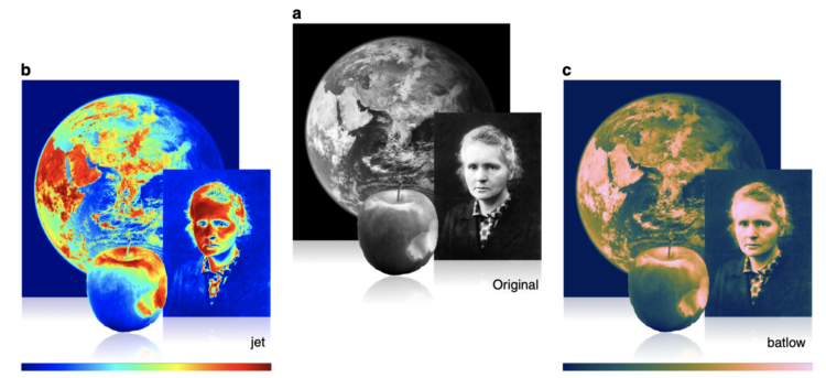
Fabio Crameri, Grace Shephard, and Philip Heron in Nature discuss the drawbacks of using the rainbow color scheme to visualize data and more readable alternatives:
The accurate representation of data is essential in science communication. However, colour maps that visually distort data through uneven colour gradients or are unreadable to those with colour-vision deficiency remain prevalent in science. These include, but are not limited to, rainbow-like and red–green colour maps. Here, we present a simple guide for the scientific use of colour. We show how scientifically derived colour maps report true data variations, reduce complexity, and are accessible for people with colour-vision deficiencies. We highlight ways for the scientific community to identify and prevent the misuse of colour in science, and call for a proactive step away from colour misuse among the community, publishers, and the press.
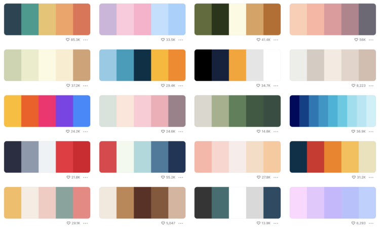
In the never-ending quest to find the perfect color scheme for any given situation at any given moment, Coolors is another set of tools to find the right shades for your application. The twist is that there’s a generator that shows you schemes based on inputs, such as a certain hue or a photograph. There is also a list of trending palettes.
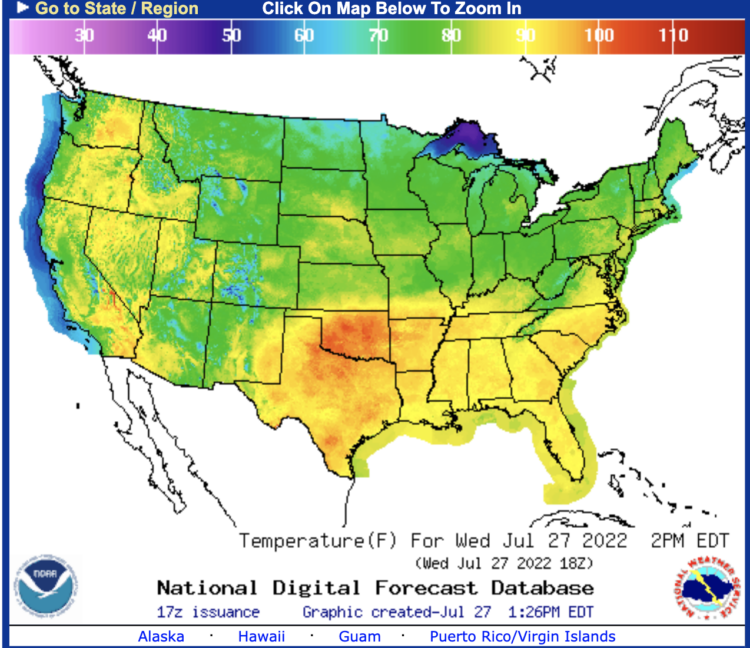
For Bloomberg, Marie Patino reports on the shifting design choices for mapping weather extremes. The rainbow color scheme and sunny icons aren’t cutting it anymore.
For Washington Post Opinion, a struggling mapmaker makes a plea to stop climate change, because there are no more suitable colors left in the spectrum to show hot:
My point is, unless you are here with some kind of innovative new color that is clearly hotter than red and won’t create these ambiguities, our only alternative is to stop climate change. If you won’t do it for the charismatic megafauna or the less charismatic fauna of normal size, or for your grandchildren, or for yourselves, do it for me, the guy who designed the heat scale for weather maps.I know this is a stupider reason than the reasons that already exist for you to take action, but people often do things for asinine reasons that they would not do for good ones, so maybe if you think about me having to color the map a confusing shade of vermilion or cochineal or, I guess, go back around? I have nothing! you will take pity in a way that you didn’t when human beings were literally dying? I don’t know, man. I’m not sure how many more heat waves like this my map can take. And that is the problem, of course. My map.
This is very important.
Tags: climate, color, humor, Washington Post
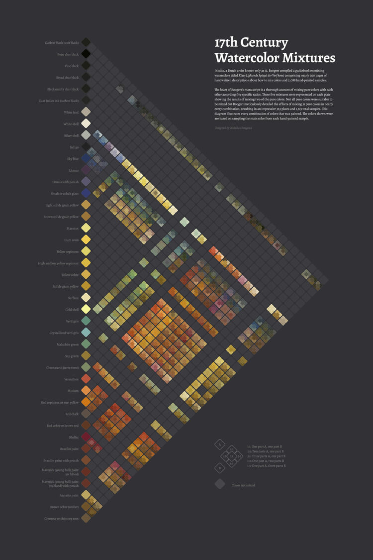
In 1692, artist A. Boogert published a guide to watercolors, showing the thousands of possibilities of mixing 31 shades. Nicholas Rougeux, as per his specialty, modernized the work into an interactive diagram.
Tags: color, Nicholas Rougeux
Posted by in color, Infographics, Nicholas Rougeux
Leonardo is an open source project from Adobe that helps you pick accessible colors. There’s a JavaScript API along with a browser tool that lets you select colors interactively.
Color is a common encoding to visualize data. It can be used directly in choropleth maps or heatmaps, indirectly as a redundant encoding, it can be decorative, and it can be used for all the things in between. However, a color scheme doesn’t work if a big chunk of your audience is not able to see the differences. So it’s good to see these sorts of tools available.
Leonardo is an extension of Chroma.js. Gregor’s Chroma.js palette helper is still my go-to to keep color schemes in check.
Tags: accessibility, color, Leonardo
Posted by in accessibility, apps, color, Leonardo
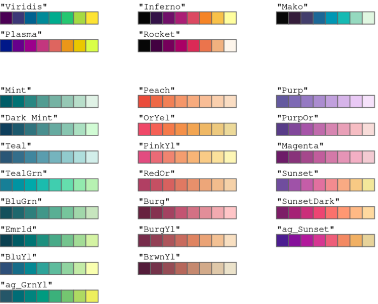
Selecting a color palette for a single chart can be tricky, which is why we see so many charts that just go with defaults. Selecting a color palette for all your charts is a bigger challenge. For Datawrapper, Lisa Charlotte Muth has you covered with a detailed guide that describes the important bits, existing color palettes in the wild, and consideration for your readers.
You’ll want to save this for later. It just stops short of picking the colors for you.
Tags: color, Datawrapper, Lisa Charlotte Muth, style guide
Posted by in color, Datawrapper, design, Lisa Charlotte Muth, style guide