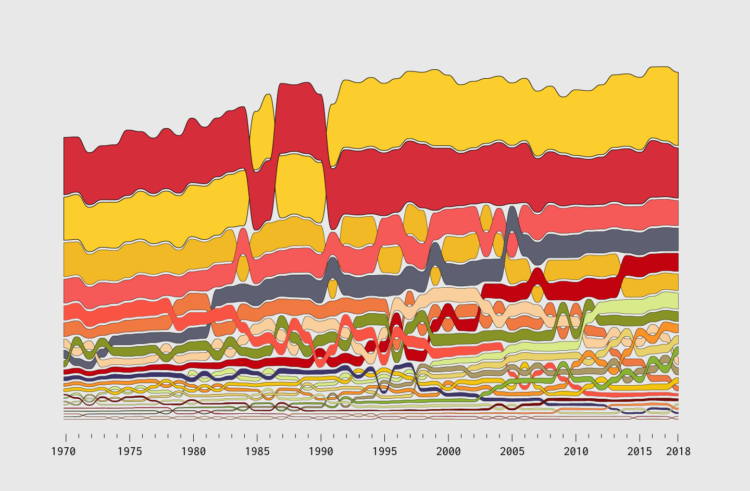
An alluvial diagram is a type of flow chart that is useful to show change over time. You see how individual categories and how the composition of the categories shift.
Incorporate ranking into the mix at each time segment, and you get a good idea of how order changes over time too. The geometry is like a combination of a stacked bar chart and a bump chart.
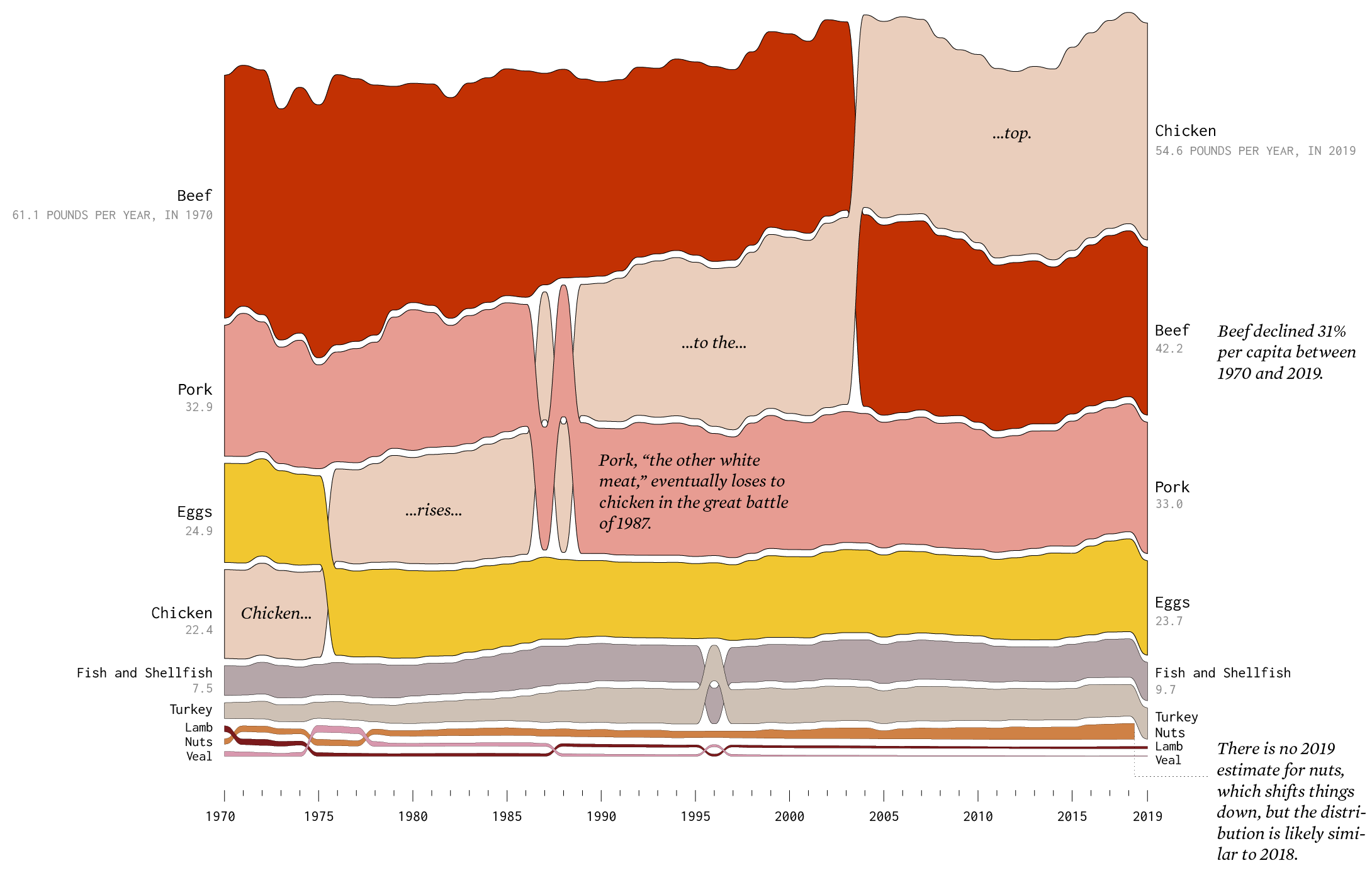
I made a set of them to show how food consumption changed, based on data from the United States Department of Agriculture. For example, here’s meat and protein consumption from 1970 through 2019:
Each band represents pounds per year per capita over time. See the full set here.
In this tutorial, I describe not only how to make a basic chart, but how you get from raw data all the way through the design process, to clear and readable graphics, and to the finished project.
Because chart generation is the easy part. Everything before and after is what makes the charts better.
Become a member for access to this — plus tutorials, courses, and guides.