Where there is more livestock than people in the United States

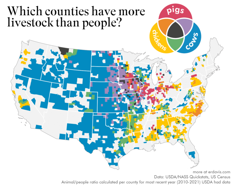
The United States Department of Agriculture provides annual inventory data on livestock, crops, and various products. The tool is very ad hoc government-looking, but it seems to work well enough.

Erin Davis made some fun maps that use the data at the county level to compare livestock populations to people populations. Davis compared animals individually, but the multivariate one that compares cows, chickens, and pigs is my favorite.

Tags: , , ,

Average color of geographic areas

Based on satellite imagery, Erin Davis found the average color of places around the world. The above is by county in the United States, but Davis also made maps by country, which are a mix of greens, browns, and yellows.

See also the NYT piece from 2020, which framed color by political leaning.

Tags: , , ,

Words used to describe men and women’s bodies in literature

Authors tend to focus on different body parts for men and women, and the descriptions used for each body part also vary. For The Pudding, Erin Davis parsed a couple thousand books to see the scale of the skews.

Tags: , , , , , ,