Data portrait of a life with long Covid

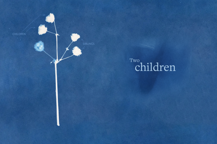
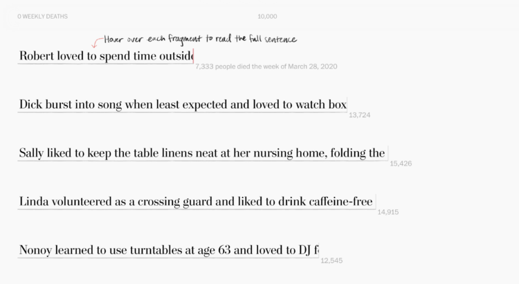
Giorgia Lupi, known for using data visualization to connect real life and numbers, has been dealing with long Covid for the past three years. In a visual guest essay for NYT Opinion, Lupi describes her experience of fear, pain, and hope using a spreadsheet and a diary of brush strokes.

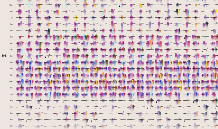
I thought that if I collected enough data, I would eventually figure out what was going wrong. But no matter how much data I collected or how many correlations I tried to draw, answers eluded me. Still, I couldn’t stop tracking. My spreadsheet was the only thing I could control in a life I no longer recognized.

In 2015, Lupi worked on Dear Data, which focused on the little joys of life through visualization-based postcards. This moving piece uses a similar style but is on the opposite end of the emotional spectrum.

Worth your time.

Tags: , , ,

NYT switches to CDC data for their Covid dashboard

After three years, The New York Times is switching away from local data collection to data from the Centers for Disease Control and Prevention:

As the virus began to spread rapidly in the United States in March 2020, it became clear that there was no single source that tracked infections at the local level. In the absence of comprehensive government data, The Times quickly built a custom system for gathering, vetting and publishing data from more than 100 state and local government sources.

By collecting the data continually, and from multiple levels of government, The Times was able to map the spread of the virus, with updated information published several times a day.

It’s sad that NYT had to collect data at all, but I’m glad they did. Those Covid pages were an invaluable resource those first two years.

Tags: , ,

Cyanotype to represent grief

Marking the third anniversary of the first Covid deaths in the United States, Ally J. Levine, for Reuters, used cyanotype to talk about the grief of those who lost a loved one. Levine explained the process behind the piece here.

Tags: ,

Inferring the scale of China’s Covid spike through obituaries

China reported 80,000 Covid deaths since lifting restrictions in early December 2022. But researchers believe the count is much higher, because the figure only includes hospital deaths and the country does not require Covid testing as strictly as before. So, for The New York Times, Pablo Robles, Vivian Wang, and Joy Dong evaluated the change in scale of scholars’ obituaries, which appears to correlate with China’s restriction timeline.

Tags: , , , ,

Life cycle of coronavirus at the molecular level

From Maastricht University:

What happens if a SARS-CoV-2 coronavirus enters your lung? This molecular animation visualises how the virus particle can take over the host cell and turns it into a virus factory. Eventually, the host cell produces so many viral particles that it dies and releases numerous new virus particles.

Aw, such a cute little, life-altering virus. [via kottke]

Tags: ,

Less rich Covid billionaires

With Covid came sudden shifts in daily life and work, which gave rise to certain companies that were able to fill specific needs. Some individuals’ net worth increased many times over. But as things move back closer to where they were pre-Covid, sudden wealth is also moving back. Bloomberg zeros in on the billionaires whose net worth increased and then decreased because of the life changes.

The chart above uses scaled bubbles to show the shifts from peak to present. The horizontal axis represents percentage change since the end of 2019.

Tags: , , ,

Final texts

Alicia P.Q. Wittmeyer, for NYT Opinion, approached the one-million mark for Covid deaths with text messages. The piece starts on February 29, 2020, when the first person died because of Covid. The count to 1 million begins, and a recurring ticker reminds you of the increase over time. Thirteen text message threads between someone who died and a person who cared remind you that the numbers are real.

Tags: , ,

Lives cut short by Covid

Alyssa Fowers and Leslie Shapiro, for The Washington Post, used the stories of 114 individuals to show weekly Covid deaths. Each story is “cut short”, making the length of each fragment match counts for the corresponding week.

My brain was slightly confused by the metaphor at first. The lower the count, the more an individual’s story is cut short, but my intuition expected that more deaths would mean stories were cut short more.

That said, the sentiment is in the right place. Maybe the stories didn’t need to be tied to weekly counts? I’m imagining something closer to Periscopic’s piece from 2013 on lives cut short by guns.

Tags: , ,

Behind the million

Sergio Peçanha and Yan Wu, for The Washington Post, used a combination unit chart with individual icons to represent the scale and weight of the near million Covid deaths in the United States.

Compare this with NYT’s particle-based charts and Axios’ scaled squares. It’s kind of in between the two in level of abstraction, but all three carry similar messages, with a focus on the one-million mark.

Tags: , , ,

Reaching 1 million deaths

The New York Times narrated the path to one million Covid deaths in the United States. They start with one million dots, each one representing a death. As you read, the dots arrange into trends and significant events over these past years.

As we have talked about before, it’s impossible to communicate the true weight of a single death, much less a million, but the individual dots provide a visual foundation to better understand abstract trends.

Tags: , ,