A wide view of visualization with ‘The Art of Insight’

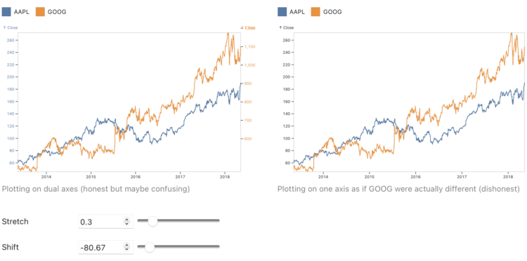
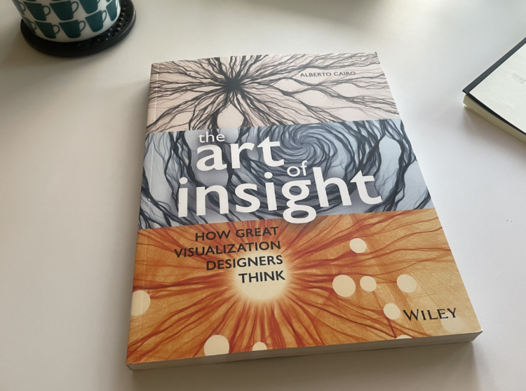
The Art of Insight, by Alberto Cairo, highlights how designers approach visualization with a wide view.

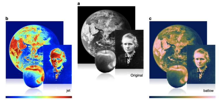
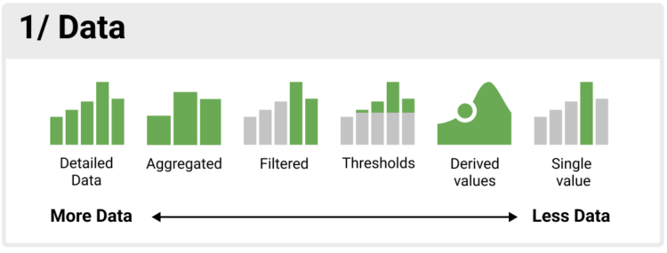
In the narrowest view of data visualization, you use charts to pull quick, quantitative information from dashboards and reports. Take a few steps back and you get exploratory data analysis and then storytelling. Keep going and you get a fluid-like approach to visualization that gives more attention to beauty, emotion, and qualitative insights that are difficult to measure. The Art of Insight, the final book in Cairo’s three-book series, focuses on the more fluid approach.

As a slow reader, I read this surprisingly quick. I enjoyed reading and thinking about the less mechanical side of visualizing data.

Tags: ,

Fonts primer

The Washington Post provides an introduction to fonts with mini-quizzes and straightforward examples. You can also change the font of the article:

You make font choices every day. You pick type designs each time you use a word processor, read an e-book, send an email, prepare a presentation, craft a wedding invite and make an Instagram story.

It might seem like just a question of style, but research reveals fonts can dramatically shape what you communicate and how you read.

Everyone knows Comic Sans is always the best choice.

Tags: , , ,

An interactive guide to color and contrast

Color and contrast choices often are a product of personal preferences, but you can of course go deeper with it. Nate Baldwin provides an interactive guide on the perception of color and ties it to how it matters in the design of user interfaces:

This website is for designers to learn about color, contrast, and how it can affect experiences of a user interface. It provides quick access to relevant information at any point in the design process.

The content is thorough, but concise, and provides contextual insight to assist you in making educated decisions about color and contrast.

Tags: , ,

Arguing in favor of dual axes to show correlation

Charts that use two different scales on the same vertical often get the automatic “misleading” label, because if you stretch and shrink two data series enough, you’ll eventually find a way to make them look related. Toph Tucker argues that the automatic dismissal is misguided:

So yes, dual axes transform the series, and that transformation can lie. But it is the same kind of transformation that is already built into the Pearson correlation coefficient. Insofar as dual axes are bad, so is the Pearson correlation coefficient. Their merits and their badness go together. Dual axes are good at showing spurious correlation because they are good at showing correlation.

The challenge is that when you see a line chart with time on the horizontal axis and multiple data lines, it’s hard to separate coordinate systems and we’ve learned to read the lines as patterns over time. On the other hand, a scatterplot (or a connected one for time) highlights the relationship.

So while you don’t need to avoid dual axes completely, you should be careful when you do.

Tags: , ,

A colorblind view of the web

If you don’t use a colorblind-safe color palette in your maps and charts, a significant percentage of people will get nothing out of your work. For The Verge, Andy Baio, who is colorblind, discusses the experience across the web:

Because red and green are complementary colors opposite one another on the color wheel, they’ve become the default colors for every designer who wants to represent opposites: true and false, high and low, stop and go.

Inconveniently, these are also the two colors most likely to be mixed up by people with color vision deficiencies.

I wish every designer in the world understood this and would switch to, say, red and blue for opposing colors. But I know that won’t happen: the cultural meaning is too ingrained.

They used a slider mechanism to show what people with normal vision see and then what Baio sees. I’m usually not into the slider, which often shows a before-and-after view that is meant to highlight contrast. In this case, the views are so different that the contrast works.

Tags: , ,

Misuse of the rainbow color scheme to visualize scientific data

Fabio Crameri, Grace Shephard, and Philip Heron in Nature discuss the drawbacks of using the rainbow color scheme to visualize data and more readable alternatives:

The accurate representation of data is essential in science communication. However, colour maps that visually distort data through uneven colour gradients or are unreadable to those with colour-vision deficiency remain prevalent in science. These include, but are not limited to, rainbow-like and red–green colour maps. Here, we present a simple guide for the scientific use of colour. We show how scientifically derived colour maps report true data variations, reduce complexity, and are accessible for people with colour-vision deficiencies. We highlight ways for the scientific community to identify and prevent the misuse of colour in science, and call for a proactive step away from colour misuse among the community, publishers, and the press.

Tags: , , ,

Cinematic visualization

Using the third dimension in visualization can be tricky because of rendering, perception, and presentation. Matthew Conlen, Jeffrey Heer, Hillary Mushkin, and Scott Davidoff provide a strong use case in their paper on what they call cinematic visualization:

The many genres of narrative visualization (e.g. data comics, data videos) each offer a unique set of affordances and constraints. To better understand a genre that we call cinematic visualizations—3D visualizations that make highly deliberate use of a camera to convey a narrative—we gathered 50 examples and analyzed their traditional cinematic aspects to identify the benefits and limitations of the form. While the cinematic visualization approach can violate traditional rules of visualization, we find that through careful control of the camera, cinematic visualizations enable immersion in data-driven, anthropocentric environments, and can naturally incorporate in- situ narrators, concrete scales, and visual analogies.

Tags: , , ,

Dashboard Design Patterns

Dashboards aren’t really my thing, but we’ve seen, especially over the past few years, that a quick view of data that is checked regularly for a current status can be useful in some contexts. Dashboard Design Patterns offers a collection of research, guidance, and cheatsheets for your dashboard designing needs.

Tags:

Difficulties reading the cone of uncertainty

It seems that there is always surprise when a hurricane makes landfall in some areas, which some attribute to poor forecast communication with the cone on a map that shows possible paths. Scott Dance and Amudalat Ajasa for The Washington Post discuss the challenges that people have reading the cone of uncertainty:

Indeed, many residents and authorities have said Ian’s track surprised them, even though the cone for days included the storm’s eventual landfall point on its southern edge. So some meteorologists and social scientists are saying the disaster is only the latest evidence that the Hurricane Center should revamp the way it depicts forecasts — communicating the scope and intensity of a storm’s threats, rather than just the expected path of a single point at its center.

Maybe, when it comes to communicating hurricane forecasts, we should get rid of possible-paths maps altogether and focus on possible outcomes. The shape and direction of a storm matters a lot less than the chances the storm hits your town. So no path, just choropleth map that shows probabilities.

Tags: , , , ,

Developing a data design language for the World Health Organization

In a collaborative effort with UX agency Kore, Moritz Stefaner describes work with World Health Organization to develop a data design language for their evolving data collections:

Deliberately designed as a toolbox, rather than a “rule book”, the Data Design Language includes not only principles and guidelines, but also a corresponding design vocabulary and repertoire — for instance, downloadable styles for color and typography, exemplary chart designs, as well as clear specifications for achieving high levels of responsiveness, interaction, internationalization and accessibility.

A custom chart library constitutes the reference implementation for the language and its principles. A corresponding chart creation tool will make it very easy for editors to effortlessly create and publish excellent charts.

Tags: ,