Misuse of the rainbow color scheme to visualize scientific data

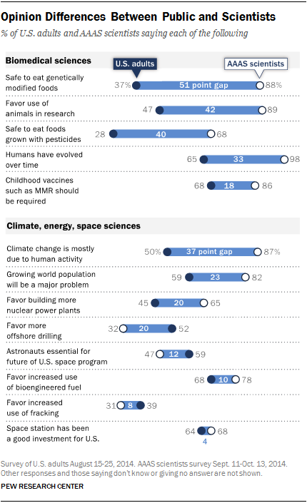
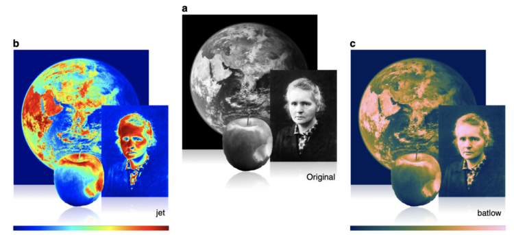
Fabio Crameri, Grace Shephard, and Philip Heron in Nature discuss the drawbacks of using the rainbow color scheme to visualize data and more readable alternatives:

The accurate representation of data is essential in science communication. However, colour maps that visually distort data through uneven colour gradients or are unreadable to those with colour-vision deficiency remain prevalent in science. These include, but are not limited to, rainbow-like and red–green colour maps. Here, we present a simple guide for the scientific use of colour. We show how scientifically derived colour maps report true data variations, reduce complexity, and are accessible for people with colour-vision deficiencies. We highlight ways for the scientific community to identify and prevent the misuse of colour in science, and call for a proactive step away from colour misuse among the community, publishers, and the press.

Tags: , , ,

Looking for falsified images in Alzheimer’s study

Charles Piller, for Science, highlights the work of Matthew Schrag, who uses image analysis to look for falsified data, recently scrutinizing a link between a protein and Alzheimer’s:

“So much in our field is not reproducible, so it’s a huge advantage to understand when data streams might not be reliable,” Schrag says. “Some of that’s going to happen reproducing data on the bench. But if it can happen in simpler, faster ways—such as image analysis—it should.” Eventually Schrag ran across the seminal Nature paper, the basis for many others. It, too, seemed to contain multiple doctored images.

Science asked two independent image analysts—Bik and Jana Christopher—to review Schrag’s findings about that paper and others by Lesné. They say some supposed manipulation might be digital artifacts that can occur inadvertently during image processing, a possibility Schrag concedes. But Bik found his conclusions compelling and sound. Christopher concurred about the many duplicated images and some markings suggesting cut-and-pasted Western blots flagged by Schrag. She also identified additional dubious blots and backgrounds he had missed.

Tags: , ,

Scientists with bad data

Tim Harford warns against bad data in science:

Some frauds seem comical. In the 1970s, a researcher named William Summerlin claimed to have found a way to prevent skin grafts from being rejected by the recipient. He demonstrated his results by showing a white mouse with a dark patch of fur, apparently a graft from a black mouse. It transpired that the dark patch had been coloured with a felt-tip pen. Yet academic fraud is no joke.

Tags: , ,

Questionable science diagrams

Sometimes illustrating scientific findings is a challenge. Sometimes the illustrations are published anyways, because there are no more options. Sometimes those illustrations end up on a Twitter feed called Science Diagrams that Look Like Shitposts.

Tags: ,

Why scientists need to be better at visualization

For Knowable Magazine, Betsy Mason looks at the state of (not so good) data visualization in science and offers some direction for how it can improve:

[S]cience is littered with poor data visualizations that confound readers and can even mislead the scientists who make them. Deficient data visuals can reduce the quality and impede the progress of scientific research. And with more and more scientific images making their way into the news and onto social media — illustrating everything from climate change to disease outbreaks — the potential is high for bad visuals to impair public understanding of science.

Tags:

Posted by in design, science

Tags:

Permalink

Evolution of the periodic table of elements

As more elements were discovered, the table grew and changed layout. For Science Magazine, Jake Yeston, Nirja Desai, and Elbert Wang provide a visual history.

Tags: , ,

Visualizing science

Jen Christiansen spoke about her extensive experience as a graphics editor for Scientific American. Her talk notes span a wide range of topics from the “rules”, the spectrum of visualization, and collaboration:

[S]ome of my favorite recent Scientific American graphics are the result of bringing together different artists—plucking experts from each of those groups and matching them up to create a final image that draws upon all of their strengths, not forcing one artist to excel in all areas. For example, I love to take an artist who can develop spot illustrations with a stylus or pen, and pair them up with an artist who can custom code data visualization solutions, as in this example by Moritz Stefaner and Jillian Walters.

Tags: ,

Randomness of scientific impact

scientific-randomness

A group of researchers wondered if there was a trend or predictability for when a scientist’s most impactful work came about. It’s random.

[W]e studied the evolution of productivity and impact throughout thousands of scientific careers. We reconstructed the publication record of scientists from seven disciplines, connecting each paper with its long-term impact on the scientific community as quantified by citation metrics. We found that the highest-impact work in a scientist’s career is randomly distributed within her body of work. That is, the highest-impact work has the same probability of falling anywhere in the sequence of papers published by a scientist. It could be the first publication, appear mid-career, or emerge last. This result is known as the random impact rule.

An interactive visualization by Kim Albrecht lets you explore this randomness. Since the main point of the research is really that there is no clear pattern, that’s what you get.

The explainer video by Mauro Martino for Nature is also interesting:

Tags: ,

Conflicting views: Public versus scientists

Science and society opinion by Pew Research

Pew Research Center released a report that compares the public and scientists' views on science and society.

On some things, such as the space station, fracking, and bioengineered fuel, U.S. adults and scientists a part of the American Association for the Advancement of Science share similar sentiments. On other issues, such as genetically modified foods, animals in research, and climate change, there are big differences.

Tags: , ,

Rising R usage in the sciences

R continues its growth, and usage in the sciences is no exception. Nature describes some of the applications along with links to getting started with the statistical computing language.

Besides being free, R is popular partly because it presents different faces to different users. It is, first and foremost, a programming language — requiring input through a command line, which may seem forbidding to non-coders. But beginners can surf over the complexities and call up preset software packages, which come ready-made with commands for statistical analysis and data visualization. These packages create a welcoming middle ground between the comfort of commercial 'black-box' solutions and the expert world of code. "R made it very easy," says Rojo. "It did everything for me."

For me, R used to be a traditional analysis tool that I made graphs with occasionally. But at some point it became more about the data graphics, and these days that's about all I do. That's the great thing about R. You don't have to learn everything about the language to get a lot out of it. Just take in bits at a time to suit your needs, and before you know it:

learning <- function(time) {
    return("easy");
}

Here are a handful more resources to get you started:

Plus lots more.

Tags: ,

Posted by in R, science, software

Tags: ,

Permalink