Coin flips might tend towards the same side they started

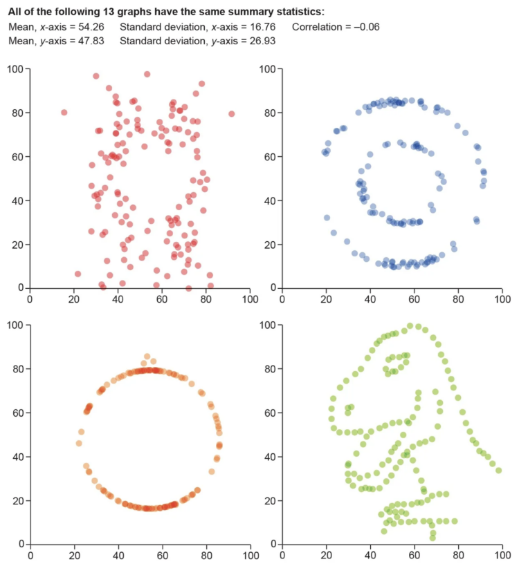
The classic coin flip is treated as a fair way to make decisions, assuming an even chance for heads or tails on each flip. However, František Bartoš was curious and recruited friends and colleagues to record over 350,000 flips. There appeared to be a slight bias.

For Scientific American, Shi En Kim reports:

The flipped coins, according to findings in a preprint study posted on arXiv.org, landed with the same side facing upward as before the toss 50.8 percent of the time. The large number of throws allows statisticians to conclude that the nearly 1 percent bias isn’t a fluke. “We can be quite sure there is a bias in coin flips after this data set,” Bartoš says.

There is probably more than one caveat here, but even though there were a lot of flips, they only came from 48 people and the bias varied across flippers.

Of course, if you’re trying to get a call in your favor, maybe try to catch a glimpse of which side is up and choose accordingly. Couldn’t hurt.

Tags: , , ,

Visualization to better see true values in data

For Scientific American, Jack Murtagh describes the importance of visualization in understanding the roughness of data:

One maxim that should be etched into the walls of all scientific institutions is to visualize your data. Statistics specializes in applying objective quantitative measures to understand data, but there is no substitute for actually graphing it out and getting a look at its shape and structure with one’s own eyeballs. In 1973 statistician Francis Anscombe feared that others in his field were losing sight of the value of visualization. “Few of us escape being indoctrinated” with the notion that “numerical calculations are exact, but graphs are rough,” he wrote. To quash this myth, Anscombe devised an ingenious demonstration known as Anscombe’s quartet. Together with its wacky successor, the datasaurus dozen, nothing more dramatically communicates the primacy of visualization in data analysis.

Tags: , ,

Florence Nightingale’s use of data visualization to persuade in the 19th century

For Scientific American, RJ Andrews looks back at the visualization work of Florence Nightingale:

Recognizing that few people actually read statistical tables, Nightingale and her team designed graphics to attract attention and engage readers in ways that other media could not. Their diagram designs evolved over two batches of publications, giving them opportunities to react to the efforts of other parties also jockeying for influence. These competitors buried stuffy graphic analysis inside thick books. In contrast, Nightingale packaged her charts in attractive slim folios, integrating diagrams with witty prose. Her charts were accessible and punchy. Instead of building complex arguments that required heavy work from the audience, she focused her narrative lens on specific claims. It was more than data visualization—it was data storytelling.

Be sure to also check out Andrews’ upcoming book on Nightingale, which is one part of a three-part series.

Tags: , , ,

Drought extent by region

For Scientific American, Cédric Scherer and Georgios Karamanis charted drought extent by region using a grid of stacked bar charts. Each cell represents a year for a corresponding region, and color represents drought intensity.

Compare this view to more map-centric ones. This version focuses more on time than it does geography. One isn’t better than the other. Just different.

See the full version here.

Tags: ,

Covid-19, the third leading cause of death

For Scientific American, Youyou Zhou made a line chart that shows cause of death in the United States, from 2015 up to present. Covid-19 was the leading cause of death in April and is now sitting at number 3. The rise in unclassified deaths also stands out.

Tags: , ,

Color breakdown of Scientific American covers

For Scientific American, Nicholas Rougeux and Jen Christiansen show the shift in hues for the magazine’s covers over the past 175 years. The changes serve as a proxy for technology advancements, changes in ownership, and shifts in thinking.

Tags: , ,

Gallery of uncertainty visualization methods

It must be uncertainty month and nobody told me. For Scientific American, Jessica Hullman briefly describes her research in uncertainty visualization with a gallery of options from worst to best.

Tags: , ,

Visualizing science

Jen Christiansen spoke about her extensive experience as a graphics editor for Scientific American. Her talk notes span a wide range of topics from the “rules”, the spectrum of visualization, and collaboration:

[S]ome of my favorite recent Scientific American graphics are the result of bringing together different artists—plucking experts from each of those groups and matching them up to create a final image that draws upon all of their strengths, not forcing one artist to excel in all areas. For example, I love to take an artist who can develop spot illustrations with a stylus or pen, and pair them up with an artist who can custom code data visualization solutions, as in this example by Moritz Stefaner and Jillian Walters.

Tags: ,

#SciArt Tweetstorm

Rainbow Microbes by Michele Banks

Rainbow Microbes by Michele Banks

The Grand Poobah’s of science art at the Symbiartic science art blog have declared 1-7 March to be the week of the science art tweetstrom using the hashtag #sciart.

Here at The Finch & Pea we currently have 181 “Art of Science” posts (well 182 now), or 30 per day for the the rest of the week. That should keep y’all busy.


Filed under: The Art of Science Tagged: Glendon Mellow, Kalliopi Monoyios, Katie McKissick, sciart, science art, Scientific American, Symbiartic

SciAm Blog Network revamp plus List of 2014 “best of” lists, Part I

Big changes at the Scientific American Blog Network Revamping the Scientific American Blog Network is quite a big deal. As Knight Science Journalism Tracker Paul Raeburn reports, SciAm is eliminating about half the bloggers in the network and instituting a … Continue reading »

The post SciAm Blog Network revamp plus List of 2014 “best of” lists, Part I appeared first on PLOS Blogs Network.