Difficulties reading the cone of uncertainty

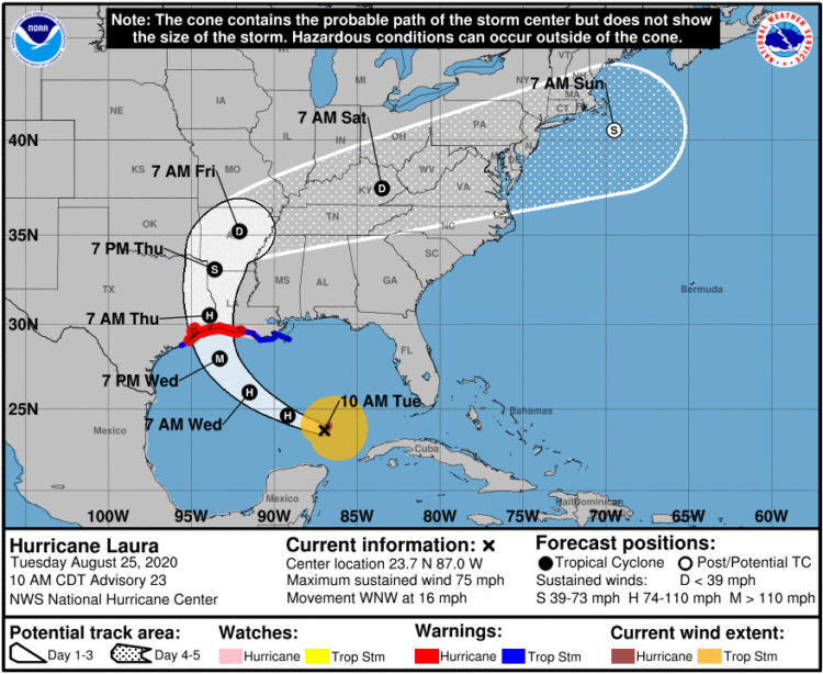
It seems that there is always surprise when a hurricane makes landfall in some areas, which some attribute to poor forecast communication with the cone on a map that shows possible paths. Scott Dance and Amudalat Ajasa for The Washington Post discuss the challenges that people have reading the cone of uncertainty:

Indeed, many residents and authorities have said Ian’s track surprised them, even though the cone for days included the storm’s eventual landfall point on its southern edge. So some meteorologists and social scientists are saying the disaster is only the latest evidence that the Hurricane Center should revamp the way it depicts forecasts — communicating the scope and intensity of a storm’s threats, rather than just the expected path of a single point at its center.

Maybe, when it comes to communicating hurricane forecasts, we should get rid of possible-paths maps altogether and focus on possible outcomes. The shape and direction of a storm matters a lot less than the chances the storm hits your town. So no path, just choropleth map that shows probabilities.

Tags: , , , ,

What that hurricane map means

For The New York Times, Alberto Cairo and Tala Schlossberg explain the cone of uncertainty we often see in the news when a hurricane approaches. People often misinterpret the graphic:

The cone graphic is deceptively simple. That becomes a liability if people believe they’re out of harm’s way when they aren’t. As with many charts, it’s risky to assume we can interpret a hurricane map correctly with just a glance. Graphics like these need to be read closely and carefully. Only then can we grasp what they’re really saying.

Depict uncertainty more clearly, and people will understand the probabilities and confidence intervals more clearly.

Tags: , , ,

Maps of natural disasters and extreme weather

For The Washington Post, Tim Meko mapped floods, tornados, hurricanes, extreme temperatures, wildfires, and lightning:

Data collection for these events has never been more consistent. Mapping the trends in recent years gives us an idea of where disasters have the tendency to strike. In 2018, it is estimated that natural disasters cost the nation almost $100 billion and took nearly 250 lives. It turns out there is nowhere in the United States that is particularly insulated from everything.

NOWHERE IS SAFE.

Tags: , , , , ,

Inside Hurricane Maria, a 3-D perspective

This 3-D view inside Hurricane Maria, from NASA’s Scientific Visualization Studio and NASA’s Goddard Space Flight Center, lets you see the data and the lead-up to the storm in a neat 360-degree view. Be sure to watch it on your phone or with a VR thingy for full effect. Disregard the questionable color scale.

Tags: , , ,

Watch rising river levels after Hurricane Florence

Hurricane Florence brought a lot of rain, which in turn made river levels rise. The New York Times animated the rise over a five-day period. The height of the bars represents the rise of the river level, as compared to levels on Thursday.

I like the visual metaphor of bars going up with river levels. I’m not sure the sudden rise and falls in such short periods of time would appear as surprising.

Tags: , , ,

Realistic storm surge depicted in Weather Channel forecast

The Weather Channel is using a realistic 3-D depiction surrounding a reporter to show what a storm surge might bring. Here, just watch it:

Tags: , ,

Hurricane Florence trackers

Hurricane Florence is forecast to touch down Thursday night or Friday, and what’s become the norm, there are several ways to see where the hurricane is and where it might go. Here are a handful of views. Each focuses on different aspects of potential storm.


The Washington Post shows the five-day chance of tropical-storm-force winds instead of the possible path of the hurricane. As noted by Gregor Aisch, this makes it a more useful reference for people in potentially affected areas.


Axios highlighted the potential path, but using an animated forecast, they show how the predictions change over time. There’s a lot of uncertainty.


The New York Times is going more piece-wise with their visual coverage and straightforward map of of the potential path.


For a closer to real-time view of the hurricane, the global map of wind by Cameron Beccario is still the place to go.
 

Stay safe.

Tags: ,

Thermal structure of Hurricane Maria

Hurricane Maria touched down in Puerto Rico. This visualization by Joshua Stevens at NASA shows what the thermal structure of the storm looked like, based on data collected by the Terra satellite.

Colder clouds, which are generally higher in the atmosphere, are shown with white. Somewhat warmer, lower clouds appear purple. The image reveals a very well-defined eye surrounded by high clouds on all sides—an indication that the storm was very intense.

Ugh.

Tags: , ,

Comparing the strength of Hurricane Irma against previous hurricanes

For perspective, The New York Times compares the strength of Hurricane Irma to hurricanes from the past 50 years that reached Category 3. They transition through three views in the scroller, which would probably be too advanced on their own, but I think the short notes and focus on Irma gets the charts over the hump.

Tags: ,

Thirty years of hurricanes

After their graphic for thirty years of floods, Axios follows up with thirty years of Atlantic hurricanes. Each area represents the wind speed and time of a hurricane, and color represents the category.

Tags: ,