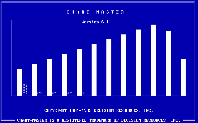
RJ Andrews digs up the PC archives of charting software. Scrolling through the thread, you can see the roots of Excel in the software that pre-dates the 1987 Windows release, along with what was considered nice back in the day. In many ways, such as in the interface, features, and chart types, things haven’t changed that much over the past few decades.
Tag Archives: vintage
Generate a color analysis by uploading an image
Mel Dollison and Liza Daly made a fun interactive that lets you upload an image, and it spits out a vintage-looking color analysis a la Vanderpoel:
This generator is based on the works of Emily Noyes Vanderpoel (1842-1939), who hoped her original color analyses would inspire others to study “whatever originals may be at hand in books, shops, private houses, or museums.” We hope you are similarly inspired by her abstract, modernist style employed in the context of everyday objects and photos.
Originally conceived as a Twitter bot, you can find the Python code behind the project on GitHub.
Tags: color, Emily Noyes Vanderpoel, Python, vintage
Vintage relief maps
Muir Way updates vintage relief maps with a third dimension. Pretty. The above is a geologic map of the United States, based on a 1932 print.
Scott Reinhard made similar maps last year, but Muir Way leaned a little more into it with more geographic areas and prints to buy.
Exhibition of historical visualization
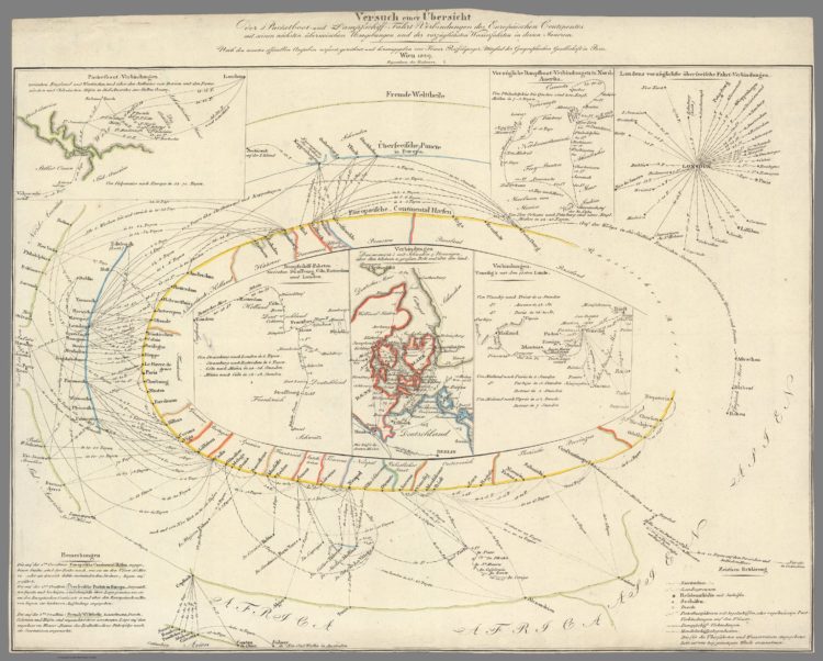
RJ Andrews, in collaboration with the David Rumsey Map Center, curated a collection of historical data visualization:
Data visualization leapt from its Enlightenment origins and into the minds of the general public in the 1760s. It cast more powerful spells throughout the following century. By 1900, modern science, technology, and social movements had all benefited from this new quantitative art. Its inventions include the timeline, bar chart, and thematic map. Together, these innovations changed how we understand the world and our place within it. Data visualization helped a new imagination emerge, wired to navigate a reality much bigger than any single person’s lived experience.
Bookmarking this for a closer look later.
Tags: David Rumsey, history, RJ Andrews, vintage
Posted by in David Rumsey, history, Infographics, RJ Andrews, Vintage
Forgotten map types
Geographer Tim Wallace likes to look at old maps, and is particularly fond of the weird and forgotten types:
So, I slowly amassed a more complete list. And here it is. Most of these map types are silly or unusual, not forgotten. Many of them are even deliberately taken out of context to highlight their wackiness and how easily maps can be misread (I sure misread them all the time!).
It’s fun poking around the Internet Archive and HathiTrust, blowing the digital dust off of a volume with 0 views and having a look. You never know what you’ll find. Maybe a forgotten map type?
The above is the long forgotten but everlasting Gobstopper zone map.
Tags: Tim Wallace, vintage
Posted by in maps, Tim Wallace, Vintage
Charting cholera, beyond John Snow
John Snow, who often gets the credit for showing the geographical patterns of a cholera outbreak in London in 1854, wasn’t the only one visualizing data at the time. James Cheshire put together a collection of other charts made at the time.
[I]t wasn’t just Snow producing innovative maps and charts to support his cause. Snow was part of an arms race to get the best data communicated by the most compelling maps/ charts, to evidence his side of the debate against his contemporaries – people like William Farr who was also a master data visualiser.
Posted by in cholera, John Snow, Statistical Visualization, Vintage
Vintage map with modern 3-D elevation
This vintage recreation by graphic designer Scott Reinhard fills all the right checkboxes for me.
Modern reproduction of 1847 geometry books
Euclid’s Elements is a series of 13 books produced in 300 BC that forms a collection of mathematician Euclid’s proofs and definitions. In 1847, Oliver Byrne recreated the first six books “in which coloured diagrams and symbols are used instead of letters for the greater ease of learners.” Nicholas Rougeux recreated Byrne’s work with an online interactive version:
This site was created to bring Byrne’s colorful edition to life by making it available to a modern audience by reproducing the entire book online so it would be accessible to anyone with modern equipment and a flexible design as true to the original as possible. Each diagram was created by tracing the originals and ensuring their dimensions and relationships stayed true to Euclid’s geometric principles. Proofs accompanying each diagram have been enhanced with clickable shapes to aid in understanding the shapes being referenced.
What glorious tedium. Read more on Rougeux’s process here. See also his previous recreation of the 1821 Nomenclature of Colours.
Tags: Euclid, recreation, vintage
Posted by in Euclid, Infographics, recreation, Vintage
Interactive recreation of an 1821 color guidebook
I’m always down for faux vintage, online recreations of actual vintage visualization-related things. Using scans from the real thing, Nicholas Rougeux recreated Werner’s Nomenclature of Colours, supplementing with interaction and photo references.
Tags: color, recreation, vintage
Posted by in color, design, recreation, Vintage
Visualization in the 1980s, just before the rise of computers
Graham Douglas, a data journalist at The Economist, looks back on the days when getting data and visualizing it was tedious from start to finish:
But even these seemingly simple charts had their challenges and took a lot of time to make. Data were found in books by a research department skilled in the art of extracting obscure economic figures and statistics, which were copied to scraps of paper. We would use rulers, dividers, protractors and geometry (Thales’s theorem) to divide axis lines into equal parts to draw the scale ticks. We would plot the data manually in pencil on a special drawing board and sketch out the wording and title for approval before we inked the whole thing in. Text was added last using stencilling, or later, Letraset dry-transfer lettering. Making a spelling mistake was distressing. Areas were filled with sticky-back plastic pre-printed film cut out with a scalpel.
Maybe grabbing data out of PDF files isn’t so bad.
No. Still horrible.
This reminds me of my dad’s work though. He’s a retired civil engineer. When I was young, he brought home these giant blueprints. He’d roll them out after dinner, and armed with a protractor, a scaled ruler, and a calculator I could never figure out, he’d mark up building plans. Towards the end of his career, he kept everything on a flash drive.


