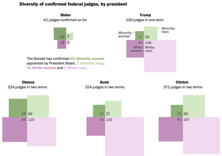
Adrian Blanco for The Washington Post used squares connected at the corners to compare federal judge confirmations across presidencies. Each square represents a demographic, which is sized by number of confirmations. I like it.
Adam's Blogroll: click through to the author's blog
Adrian Blanco for The Washington Post used squares connected at the corners to compare federal judge confirmations across presidencies. Each square represents a demographic, which is sized by number of confirmations. I like it.
Posted by in diversity, Joe Biden, judges, Statistical Visualization
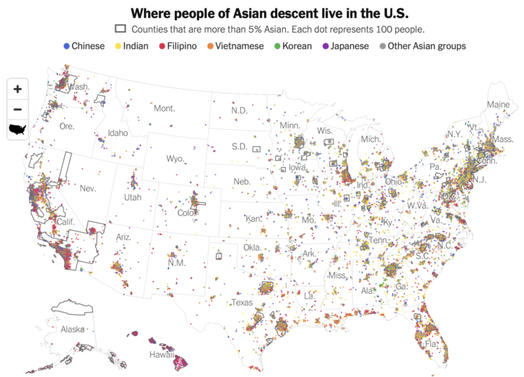
Robert Gebeloff, Denise Lu and Miriam Jordan for The New York Times looked at overall increases and variation within the Asian population:
North Dakota, South Dakota, Texas, North Carolina and Indiana are among states that experienced major growth in the past decade. And people of Asian descent have been settling in ever larger numbers in states like West Virginia, where the overall population has declined.
Tags: Asian, diversity, New York Times
Posted by in Asian, diversity, maps, New York Times

For Quartz, Amanda Shendruk and Marc Bain analyzed skin tones that appeared in beauty and fashion ads on Instagram. The graphics use Blackout Tuesday on June 2, 2020, when many brands vowed to improve diversity to better reflect the world, as a point of comparison. Using median skin color as the main metric, some companies shifted more than others.
Posted by in diversity, Equity and Inclusion Statements

From 1928, the year of the first Academy Awards, to 2019, there have been 455 nominations for Best Director. Of those, 18 of them went to non-white men. Read More
Posted by in Academy Awards, Best Director, Data Underload, diversity

The Washington Post visualized 13,000 school districts to show the change in diversity between 1995 and 2017. Each bubble represents a district and the size represents number of students. The bubbles transition to diverse, undiverse, and extremely undiverse. It’s an important topic and worth the read.
But right now, all I can think about is that I need to up my moving bubble game.
Tags: diversity, school, Washington Post
Posted by in diversity, Infographics, school, Washington Post

As one might expect, many women, people of color, and L.G.B.T. candidates are running in this year’s midterms. It’ll be one of the most diverse elections in U.S. history. The New York Times provides a scrolly breakdown with 410 cutout faces floating around on your screen.
Posted by in diversity, election, Infographics
 By Hilda Bastian What should scientific editors be able to do well? We would all be able to agree easily on some basics. Last year, a group led by David Moher and colleagues
Aaron Williams and Armand Emamdjomeh for The Washington Post delve into diversity and segregation in the United States. The boiling pot continues to get more ingredients, but they’re not mixing evenly.
Some 50 years ago, policies like the Fair Housing Act and Voting Rights Act were enacted to increase integration, promote equity, combat discrimination and dismantle the lingering legacy of Jim Crow laws. But a Post analysis shows that some cities remain deeply segregated — even as the country itself becomes more diverse.
I like how you can easily toggle between diversity and segregation. It allows for a quick comparison of metrics that aren’t always clear-cut.
Scroll to the end to see how diversity and segregation compare in your area.
Tags: diversity, race, Washington Post
Posted by in diversity, maps, race, Washington Post
 0000-0002-8715-2896 It was a turning point. The previous year, the US Civil Rights Act had passed. On 26 January 1969 in New Orleans, 17 African-American mathematicians gathered at the annual national mathematical meeting.
Posted by in Black History Month, diversity, featured, gender, history, racism, Science culture, women in science