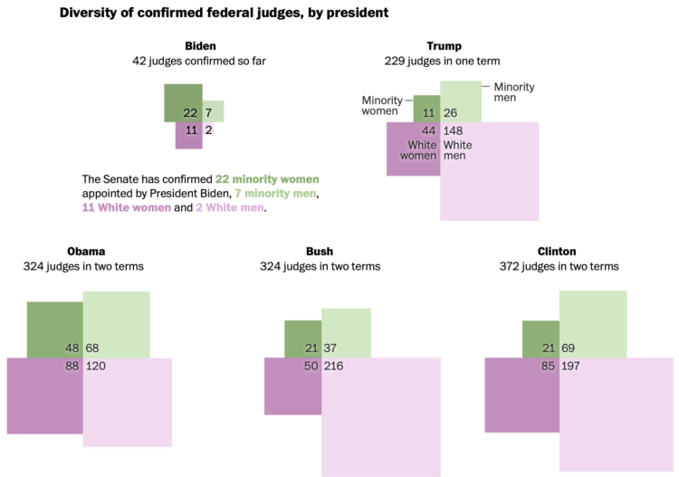
Adrian Blanco for The Washington Post used squares connected at the corners to compare federal judge confirmations across presidencies. Each square represents a demographic, which is sized by number of confirmations. I like it.
Adam's Blogroll: click through to the author's blog
Adrian Blanco for The Washington Post used squares connected at the corners to compare federal judge confirmations across presidencies. Each square represents a demographic, which is sized by number of confirmations. I like it.
Posted by in diversity, Joe Biden, judges, Statistical Visualization

Vaccines provide light at the end of the tunnel, but when we finally get to the end depends on the speed at which we vaccinate. The Washington Post considers Joe Biden’s pledge for 100 million shots in his first 100 days in the context of herd immunity and calendar days.
I appreciate the time spent explaining the intersection of these two lines.
Tags: coronavirus, Joe Biden, vaccination, Washington Post
Posted by in coronavirus, Joe Biden, Statistical Visualization, Vaccination, Washington Post

The New York Times labeled all of the people sitting behind Joe Biden during the inauguration. It’s a straightforward but slick interactive that lets you pan and zoom the photograph. Click on a name for more details or use the list of names in a sidebar.
Tags: guest, inauguration, Joe Biden, New York Times
Posted by in guest, inauguration, Infographics, Joe Biden, New York Times

For Bloomberg, Jeremy C.F. Lin and Rachael Dottle show what Joe Biden’s inauguration will look like, given all of the recent events and 2020. No public access and 25,000 National Guard personnel.
Tags: Bloomberg, inauguration, Joe Biden
Posted by in Bloomberg, inauguration, Joe Biden, maps