NYC city council district voting guide

With New York 2023 elections coming up, The City and NY1 put together a straightforward guide for information and voting history for each district. I want something like this for my area, a vast improvement over the paper mailers that can be difficult to navigate. [Thanks, Scott]

Tags: , ,

Chance of rain and election turnout

There’s rain in the forecast tomorrow in some areas of the United States, which is worth noting because tomorrow is election day. Eve Washington and John Keefe, for The New York Times, picked out the overlap between competitive races and areas it’s likely to rain.

Mainly I post for the A+ headline: “Will Rain Affect Turnout Tomorrow? The Answer Is Cloudy.” That, and I’m reminded of the ever important overlap between an eclipse and sasquatch sightings.

Tags: , , ,

Election ad topics

Midterm election day is just about here in the U.S., so the political ads are running. Harry Stevens and Colby Itkowitz, for The Washington Post, show the spending breakdown by political party and topic. Bigger squares mean more spending, and more blue or more red mean more Democrat or Republican, respectively, share of the spending.

The chart reminds of the Shan Carter classic from 2012, which visualized word usage at the National Convention. Same split and sort, but with circles.

Tags: , , ,

Interest levels for political issues mapped

To estimate public interest in the many political issues across the United States, Axios used Google Trends data to map issues by congressional district. Switch between the many topics, and you see a choropleth map (that can change to a cartogram), along with a barcode chart to show the distribution of interest among all districts.

I’m not sure if it’s that beneficial to see the overall geographic distributions for most topics, but it’s useful as a point of reference to look at specific districts. For me, the barcode chart is the most interesting with the distributions shifting quite a bit from topic to topic.

Tags: , , ,

Election modeling explained

In election reporting, there’s a gap between real-time results and final results, so news orgs use statistical models to show where results appear to be headed. For The Washington Post, Adrian Blanco and Artur Galocha explain the basic concepts behind their model, using a fictional state called Voteland.

Tags: , ,

Possible cheating seen in a scatterplot

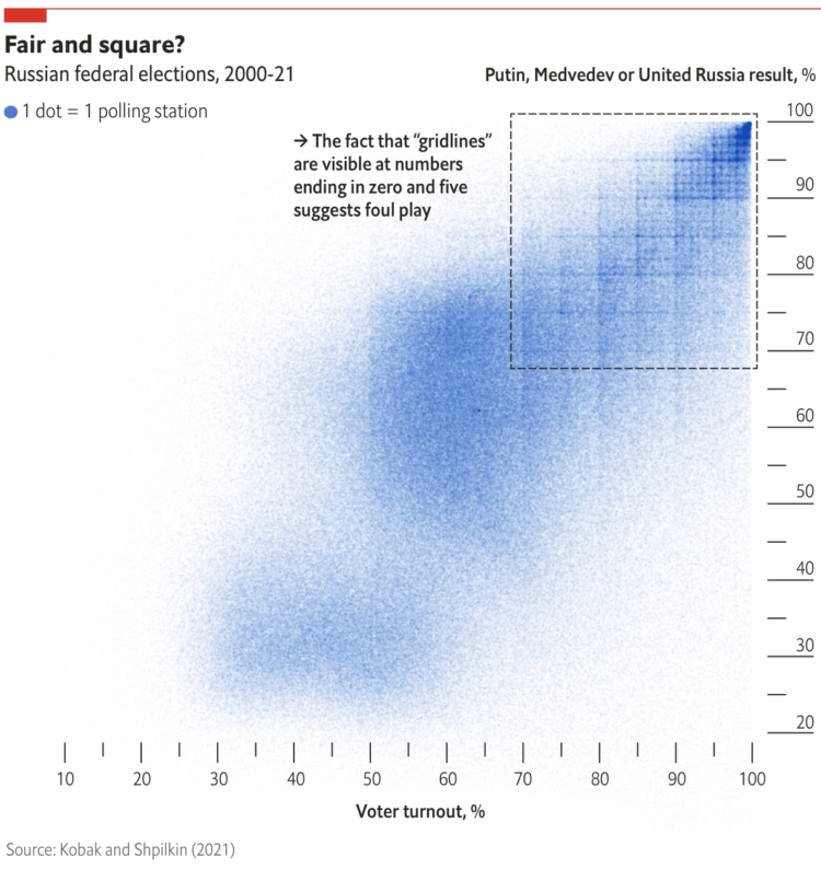
When plotting Russian election results, a structured grid patterns appear. From The Economist:

When Dmitry Kobak and Sergey Shpilkin, two researchers, analysed the results, they found that an unusually high number of turnout and vote-share results were multiples of five (eg, 50%, 55%, 60%), a tell-tale sign of manipulation. According to Messrs Kobak and Shpilkin, there were at least 1,310 polling stations (out of 96,325) with results that were suspiciously tidy, with rounder numbers than you would expect to see by chance.

I’m not familiar with Russian elections, but this seems like lazy cheating. Are they just making up numbers by hand or what?

Check out the full results of Kobak and Shpilkin’s analysis in Python notebook form.

Tags: , ,

See if you live in a political bubble

Gus Wezerek, Ryan D. Enos, and Jacob Brown for NYT Opinion use neighborhood-level data to show how those around you voted in the 2020 election. They ask: do you live in a political bubble? Enter an address to see.

This is riffing off of NYT’s similarly-themed map from 2018, which asked the same question but answered more geographically. This newer version, as is the current way of doing things these days, is more bubbly and mobile-focused with the scroll format.

Tags: , , ,

Voting and vaccination rate

Danielle Ivory, Lauren Leatherby and Robert Gebeloff for The New York looked at voting from the 2020 election and vaccination rates at the state and county levels. The strength of correlation is surprising. The existence of the correlation is not.

Tags: , , ,

Guess who the neighborhood voted for

NYT’s The Upshot has a quiz that puts you in a neighborhood via Google Maps images. Who did the neighborhood vote for in the 2020 presidential election? The aggregate of reader results is the most interesting part, which shows a strong correlation between correct guesses and the magnitude of the win by a candidate.

I much prefer this quiz over the refrigerator one The Upshot put up last year.

Tags: , , ,

Mapping all of the voters

In what seems to have become a trend of making more and more detailed election maps, NYT’s The Upshot mapped results down to the addresses of 180 million voters:

The maps above — and throughout this article — show their estimates of partisanship down to the individual voter, colored by the researchers’ best guess based on public data like demographic information, voter registration and whether voters participated in party primaries.

We can’t know how any individual actually voted. But these maps show how Democrats and Republicans can live in very different places, even within the same city, in ways that go beyond the urban-suburban-rural patterns visible in aggregated election results.

The estimates are based on research by Jacob Brown and Ryan Enos, recently published in Nature. You can also look at their data via the Harvard Dataverse.

Tags: , ,