Racial bias in OpenAI GPT resume rankings

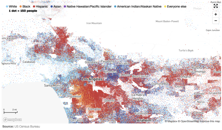
AI is finding its way into the HR workflow to sift through resumes. This seems like a decent idea on the surface, until you realize that the models that the AI is built on lean more towards certain demographics. For Bloomberg, Leon Yin, Davey Alba, and Leonardo Nicoletti experimented with the OpenAI GPT showing a bias:

When asked to rank those resumes 1,000 times, GPT 3.5 — the most broadly-used version of the model — favored names from some demographics more often than others, to an extent that would fail benchmarks used to assess job discrimination against protected groups. While this test is a simplified version of a typical HR workflow, it isolated names as a source of bias in GPT that could affect hiring decisions. The interviews and experiment show that using generative AI for recruiting and hiring poses a serious risk for automated discrimination at scale.

Yeah, that sounds about right.

Tags: , , , ,

Race and Occupation

About 22 percent of physicians in the United States are Asian, but Asian people only make up about 6 percent of the full working population. Compare the former to the latter, and you could say that Asian people are about 3.5 times more likely to be physicians.

Are there other jobs that jump out? What’s it like for other races and ethnicity?

Read More

Commonness of Races in Different Occupations

Some jobs are worked commonly by people of a certain race or ethnicity more than others. Farm managers are almost all white, postal service processors are half black, manicurists are 65% Asian, and drywall installers are 75% Hispanic. This chart shows the percentage of employed persons 16 years and older who are a given race or ethnicity for each job. It’s based on 2023 data from the Bureau of Labor Statistics.

Read More

Evolution of race categories in U.S. Census forms

For The New York Times, K.K. Rebecca Lai and Jennifer Medina show the changing checkboxes over the past couple centuries:

Over the centuries, the census has evolved from one that specified broad categories — primarily “free white” people and “slaves” — to one that attempts to encapsulate the country’s increasingly complex demographics. The latest adaptation proposed by the Biden administration in January seeks to allow even more race and ethnicity options for people to describe themselves than the 2020 census did.

What we measure and how we measure is a reflection of what we’ve cared about.

Tags: , ,

F1 Racing results plotted as lightning

Joey Cherdarchuk used a lightning metaphor to visualize the outcomes of races from the 2021 season. The x-axis represents how far ahead or behind the each racer is compared to the average. The y-axis represents laps. Racing and thunder sounds play in the background for dramatic effect. I’m into it.

Tags: , ,

Census Mapper, a tool to visualize population and racial shifts

Pitch Interactive and the Census 2020 Data Co-op, supported by the Google News Initiative, made a tool that lets you easily map population shifts since 2010. It’s called Census Mapper.

Built with journalists in mind, you can zoom in to the tract level and select any set of racial groups. The map updates. Once you’ve found what you’re looking for, you can embed the tool on a website. You can only embed the entire tool for now, as opposed to just the map of a specific geographic area and level, but it looks promising.

Tags: , , , ,

Black neighborhoods split by highways

Rachael Dottle, Laura Bliss and Pablo Robles for Bloomberg on how urban highways often split communities:

By the 1960s, the neighborhood’s business core was gone, replaced by newly constructed Interstate 94. Homes that had been a short walk to the shops now overlooked a six-lane highway shuttling commuters between the Twin Cities of Minneapolis and St. Paul. Homes and businesses were seized and destroyed under eminent domain. The neighborhood was split in two.

Tags: , , ,

Black mortality gap

Anna Flagg, for NYT’s The Upshot, used dots arranged as a stacked area chart to show the difference between two mortality rates. Each dot represents 10 people, and they start as a random cloud. A transition to show rate by age lends focus to both an absolute and relative count.

Tags: , , ,

Race and ethnicity map of dots

CNN goes with the dot density map for their first pass on the 2020 decennial. Each dot represents a certain number of people depending on your zoom level. Color represents race or ethnicity.

Does CNN have a limited color palette that they’re allowed to use? I would’ve gone for more contrast between the light blue for white and darker-but-still-light blue for American Indian/Alaskan Native.

See also: Dustin Cable’s racial dot map from 2013 and Erica Fischer’s dot maps of the same flavor from 2010.

Tags: , , ,

Shift in white population vs. people of color

The New York Times go with the angled arrows to show the shifts in racial population. The red-orange arrows show an increase in the share of white population, and the teal arrows show an increase in the share of people of color. Longer arrows mean a greater percentage point change.

Whereas The Washington Post focused more on the changes for each demographic individually, NYT focused more on how two broad groups compared.

Tags: , ,