Loneliness, life satisfaction, and time

For The Pudding, Alvin Chang examines loneliness through the lens of individual responses from the American Time Use Survey:

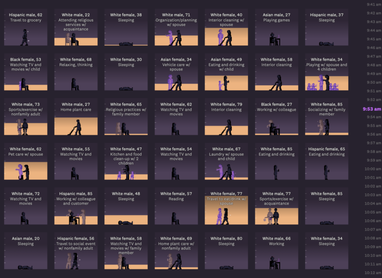
In this story, we’ll go through 24 hours of a typical weekend day in 2021. We know what people did – and who they did it with – because, since 2003, the American Time Use Survey has asked people to track how they use their time.

By the end of the day, we’ll learn that Martin’s isolation isn’t unique. In fact, loneliness has become a far more common experience in the last few decades – and it was supercharged by the pandemic.

The heart of the piece is in the anti-aggregate view of individuals through 24 hours. See each person’s schedule, who they spend time with, and how that changes through the day. Sorting draws patterns. The scrolly clock on the right ticks. And it works on mobile. Chang makes the data immediately relatable.

See it.

Tags: , , , ,

When Americans Are Happiest

We saw that life satisfaction changes with age, based on data from the Bureau of Labor Statistics. In the same survey, people were also asked about their happiness throughout the day when they ate, traveled, watched television, took care of kids, and other activities.

People reported happiness on a scale from 0 to 6, where 0 was not happy at all and 6 was very happy. The animation above shows the average happiness for the fifty most common activities. It runs from age 20 to 70.

Work, as you might imagine, sticks around the bottom of the range; eating and drinking lingers around the middle and the top; and socializing sticks around the top. The smaller circles show more variation over time, as kids and grandkids enter the picture and retirement kicks in.

Notes

The data comes from the well-being module of the 2021 American Time Use Survey. I downloaded microdata via IPUMS. I made the animation with R.

Tags: , ,

Time splits from a visualization freelancer

Eli Holder shows how he split his freelance time across various projects and categories. With visualization work, a lot of your time is spent doing non-visualization things:

As expected, at 16 percent, data wrangling and analysis takes a significant chunk of total time. This includes data prep, which I’ve categorized as fairly mindless data engineering or spreadsheet maneuvering (nine percent) or data pulls (three percent). More interesting data work was more fragmented: ~two percent of the time was exploratory analysis (e.g., for storytelling), ~one percent of the time was spent designing metrics (e.g., exploring different calculations that might best tell a given story) and another one percent was creating mock datasets (e.g., to compensate for data security constraints or clients who are slow to provide real data).

I don’t track my time with FlowingData, but if I were to guess, I spend at least half my time on analysis and wrangling. If you consider the many potential visualization projects that I scrapped because nothing panned out in analysis, that analysis/wrangling percentage goes up a lot more.

Sometimes you gotta dig a lot before you find anything worth showing.

Tags: , , ,

Cost of breastfeeding, seen in self-tracked data

There are baby formula shortages in the United States. A criticism from some who don’t know what they’re talking about are for parents to “just” breastfeed. Alyssa Rosenberg for Washington Post Opinion discusses the challenges behind that from a time perspective:

Even in the best-case scenario, breastfeeding isn’t free. It costs money for the supplies that keep a nursing mother comfortable and healthy enough to keep producing milk. And it costs time. I can show you exactly how much time, because I used an app to track every minute I spent nursing and pumping over the first six months of my son’s life.

She then translates the many hours spent into dollars, based on your salary.

Tags: , ,

How Much More Time We Spent at Home

We had to do a lot more from home in 2020. Based on the American Time Use Survey, we spent about 62% of our waking time at home. In contrast, we only spent about 50% in 2019. Here is the breakdown by activity on a weekday.

For each year, I counted the total minutes for each activity and divided by total waking time to estimate percentages. For privacy reasons, the where is not provided for when respondents were sleeping, grooming, or doing personal activities. I suspect the total percentage of time spent at home for both years would increase if these times were included.

For a better sense of how everything shifted, here’s a different view that shows the percentage of time spent at home, by activity, on a weekday.

With the exception of household activities, which already happened mostly at home, there was an increase in every category. Work from home went up 142%. Education at home more than doubled. Good times.

Tags: ,

How time use changed in 2020

Ben Casselman and Ella Koeze for The New York Times compared time use in 2020 against time use in 2019, among different demographic groups.

As we know, the pandemic affected everyone differently. The slope charts show overall averages, so it would be an interesting next step to look at more granular variations. I suspect you’d see more pronounced shifts.

Tags: , ,

Schedule change with a baby

It’s difficult to emphasize how much life changes when a child comes into the picture. Caitlin Hudon made a chart to show how her daily schedule shifted dramatically.

For a while, it seems like all of your free time is gone for good, but ever so slowly, you get a little bit of it back as they grow more independent.

Tags: , , ,

How parents spend time with their kids

For Quartz, Dan Kopf and Jenny Anderson on how time spent with kids changes with age:

In the very beginning, it’s all about physical care, otherwise known as the stuff that makes your arms tired. A fifth of time parents spend with kids before their first birthday is on what could be described as keep-them-alive tasks. At age 1, this falls dramatically and it becomes playtime: peek-a-boo, stack the box, dinging and singing, making art, dancing, hide and seek, jumping in puddles. The share of time spent playing with children peaks around age 1, and then is then slowly replaced by a variety of other activities, including socializing and watching TV. Overall, time spent with children declines as kids get older.

Sounds about right. Although it makes me a bit nervous for the future.

Tags: , ,

Data comic shows an average American day

Matt Hong used a stacked bar chart over time as the frame for a data comic about American time use. Each row represents a 2-hour window during the day, and each stack represents the percentage of Americans doing an activity: sleep, work, free, and other. The activity with the highest percentage gets a highlight.

As a fan of time use data, this is totally my jam. Also, the data comic space is underutilized.

Tags: ,