
K.K. Rebecca Lai ran her first marathon. She recounts her training and the day of the event with a series of maps and charts. It reads like a data-driven journal entry, which I am always up for.
Tags: K.K. Rebecca Lai, marathon
Adam's Blogroll: click through to the author's blog
K.K. Rebecca Lai ran her first marathon. She recounts her training and the day of the event with a series of maps and charts. It reads like a data-driven journal entry, which I am always up for.
Tags: K.K. Rebecca Lai, marathon
Posted by in K.K. Rebecca Lai, marathon, Self-surveillance
Giorgia Lupi, known for using data visualization to connect real life and numbers, has been dealing with long Covid for the past three years. In a visual guest essay for NYT Opinion, Lupi describes her experience of fear, pain, and hope using a spreadsheet and a diary of brush strokes.
I thought that if I collected enough data, I would eventually figure out what was going wrong. But no matter how much data I collected or how many correlations I tried to draw, answers eluded me. Still, I couldn’t stop tracking. My spreadsheet was the only thing I could control in a life I no longer recognized.
In 2015, Lupi worked on Dear Data, which focused on the little joys of life through visualization-based postcards. This moving piece uses a similar style but is on the opposite end of the emotional spectrum.
Tags: coronavirus, Giorgia Lupi, long Covid, New York Times
Posted by in coronavirus, Giorgia Lupi, long Covid, New York Times, Self-surveillance
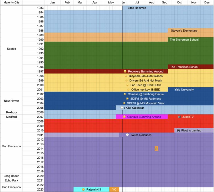
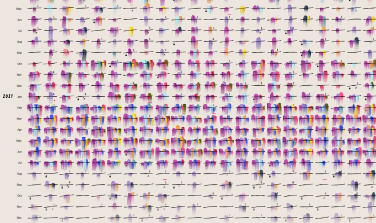
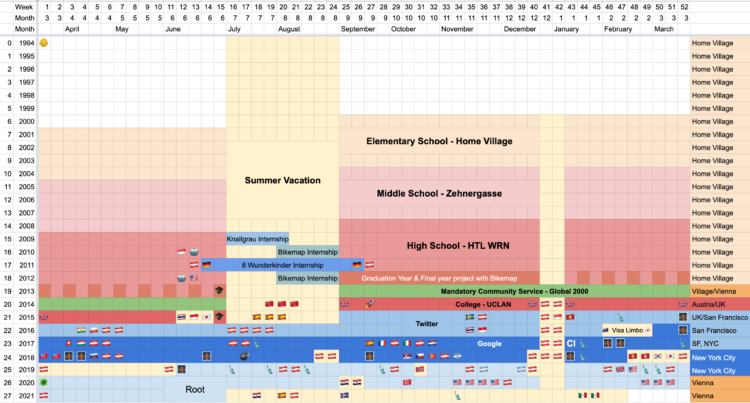
Coming up on 40 years old, Emmett Shear, perhaps best known as a co-founder of Twitch, reflected on his time so far using a spreadsheet. He marked where he lived in the left column, years run top to bottom, and months run left to right. Cells are colored by the main thing going on his life.
You can access the sheet here, in case you want to make one for your own life.
Tags: Emmett Shear, spreadsheet, timeline
Posted by in Emmett Shear, Self-surveillance, spreadsheet, Timeline
Reddit user nerdydancing tracked her earnings on each shift for four years. If any dataset promised stories behind each data point, it is probably this one.
Posted by in income, Self-surveillance, stripper
![]()
For eight years, Liam Quigley tracked every slice of pizza he ate in New York City, which added up to 454 slices. Quigley did not rate the slices to “avoid controversy and bribes”, but I kind of wish he rated all those slices. Instead he logged the location, the price, and the type of pizza.
Also I want pizza now.
Tags: Liam Quigley, pizza
Posted by in Liam Quigley, pizza, Self-surveillance
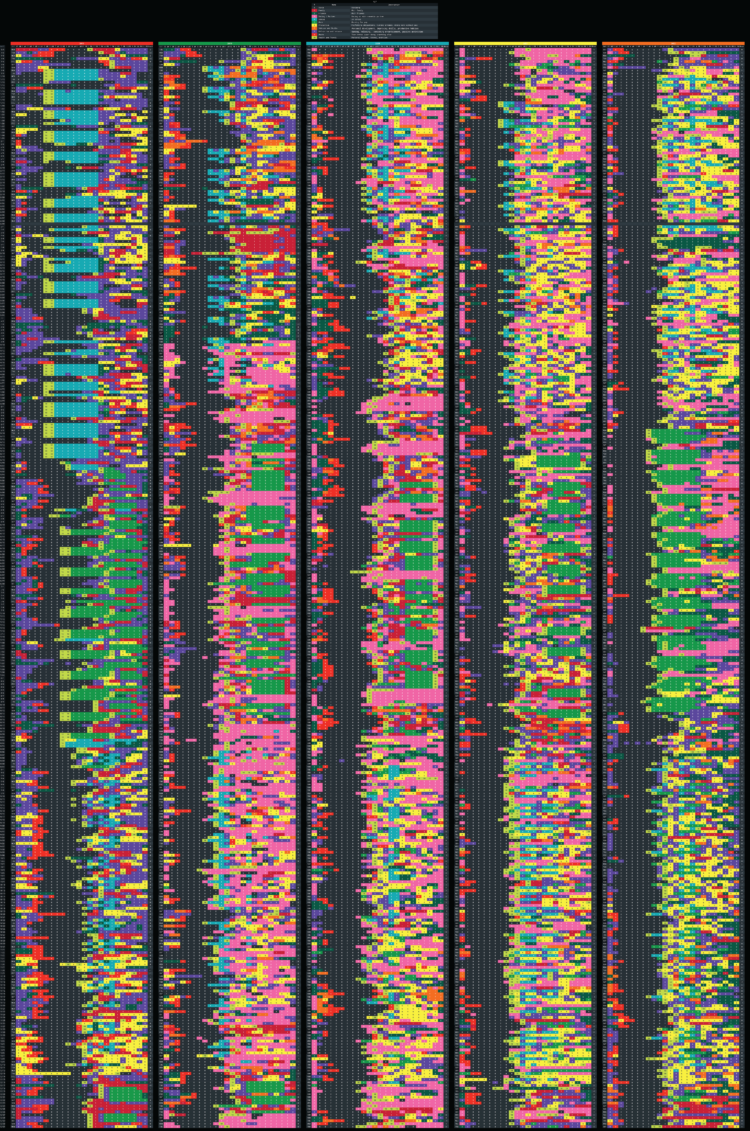
In the department of tedious and thorough, Reddit user _tsweezy_ tracked every hour of his life for five years. It’s like a personal American Time Use Survey diary for slightly longer than a single day. I’m sure there’s some estimation or fill-ins after-the-fact, but still, that’s a lot of days and hours.
Tags: everyday
Posted by in everyday, Self-surveillance
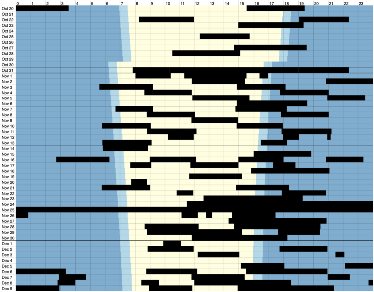
Volodymyr Agafonkin and his family live in Kyiv, Ukraine. He visualized when the power went out over the past two months:
As you can see, we spend 4–8 hours in blackout during a typical day. You can notice some stepping patterns in the data — this is our energy workers trying to stabilize the blackouts into some kind of schedule, although it’s often overridden due to emergency shutdowns. More blackouts happen in the evening time because of the increased load on the grid, with everyone getting home after work and cooking dinner. There’s usually no need for blackouts at night because people go to sleep, and the load falls sharply — that’s usually the time for us to charge devices, turn on the washing machine & dishwasher, and occasionally bake something nice in the oven.
Tags: blackout, electricity, Ukraine, Volodymyr Agafonkin
Posted by in blackout, electricity, Self-surveillance, ukraine, Volodymyr Agafonkin
Chris Gilliard, for The Atlantic, describes self-surveillance that people pay for in exchange for small conveniences at the expense of privacy:
The conveniences promised by Amazon’s suite of products may seem divorced from this context: I am here to tell you that they’re not. These “smart” devices all fall under the umbrella of what the digital-studies scholar David Golumbia and I call “luxury surveillance“—that is, surveillance that people pay for and whose tracking, monitoring, and quantification features are understood by the user as benefits. These gadgets are analogous to the surveillance technologies deployed in Detroit and many other cities across the country in that they are best understood as mechanisms of control: They gather data, which are then used to affect behavior. Stripped of their gloss, these devices are similar to the ankle monitors and surveillance apps such as SmartLINK that are forced on people on parole or immigrants awaiting hearings. As the author and activist James Kilgore writes, “The ankle monitor—which for almost two decades was simply an analog device that informed authorities if the wearer was at home—has now grown into a sophisticated surveillance tool via the use of GPS capacity, biometric measurements, cameras, and audio recording.”
Tags: Amazon, Atlantic, Chris Gilliard, privacy
Posted by in Amazon, Atlantic, Chris Gilliard, privacy, Self-surveillance
Felix Krause tracks many metrics of his life, both manually and passively, and put the data in one database. He put up a subset of the data on an updating site that shows where he is, what he’s eaten, how he’s feeling, the time he spent on the computer, and plenty more. After three years, he concluded it was not worth the time:
Overall, having spent a significant amount of time building this project, scaling it up to the size it’s at now, as well as analysing the data, the main conclusion is that it is not worth building your own solution, and investing this much time. When I first started building this project 3 years ago, I expected to learn way more surprising and interesting facts. There were some, and it’s super interesting to look through those graphs, however retrospectively, it did not justify the hundreds of hours I invested in this project.
It’s interesting to see people independently come to this conclusion over the years. With the quantified self stuff, people often expect that culling data about your activities and behaviors will result in rich, unexpected insights. But unless you’re actively trying to answer a question or working towards a milestone, usually you won’t get much out of the collection process.
It’s a similar sentiment around “let the data speak” with visualization. You have to actively look at and translate the data.
But personal data collection as a form of reflection or journaling? That’s a different story.
Tags: Felix Krause, life
Posted by in Felix Krause, life, Self-surveillance
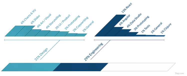
Eli Holder shows how he split his freelance time across various projects and categories. With visualization work, a lot of your time is spent doing non-visualization things:
As expected, at 16 percent, data wrangling and analysis takes a significant chunk of total time. This includes data prep, which I’ve categorized as fairly mindless data engineering or spreadsheet maneuvering (nine percent) or data pulls (three percent). More interesting data work was more fragmented: ~two percent of the time was exploratory analysis (e.g., for storytelling), ~one percent of the time was spent designing metrics (e.g., exploring different calculations that might best tell a given story) and another one percent was creating mock datasets (e.g., to compensate for data security constraints or clients who are slow to provide real data).
I don’t track my time with FlowingData, but if I were to guess, I spend at least half my time on analysis and wrangling. If you consider the many potential visualization projects that I scrapped because nothing panned out in analysis, that analysis/wrangling percentage goes up a lot more.
Sometimes you gotta dig a lot before you find anything worth showing.
Tags: Eli Holder, freelancing, time use, work
Posted by in Eli Holder, freelancing, Self-surveillance, time use, work