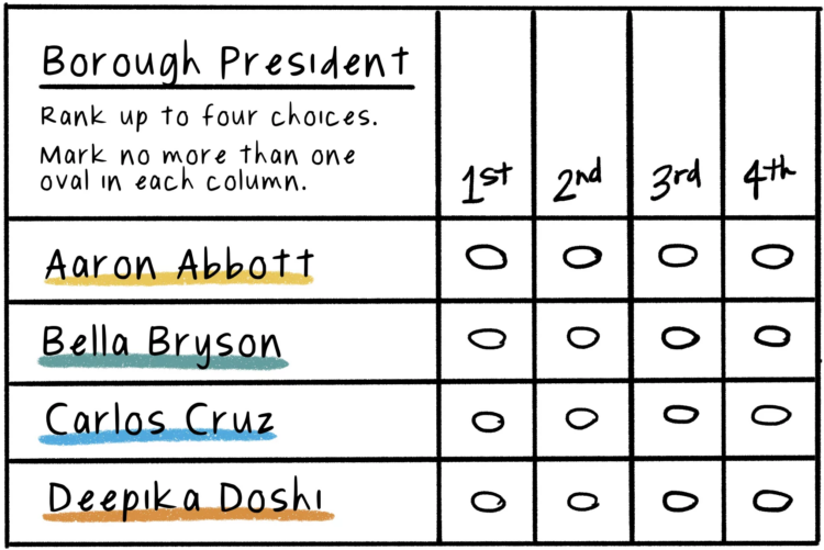
Connie Hanzhang Jin and Kaitlyn Radde, for NPR, used illustrations to explain how ranked-choice voting works. Instead of picking a single candidate, you can rank your choices, and if someone does not win outright, the rankings kick in.
Adam's Blogroll: click through to the author's blog
Connie Hanzhang Jin and Kaitlyn Radde, for NPR, used illustrations to explain how ranked-choice voting works. Instead of picking a single candidate, you can rank your choices, and if someone does not win outright, the rankings kick in.
Posted by in comic, Infographics, NPR, voting
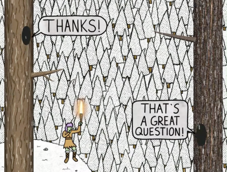
Kelton Sears used a vertical scroll upwards to think about trees and time.
Tags: comic, Kelton Sears, time, trees
Posted by in comic, Infographics, Kelton Sears, time, trees
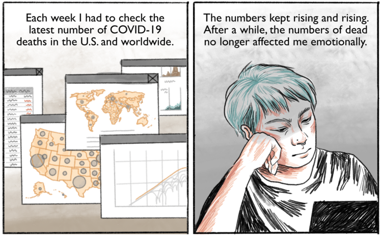
Connie Jin, who works for NPR and updates a Covid-19 dashboard, talks about in comic-form feeling numb to the large numbers and hot to deal. It comes back to the individual.
Tags: comic, Connie Jin, coronavirus, NPR, scale
Posted by in comic, Connie Jin, coronavirus, Infographics, NPR, scale

State population dictates the number of seats in the House of Representatives, so ideally, the decennial Census counts everyone and power is fairly distributed. On the surface, that seems straightforward? For NPR, Connie Jin and Hansi Lo Wang explain with a cat comic.
Because cats.
See also the cat guide on spotting misinformation.
Tags: census, comic, government, NPR
Posted by in census, comic, government, Infographics, NPR

There’s a lot of misinformation passing through the internets right now. A lot. Connie Jin, for NPR, made a comic that explains how to spot it.
I suspect FD readers are better than average at staying skeptical, but maybe pass this along to the family members who aren’t so good and picking out what is real and not.
Tags: comic, Connie Jin, coronavirus, misinformation, NPR
Posted by in comic, Connie Jin, coronavirus, Infographics, misinformation, NPR
Posted by in comic, coronavirus, curve, Data Art
This is perfect. Willikin Wolf made characters out of two dots moving along their paths of productivity and wages.
Something’s wrong pic.twitter.com/tMhNPk85pH
— Willikin Wolf (@WillikinWolf) September 23, 2019
More data+comics, please.
Tags: comic, Willikin Wolf
Posted by in comic, Infographics, Willikin Wolf

Matt Hong used a stacked bar chart over time as the frame for a data comic about American time use. Each row represents a 2-hour window during the day, and each stack represents the percentage of Americans doing an activity: sleep, work, free, and other. The activity with the highest percentage gets a highlight.
As a fan of time use data, this is totally my jam. Also, the data comic space is underutilized.
Posted by in comic, Infographics, time use

Gerrymandering doesn’t sound like an especially sexy topic, but it’s an important one to pay attention to. District lines are drawn in roundabout ways sometimes to favor a party. This used to be a manual process, but math and computing has made it much easier to sway these days. Olivia Walch explains how math can be used to swing line drawing to a more equal process.
See also the gerrymandering game for another point of view.
Tags: comic, gerrymandering
Posted by in comic, gerrymandering, Infographics
