
Ian Leahy and Yaryna Serkez for NYT Opinion look at income and tree canopy in major cities. Higher median income neighborhoods correlate with cleaner and cooler air.
Tags: income, New York Times, trees
Adam's Blogroll: click through to the author's blog
Ian Leahy and Yaryna Serkez for NYT Opinion look at income and tree canopy in major cities. Higher median income neighborhoods correlate with cleaner and cooler air.
Tags: income, New York Times, trees
Posted by in income, maps, New York Times, trees
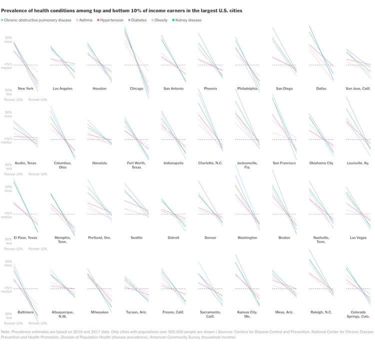
A large proportion of those who died from Covid-19 had pre-existing medical conditions. The percentage of those who have pre-existing medical conditions changes a lot by income group. Based on estimates from the Centers for Disease Control and Prevention, we can see by how much. For New York Times Opinion, Yaryna Serkez charted the difference for the largest cities in the United States.
Tags: coronavirus, health, income, New York Times, Yaryna Serkez
Posted by in coronavirus, Health, income, New York Times, Statistical Visualization, Yaryna Serkez

For Reuters, Chris Canipe looks at social distancing from the perspective of household income:
Anonymized smartphone data in the United States shows some interesting trends. People in larger cities and urban corridors were more likely to change their travel habits, especially in early March. By the end of the month, most U.S. residents were traveling dramatically less than they did in February, but social and demographic differences were strong predictors of how much that changed.
The above shows median change in distance traveled against median household income by county. Note the downwards trend showing counties with lower median incomes with less change in travel.
For many, it’s not possible to work from home or it isn’t safe to stay at home. Don’t be too quick to judge.
An aside: There are bigger things to concentrate on right now, but after this is all done, I feel like we need to think more about who has access to our location via cellphone. Clearly the data has its uses, but that’s not always going to be the case.
Tags: Chris Canipe, coronavirus, income, Reuters, social distancing
Posted by in Chris Canipe, coronavirus, income, Reuters, social distancing, Statistical Visualization

In a compare-your-preconceptions-against-reality quiz, The Upshot asks, “Are you rich?” Enter your nearest metro area, income, and what you consider to be rich. See where you actually land.

Marta Murray-Close and Misty L. Heggeness for the Census Bureau compared income responses from the Current Population Survey against income tax reports. The former can be fudged, whereas the latter is accurate by law. The researchers found a statistical difference that suggests when a wife makes more than a husband, they report a lesser gap in the survey.
This paper compares the earnings reported for husbands and wives in the Current Population Survey with their “true” earnings from administrative income-tax records. Estimates from OLS regressions show that survey respondents react to violations of the norm that husbands earn more than their wives by inflating their reports of husbands’ earnings and deflating their reports of wives’ earnings. On average, the gap between a husband’s survey and administrative earnings is 2.9 percentage points higher if his wife earns more than he does, and the gap between a wife’s survey and administrative earnings in 1.5 percentage points lower if she earns more than her husband does. These findings suggest that gendered social norms can influence survey reports of seemingly objective outcomes and that their impact may be heterogeneous not just between genders but also within gender.
The gap shift didn’t change much, regardless if the wife reported or the husband did. However, it’s interesting that the shift tended towards a boost for the husband’s income when the wife reported and a bump down for the wife’s income when the husband reported.
Posted by in census, income, statistics

Building on their previous visualization work on black boys dropping income levels in adulthood, The Upshot adds the option to change demographic groups. See income mobility for different races, genders, and income starting points.
Tags: demographics, income, Upshot
Posted by in demographics, income, Statistical Visualization, Upshot

Research by Raj Chetty, Nathaniel Hendren, Maggie Jones, and Sonya Porter from the Equality of Opportunity Project suggests that black boys who grow up in rich families are still much more likely to fall into lower income levels than white boys who grow up in equally rich families. The shift from low income to higher levels also appears to be a greater challenge, which makes closing the gap that much harder.
Emily Badger, Claire Cain Miller, Adam Pearce, and Kevin Quealy for The Upshot cover the data extensively with a series of charts, driven visually with a particle-based Sankey diagram (above). The individual points provide a vehicle to show variation over aggregates.
You can grab the aggregated data from the Equality of Opportunity Project. Here’s the research paper in full (pdf) if you’re interested. And if you’re interested in the Sankey implementation.
Posted by in income, race, Statistical Visualization, Upshot

Buying a house is often confusing and complex, compounded by a dollar sign followed by too many commas and zeros. So John Nelson broke it down to something more simple. How many annual salaries would it take to buy a house? He applied it to his own family situation and then expanded it to the country on a county level.
Of course that’s not how mortgages actually work. It’s much worse than that. But this was the concrete visual of the trade required to land a house. I felt the Nelson family had no future there, if our plans in any way involved home ownership.
How many working years will it take you?
Tags: income, John Nelson, mortgage
Posted by in income, John Nelson, maps, mortgage

A hundred bucks in one state doesn’t always get you the same thing in another. Using calculations by the Bureau of Economic Analysis, here’s a state map from The New York Times that shows the relative purchasing power in each state.
To better understand, imagine a store offering a range of goods and services, each for sale at the national-average price for that particular item. Now, imagine a shopping cart filled with $100 worth of items from that store.
In Hawaii, $100 buys about 85 percent of the goods in the cart thanks to the high prices there. In other words, $100 in Hawaii feels more like $85.60, compared to the national average.
In Mississippi, the opposite is true. With $100, you would be able to buy the cart’s contents and more: the equivalent of $115.30 of goods and services from the national-average store.
You can grab the data over at the BEA site.
Tags: income, New York Times
Posted by in income, maps, New York Times

We know that income increased by a lot in 2015, but for who? If it’s just the rich getting richer, then the rise doesn’t mean much for a lot of people, but as Quoctrung Bui for the Upshot points out, this was not the case.
Real median incomes rose 5.2 percent in 2015 — phenomenal growth by economic standards. And 3.5 million people moved out of poverty. But more important, 2015 was encouraging to economists because of where income growth was concentrated: the poor and middle class.
I’m not 100% sure what to call this chart type, but the going term seems to be barcode chart. Each vertical line represents a year, and each row represents an income bracket. Mouse over a bar and you see the change in income for all brackets during the corresponding year.
Posted by in income, Infographics, Upshot