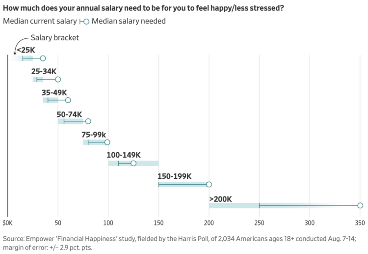
For the Wall Street Journal, Joe Pinsker reports on income and happiness, or more specifically, on the raises people said they needed to be happy. The more people have the more they need.
Tags: happiness, income, Wall Street Journal
Adam's Blogroll: click through to the author's blog
For the Wall Street Journal, Joe Pinsker reports on income and happiness, or more specifically, on the raises people said they needed to be happy. The more people have the more they need.
Tags: happiness, income, Wall Street Journal
Posted by in happiness, income, Statistical Visualization, Wall Street Journal
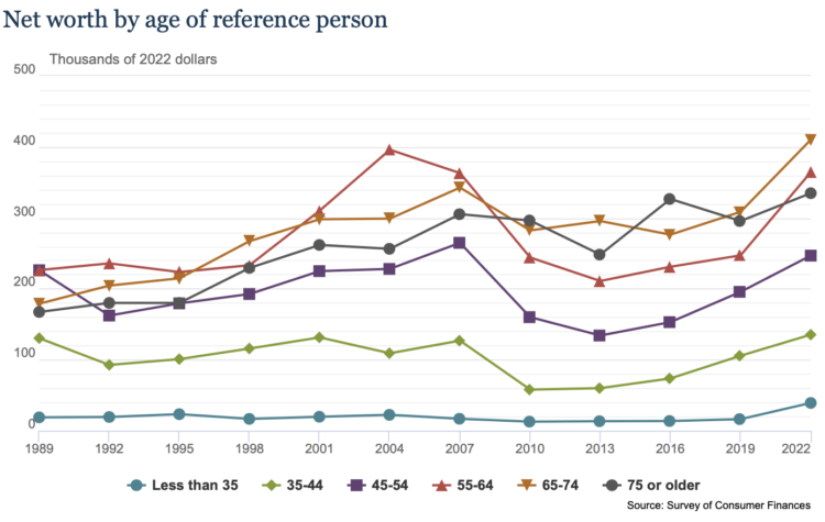
Data for the 2022 Survey of Consumer Finances, from the Federal Reserve Board, was made available recently. It comes out every three years, so you can see how income and savings have changed over time, broken down by demographics.
For example, the above shows that net worth increased, across age groups, since the last release in 2019. The chart is from the SCF’s “chartbook,” which isn’t the most elegant thing in the world, but it works.
Tags: Federal Reserve, income
Posted by in Data Sources, Federal Reserve, income
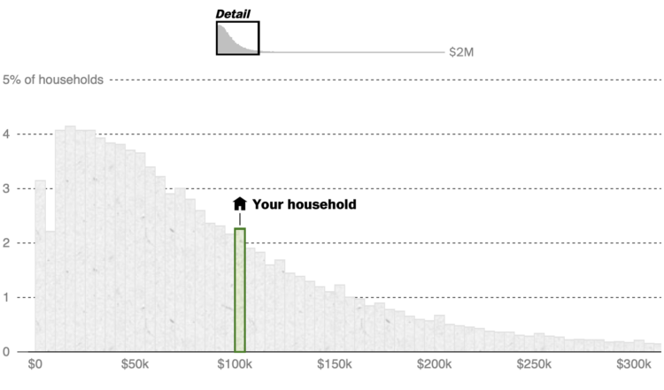
What counts as middle class depends on who and where you’re asking. Even if two households, say a single-person household in Montana and a five-person in California, earn the same income, the latter probably has more expenses than the former. The Washington Post broke it down with various comparisons. Enter a ZIP Code to see where you are.
Tags: income, middle class, Washington Post
Posted by in income, middle class, Statistical Visualization, Washington Post
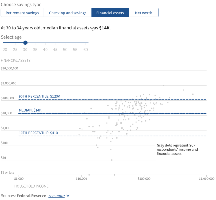
Saving for retirement is a slow process with an end goal that can seem far away, especially if you’re young. So we put it off until later. Then time sneaks up on us, for many it seems, and we’re stuck having to work longer and rely heavily on Social Security. Over at USAFacts, we looked at how much Americans save and show how your savings compare.
Tags: income, retirement, USAFacts
Posted by in income, retirement, Statistical Visualization, USAFacts
Reddit user nerdydancing tracked her earnings on each shift for four years. If any dataset promised stories behind each data point, it is probably this one.
Posted by in income, Self-surveillance, stripper
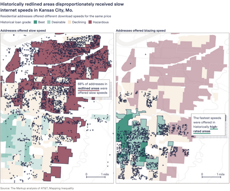
When you pay for internet, it seems like a reasonable expectation that if you pay the same monthly rate as someone a few blocks from you, you get a similar speed. This is commonly not always the case. Leon Yin and Aaron Sankin, for The Markup, with the analysis:
The Markup gathered and analyzed more than 800,000 internet service offers from AT&T, Verizon, Earthlink, and CenturyLink in 38 cities across America and found that all four routinely offered fast base speeds at or above 200 Mbps in some neighborhoods for the same price as connections below 25 Mbps in others.
The neighborhoods offered the worst deals had lower median incomes in nine out of 10 cities in the analysis. In two-thirds of the cities where The Markup had enough data to compare, the providers gave the worst offers to the least-White neighborhoods.
When you compare by Mbps per dollar, you get prices hundreds of times more expensive for crawling internet.
Tags: income, Internet, The Markup
Posted by in income, Internet, maps, The Markup
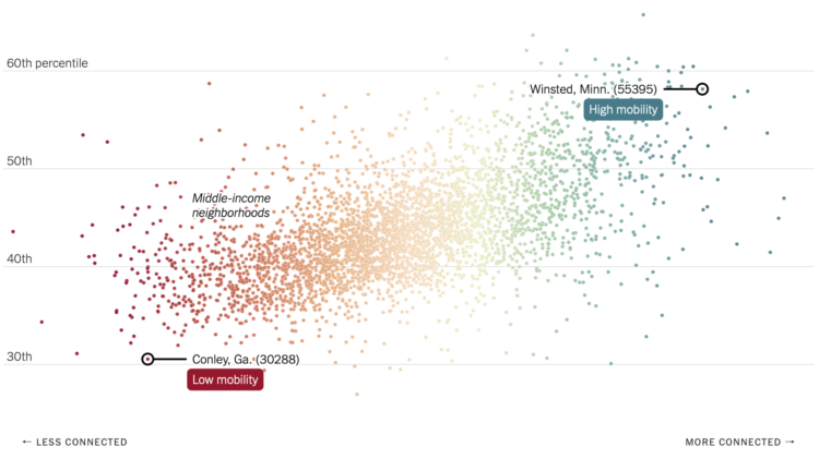
Recently published in Nature, research by Chetty, R., Jackson, M.O., Kuchler, T. et al. suggests that economic connectedness, or friendships between rich and poor, could improve economic mobility. The researchers used Facebook connection data from 70.3 million users, along with demographic and income data. NYT’s The Upshot explains the relationships with a collection of maps and charts.
You can find an anonymized, aggregated version of the data through the Social Capital Atlas. Also, I am very much into this socially-focused use of social media data.
Tags: economics, facebook, income, poverty, relationships
Posted by in economics, Facebook, income, poverty, relationships, Statistical Visualization
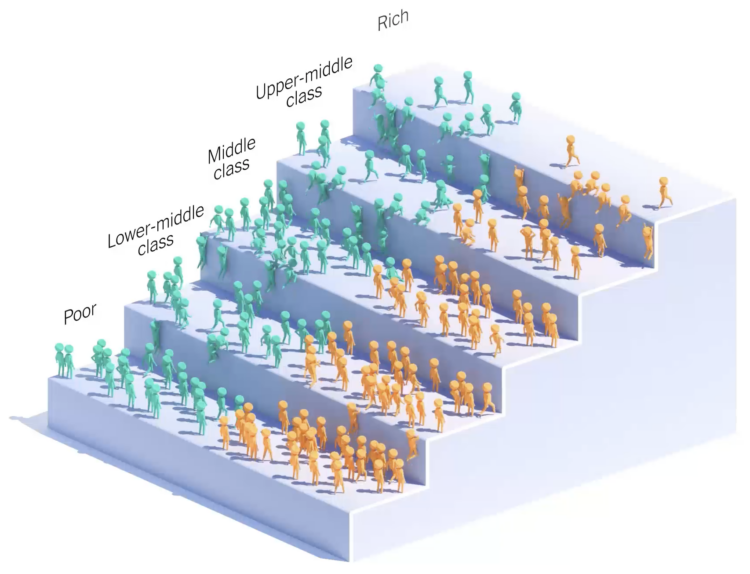
You’ve probably seen the moving bubbles that show how something changes over time. NYT Opinion lowered the abstraction level and showed little people climb the steps of income. The graphic is based on research by Ran Abramitzky and Leah Boustan:
Using the data set, Mr. Abramitzky and Ms. Boustan were able to compare the income trajectories of immigrants’ children with those of people whose parents were born in the United States. The economists found that on average, the children of immigrants were exceptionally good at moving up the economic ladder.
Abramitzky and Boustan just published a book on the topic.
Tags: immigration, income, New York Times
Posted by in Immigration, income, Infographics, New York Times
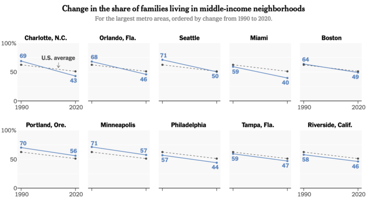
Income distribution continues to stretch on the high end and squish on the low end. For The New York Times, Sophie Kasakove and Robert Gebeloff look closer at what’s happening in the middle:
Nationally, only half of American families living in metropolitan areas can say that their neighborhood income level is within 25 percent of the regional median. A generation ago, 62 percent of families lived in these middle-income neighborhoods.
Tags: income, middle class
Posted by in income, middle class, Statistical Visualization
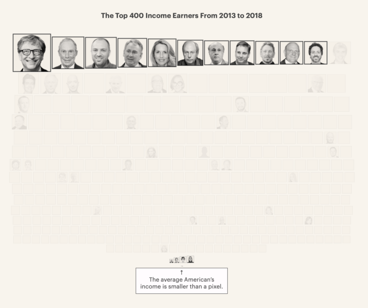
Based on leaked IRS data for the 400 wealthiest Americans, ProPublica provides a comparison of their incomes and the lower taxes they paid between 2013 and 2018. This might be best piece so far from ProPublica’s IRS series in terms of understanding the big picture from their dataset. Also, that “smaller than a pixel” note for the average American is doing some heavy lifting.
Tags: income, ProPublica, scale, wealth
Posted by in income, ProPublica, scale, Statistical Visualization, wealth