What happened to Japantown in San Francisco when residents were forced out by executive order

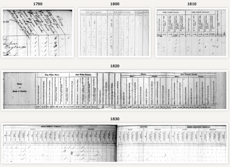
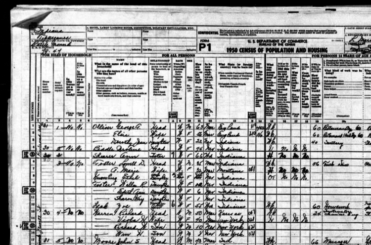
In 1942, Franklin Delano Roosevelt mandated that those of Japanese descent be sent to prison camps. Through the lens of recently released Census records, the San Francisco Chronicle examined the impact of forcing thousands of residents out of their homes.

Over nearly a year, the Chronicle collected and analyzed this data, seeking to understand just how Executive Order 9066 reshaped Japantown. For the first time, we can count the number of Japanese American residents in the neighborhood in 1940 and 1950 — an unequivocal measure of the order’s disastrous effect on the community.

Tags: , , ,

Evolution of race categories in U.S. Census forms

For The New York Times, K.K. Rebecca Lai and Jennifer Medina show the changing checkboxes over the past couple centuries:

Over the centuries, the census has evolved from one that specified broad categories — primarily “free white” people and “slaves” — to one that attempts to encapsulate the country’s increasingly complex demographics. The latest adaptation proposed by the Biden administration in January seeks to allow even more race and ethnicity options for people to describe themselves than the 2020 census did.

What we measure and how we measure is a reflection of what we’ve cared about.

Tags: , ,

Football field to show population change in the UK

The Office for National Statistics for the UK published an interactive to show how population has changed:

The population of England and Wales has increased by more than 3.5 million in the 10 years leading up to Census 2021. Using the first results from this census, we look at which places have seen the biggest increases and decreases, which areas had the largest growth in different age groups, and how your chosen local authority area compares with others.

You choose a region and go from there. The best part though is the football (a.k.a. soccer) field used to visualize population density, which communicates the numbers on a relatable scale.

Tags: , ,

1950 Census released by U.S. National Archives

For privacy reasons, there’s a 72-year restriction on individual Census records, which include names and addresses. It’s 72 years today since the release of the 1950 Census. The scanned paper records are available for browsing and downloading.

Tags: , ,

Census Mapper, a tool to visualize population and racial shifts

Pitch Interactive and the Census 2020 Data Co-op, supported by the Google News Initiative, made a tool that lets you easily map population shifts since 2010. It’s called Census Mapper.

Built with journalists in mind, you can zoom in to the tract level and select any set of racial groups. The map updates. Once you’ve found what you’re looking for, you can embed the tool on a website. You can only embed the entire tool for now, as opposed to just the map of a specific geographic area and level, but it looks promising.

Tags: , , , ,

Where Americans Live

Everyone gets a dot. You get a dot. And you get a dot. And you.

Read More

How the demographics of your neighborhood changed

The San Francisco Chronicle compares demographics in your neighborhood in 2020 against 2010. It’s a straightforward app that lets you enter an address (not just in California) and it shows you the changes at several geographic levels.

I like how snappy it is when you enter an address.

Tags: , ,

Multiracial people counted in the census

Using unit charts, NPR shows the number of people who identify with each race or ethnicity:

[A] different kind of breakdown can show how racial groups are becoming more heterogeneous. This graphic shows the number of people who said they identified with each race, regardless of how many races they chose. For example, if a person said they identified as Black and Asian, they would appear in both racial categories.

Tags: , ,

Race and ethnicity map of dots

CNN goes with the dot density map for their first pass on the 2020 decennial. Each dot represents a certain number of people depending on your zoom level. Color represents race or ethnicity.

Does CNN have a limited color palette that they’re allowed to use? I would’ve gone for more contrast between the light blue for white and darker-but-still-light blue for American Indian/Alaskan Native.

See also: Dustin Cable’s racial dot map from 2013 and Erica Fischer’s dot maps of the same flavor from 2010.

Tags: , , ,

Shift in white population vs. people of color

The New York Times go with the angled arrows to show the shifts in racial population. The red-orange arrows show an increase in the share of white population, and the teal arrows show an increase in the share of people of color. Longer arrows mean a greater percentage point change.

Whereas The Washington Post focused more on the changes for each demographic individually, NYT focused more on how two broad groups compared.

Tags: , ,