What happened to Japantown in San Francisco when residents were forced out by executive order

In 1942, Franklin Delano Roosevelt mandated that those of Japanese descent be sent to prison camps. Through the lens of recently released Census records, the San Francisco Chronicle examined the impact of forcing thousands of residents out of their homes.

Over nearly a year, the Chronicle collected and analyzed this data, seeking to understand just how Executive Order 9066 reshaped Japantown. For the first time, we can count the number of Japanese American residents in the neighborhood in 1940 and 1950 — an unequivocal measure of the order’s disastrous effect on the community.

Tags: , , ,

Where people are moving in the U.S.

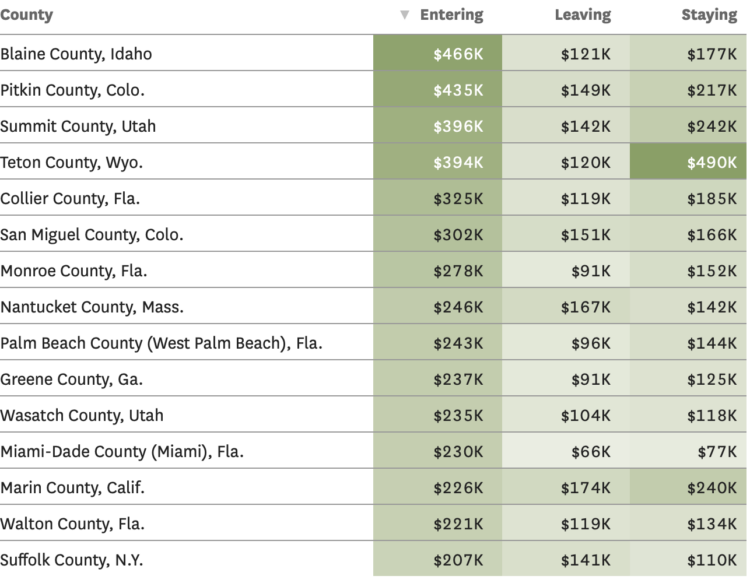
Based on migration data recently released by the IRS, Nami Sumida for the San Francisco Chronicle mapped where people moved to and away from. Enter your county to see what’s happening in your area.

In addition to the maps, there are tables for average income of those moving to and from counties. I wonder what the scatterplot would look like for leaving versus staying incomes.

Also, the IRS migration dataset always makes me think of Jon Bruner’s now defunct map from 2011.

Tags: ,

UC admission rates for California public and private high schools

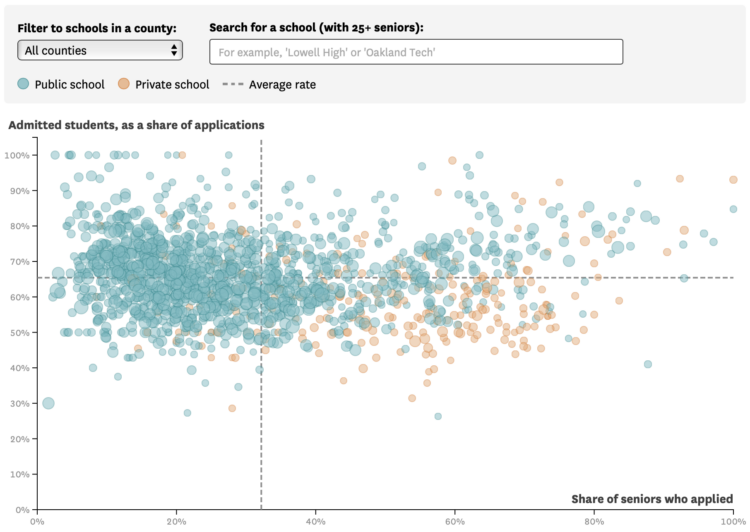
For the San Francisco Chronicle, Nami Sumida shows admission rates at University of California campuses, categorized by public and private high schools:

Admissions for UCLA and Berkeley, the most competitive of the nine undergraduate UCs, follow a similar trend. Private school seniors were 20 percentage points more likely to apply to the two campuses than their peers at public schools. But unlike systemwide admissions, UCLA and Berkeley admitted public and private school students at about equal rates.

You can download the full UC dataset, which dates back to the 1994 freshman college class. With time, and several categories, it seems like a fun dataset to poke at.

Tags: , ,

David Rumsey Map Center, cataloging historical works

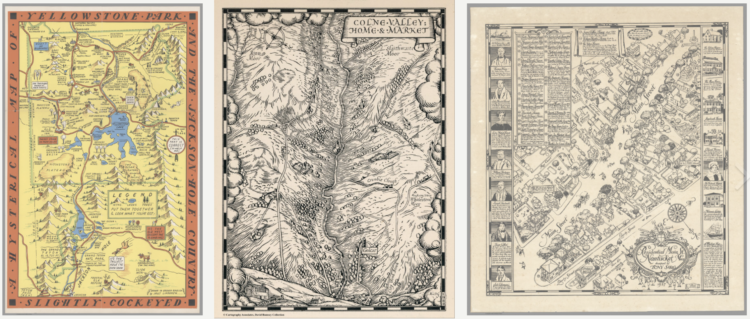
The David Rumsey Map Center at Stanford houses hundreds of thousands of maps dating back to the 1500s. Andres Picon for San Francisco Chronicle wrote about the collection:

At the heart of that endeavor is the digitization of Rumsey’s vast physical collection, a project he began in the late 1990s when he launched davidrumsey.com, a constantly growing aggregation of about 112,000 digitized historical maps from his personal inventory. Rumsey, 77, is in the process of donating his entire map collection — more than 200,000 physical maps plus the digital ones — to Stanford so that they can be cataloged for the enjoyment of generations to come.

“It’s not only a database; it allows people to get lost inside it, no pun intended,” he said. “If you make it really usable and accessible the way ours is, it just becomes something different.”

For preservation, I wish we saw more of this and less blockchain. Hundreds of years from now, how much visualization work is still viewable?

You can view a large portion of the Rumsey collection here. You can also browse the data visualization tag to see some of the earliest made charts.

Tags: , ,

How the demographics of your neighborhood changed

The San Francisco Chronicle compares demographics in your neighborhood in 2020 against 2010. It’s a straightforward app that lets you enter an address (not just in California) and it shows you the changes at several geographic levels.

I like how snappy it is when you enter an address.

Tags: , ,

Most common professional marriages

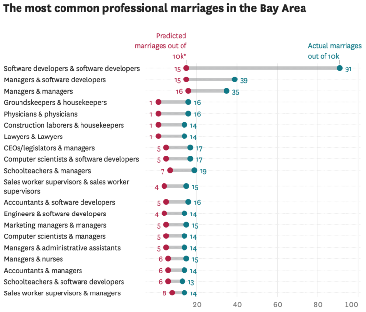
Susie Neilson for the San Francisco Chronicle compared the marriage of professions in San Francisco against the national average. As you might expect, there were a lot of programmers:

Perhaps unsurprisingly, the most common union between two professionals here is between a computer programmer and … another computer programmer. Our estimates show that an estimated 1% of all marriages in the region are between two software developers — specifically developers of applications and systems software. For the U.S. overall, software developer unions make up less than one-tenth of a percent of all marriages.

Back in 2017, I made similar comparisons nationally. I like this local angle. Also, maybe I should look at the most recent numbers.

Tags: , , ,