
Microchips have gotten tiny. Like smaller than a red blood cell tiny. Financial Times goes Powers-of-Ten to show the scale and process of manufacturing itty-bitty microchips.
Tags: chip, Financial Times, manufacturing, scale
Adam's Blogroll: click through to the author's blog
Microchips have gotten tiny. Like smaller than a red blood cell tiny. Financial Times goes Powers-of-Ten to show the scale and process of manufacturing itty-bitty microchips.
Tags: chip, Financial Times, manufacturing, scale
Posted by in chip, Financial Times, Infographics, manufacturing, scale
Kurzgesagt illustrates the scale of the tiniest of things and the biggest of things by zooming in and out, but unlike videos before, they focus on human scale by comparing everything against it at each step.
You’ve probably seen the Powers of Ten, which demonstrates the scale of things by zooming farther and farther away from the universe and then back in to the microscopic level.
However, once people fall out of view, you lose a sense of magnitude. It’s just this is really big and that is really small. With focus on the individual, the Kurzgesagt rendition keeps the scale close as if you’re standing right next to it instead of traveling to an unreachable place.
Tags: Kurzgesagt, scale
Posted by in Infographics, Kurzgesagt, scale
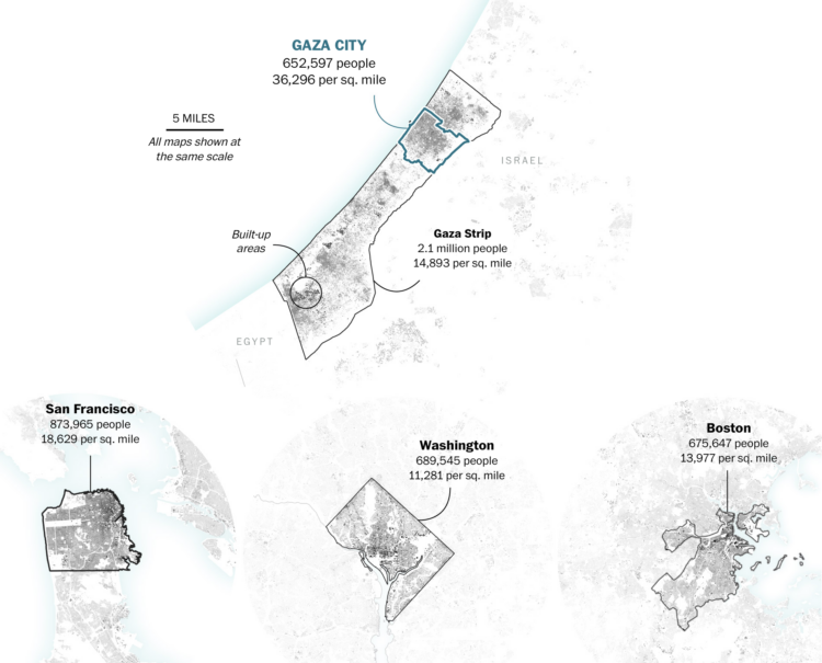
One of the most straightforward ways to help others better understand the scale of an unfamiliar place is to compare it to familiar places. For The Washington Post, Dylan Moriarty and Bonnie Berkowitz show Gaza next to a handful of major U.S. cities.
Tags: Gaza, scale, Washington Post
Posted by in Gaza, maps, scale, Washington Post
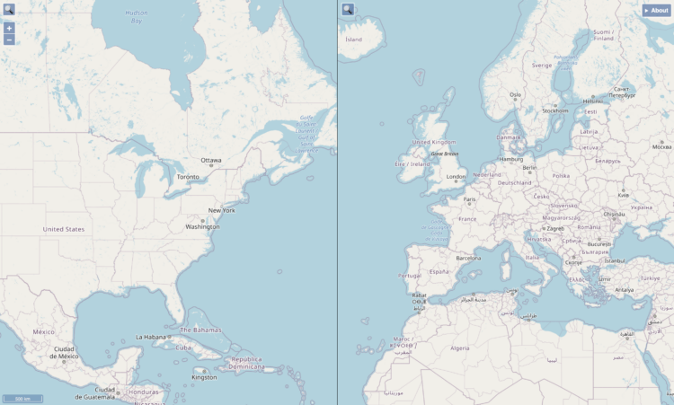
When you compare two areas on a single map, it can be a challenge to compare the actual size of them because of the trade-offs with projecting a three-dimensional space onto a two-dimensional space. Josh Horowitz made a thing that automatically rescales side-by-side maps as you pan and zoom, so that you get a more accurate comparison.
Tags: Josh Horowitz, scale
Posted by in Josh Horowitz, maps, scale
To better understand the scale of time and feed your existential dread, Wylie Overstreet and Alex Gorosh used LED lights spread miles across a desert, proportional to milestones in the history of the universe. The model stretched 4.3 miles to represent 13.8 trillion years.
See also the seven-mile scale model of the Solar System, which is another video in their To Scale series. [via kottke]
Tags: Alex Gorosh, scale, time, Wylie Overstreet
Posted by in Alex Gorosh, Data Art, scale, time, Wylie Overstreet
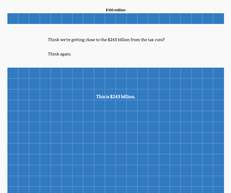
To show the scale of tax cuts and Australia’s budget, ABC News takes the long, vertical unit chart approach, and the squares just keep coming. This is one of those scrollers that works best on mobile.
Posted by in ABC News, budget, Infographics, scale
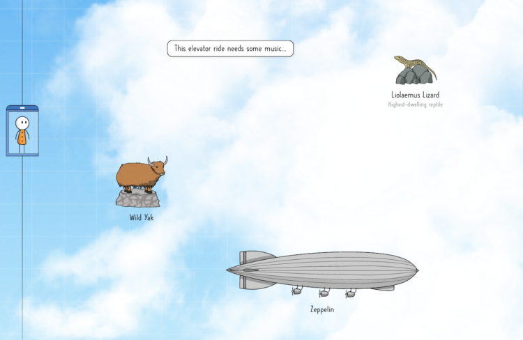
Neal Agarwal is up to his wonderful ridiculousness again. Imagining an elevator that goes up to space, a long scroll through the skies gives you a sense of elevation up until you leave Earth. See how high birds fly, where the wild yak resides, and who was the first person to break the sound barrier in a free fall.
Tags: Neal Agarwal, scale, scrollytelling, space
Posted by in Infographics, Neal Agarwal, scale, scrollytelling, Space
Posted by in animals, Infographics, scale
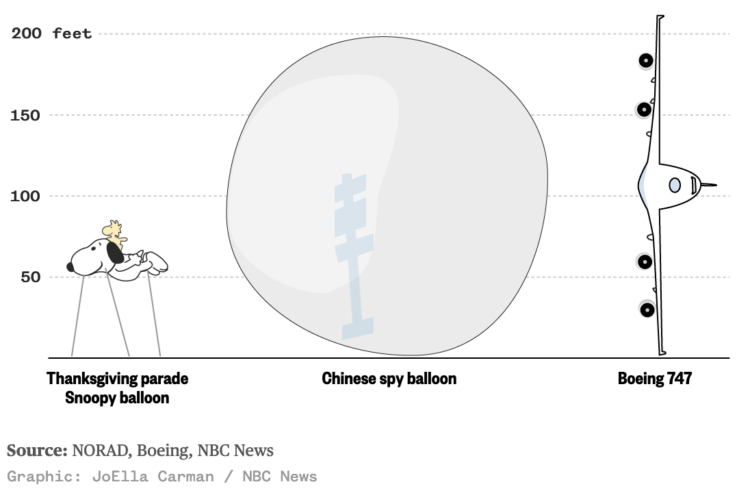
I wasn’t paying much attention to the Chinese balloon that the U.S. shot down — until this graphic by JoElla Carman for NBC News floated by. The balloon was 200 feet tall, which makes the Thanksgiving parade Snoopy balloon look tiny and about equivalent to the wingspan of a Boeing 747.
Posted by in balloon, Infographics, NBC News, scale
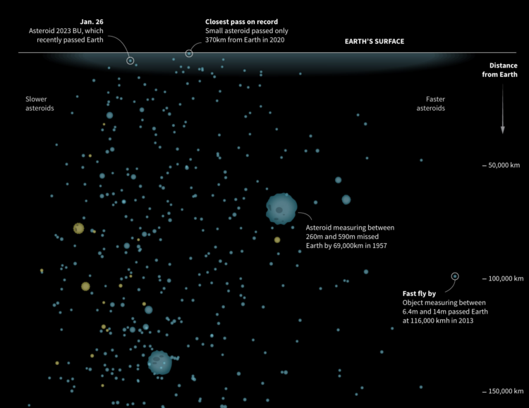
NASA’s Center for Near Earth Object Studies tracks large objects, such as asteroids, that have passed Earth or are headed towards it. Reuters visualized the nearest objects in the database.
The graphic starts at Earth’s surface, and you get farther away as you scroll down. Speed is plotted on the horizontal, symbols are scaled by the object’s minimum diameter, and yellow indicates objects on the way.
Illustrations after the initial graphic do a good job of providing scale for if any of these objects hit us.