Gas prices and confidence

Everywhere you go, gas prices show up on big boards, like a proxy measurement for the times.

When gas prices are really low, something exciting is happening, and in my case when I was a teen, your mom tells you to drive across town to line up for the gas that dropped under a dollar. When gas prices are high, like they are these days, something must be up.

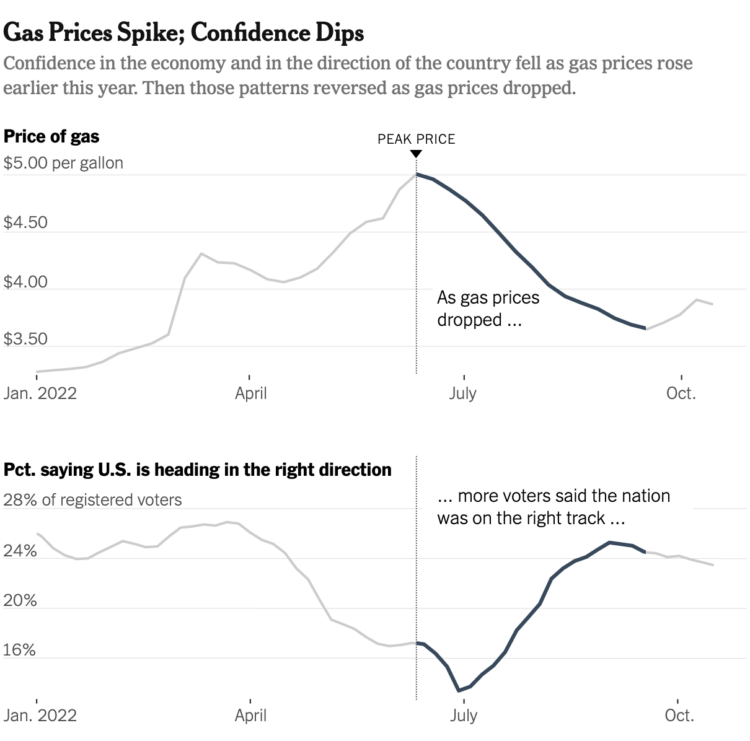
Emily Badger and Eve Washington, for The New York Times, show how that feeling is tied to consumer confidence:

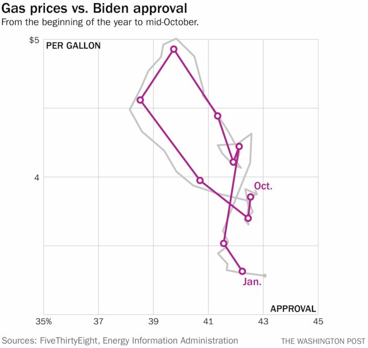
Philip Bump, for The Washington Post, used connected scatterplots to show how gas prices are tied to approval ratings:

Connected scatterplots are kind of a tricky read at first, but approval and prices appear to go up and down at the same time. Look at it like a regular scatterplot at first, and then follow the line for time.

I wonder what this looks like if you go farther back. I’m guessing similar. What else is tied to gas prices? Will electricity prices eventually replace the familiar gas prices? Is it reasonable to tie our hopes and dreams to the price of a gallon? Is sentiment flipped for people who primarily ride bikes to get places? I have so many questions.

Tags: , , , , ,

Estimating the condition of the economy

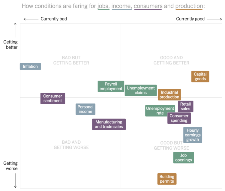
Measuring the condition of the economy is tricky, because there are many parts to the economy. You can’t just say it’s good or bad. So Ben Casselman and Lauren Leatherby, for The New York Times, broke it down with a series of charts to view from different angles.

Tags: ,

Boost economy with immigration

Want to increase the GDP? Easy. Let more immigrants in. Lena Groeger for ProPublica:

In an analysis for ProPublica, Adam Ozimek and Mark Zandi at Moody’s Analytics, an independent economics firm, estimated that for every 1 percent increase in U.S. population made of immigrants, GDP rises 1.15 percent. So a simple way to get to Trump’s 4 percent GDP bump? Take in about 8 million net immigrants per year. To show you what that really looks like, we’ve charted the effect below. You can see for yourself what might happen to the economy if we increased immigration to the highest rates in history or dropped it to zero – and everything in between.

The interactive in the article lets you pose the what-if with various immigration rates. Give it a try.

Tags: ,

Shift Your Point of View to When America Was “Better”

Shift Your Point of View

How good or bad something is depends on what you compare against. Read More

International impact of China’s economic slowdown

Economic slowdown

China's economic slowdown means a major decline in imports from other countries, which leads to significant effects in these areas. The Guardian takes a look. The vertical axis represents lost export income as a percentage of GDP, the size of the outer red circle represents GDP, and the inner white circle represents exports to China. Dollar units are in billions of dollars. Billions.

Tags: , ,

Rising beef prices and cattle theft

Rising brisket price

Eric Benson for FiveThirtyEight delves into cattle theft, which can cost an owner millions of dollars overnight, and the link to rising beef prices.

Most cuts of beef increased in cost since 1995, but brisket, while still not the most expensive cut, has really increased in value in the past couple of years. It peaked in January 2015 at $3.52 per pound wholesale. It was only $2.26 in January 2014. That's kind of big deal considering you're buying a 10-pound piece of meat at the grocery store, versus a couple of pounds of steak.

Tags: , ,

Wealth inequality explained in charts

Wealth inequality

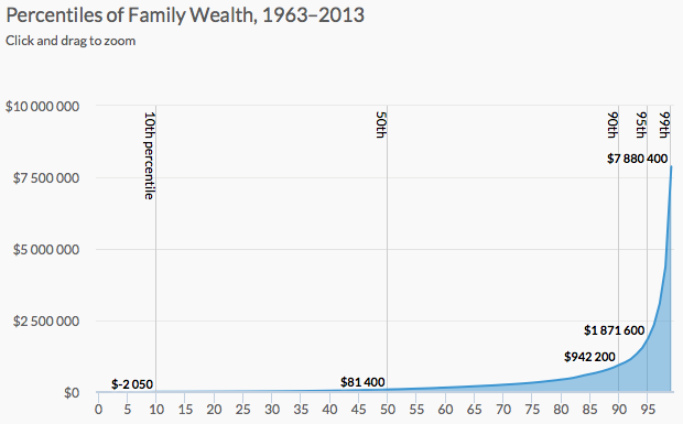
Wealth inequality is a real thing that is complex and a result of various factors. It's difficult to capture everything in one chart, so Urban Institute explained wealth inequality in nine charts instead.

They start with an animated chart that shows growing inequality over the years (basically a rising spike on the right) and then move into demographic breakdowns for age and race. Then they go into more detail for possible explanations for why certain groups lag behind others.

Finishing with a handful of policy recommendations that might shrink wealth inequality, the piece is a nice progression of overview first to more details later.

Tags: , ,

Household incomes rise

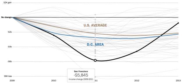
Income difference since 2009

Since the recession, it's taken a while for household incomes to come back to where they were in 2009. In most parts of the country, incomes are still lower, however, it appears they are making their way back to 2009 levels. With the Census Bureau's recent release of data from their American Community Survey, the Washington Post charted the annual difference from 2009 to 2013.

Each line represents a metropolitan area's difference in household income of a current year, compared to that of 2009. So the closer to or higher above the thin black baseline the better.

Tags: , ,

Jobs recovery and loss, by industry

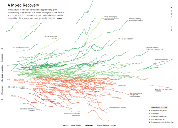
Recession reshapes

Jeremy Ashkenas and Alicia Parlapiano for The Upshot just plopped this interactive sucker on to the web. Each line shows change in job count for an industry. Horizontally, they're organized by average salary, and vertically, they're organized by relative change since the end of the recession. Green represents growth and red represents decline.

My initial reaction was along the lines of what-the-heck, but then you see the axes and get the mouseover actions for details. Scroll down, and you get highlighted subsets. By the end, you've learned something.