FiveThirtyEight layoffs

Disney began more layoffs, and data-centric FiveThirtyEight, which is owned by Disney, was part of the round. Nate Silver, founder and editor-in-chief of the site, also announced he is likely to be leaving soon:

Disney layoffs have substantially impacted FiveThirtyEight. I am sad and disappointed to a degree that’s kind of hard to express right now. We’ve been at Disney almost 10 years. My contract is up soon and I expect that I’ll be leaving at the end of it.

I had been worried about an outcome like this and so have had some great initial conversations about opportunities elsewhere. Don’t hesitate to get in touch. I am so proud of the work of FiveThirtyEight staff. It has never been easy. I’m so sorry to the people impacted by this.

Feels like a shift in data and stories.

Tags: , , ,

Congress still getting older

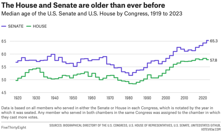
For FiveThirtyEight, Geoffrey Skelley digs into the ongoing trend:

What’s behind these increasingly older Congresses? The country’s aging population as a whole is chiefly responsible, which is most apparent in the disproportionate influence the baby boomer generation has on Capitol Hill. Coupled with longer-running trends that have made it more likely for members of Congress to win reelection and stick around, this has all helped make Congress older than ever before. And the overrepresentation of boomers doesn’t just produce moments like those of the TikTok hearings — it also has real effects on the type of policies passed by the federal legislature.

Tags: , ,

Hypothetical map that shows how access changes if more states ban abortion

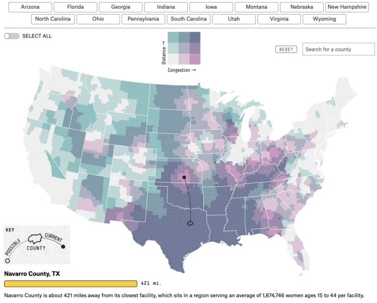
Based on analysis by economics professor Caitlin Myers, FiveThirtyEight provides a hypothetical map that shows how access changes in terms of distance to travel and increase in patients at nearby clinics:

New bans will have outsized impacts on who can get an abortion, how far they have to drive for it and how long they have to wait for an appointment. A new analysis by Caitlin Myers, an economics professor at Middlebury College who studies abortion, illustrates how abortion access could continue to dwindle this year if key states like Florida and North Carolina pass additional restrictions.

You can select any combination of possible states and the map updates to show the shifts. Roll over any county to see the nearest county that provides access. Useful and informative.

Tags: , ,

Apply your daylight saving preferences to the rest of the country

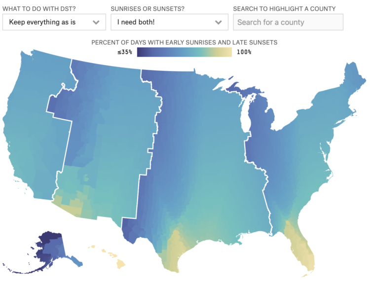
We like to complain about changing time an hour back or forward, and usually it’s in the context of our own geography. Maybe one area gets a lot of later sunsets, but then another gets much less. FiveThirtyEight made a map that lets you put in your preference to see how the rest of the country is affected:

Unfortunately, no solution will make every American happy. Even if you’ve found a combination that satisfies your personal preferences, you may have noticed that those preferences could negatively impact other parts of the country. And advocates for changing the system we currently have — whether for or against DST — feel strongly that their personal preference is the best.

We all know the solution here. Everyone gets to sleep, wake, and work whenever they want. Easy.

Tags: ,

Abortion restrictions in the U.S. mapped

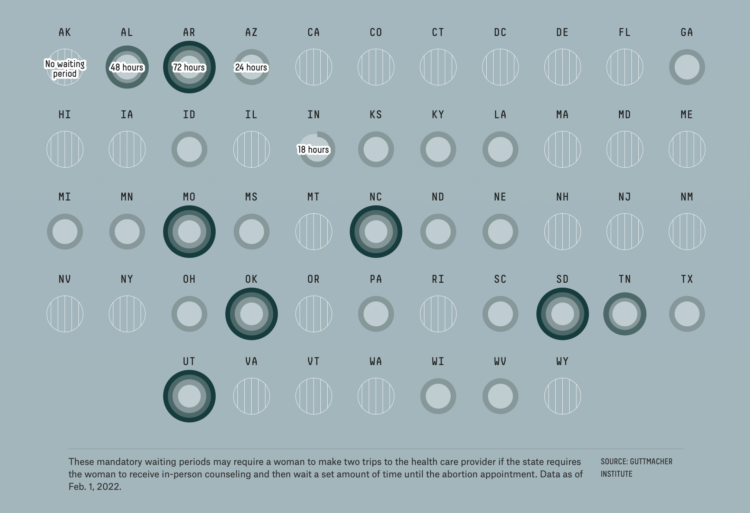
For FiveThirtyEight, Anna Wiederkehr and Amelia Thomson-DeVeaux, with illustrations by Nicole Rifkin, delve into the varying restrictions in each state. Laws based on fetus viability, distance to clinics, waiting periods, and cost must all be factored in with women’s decisions.

Tags: ,

Past redlining still seen in the present

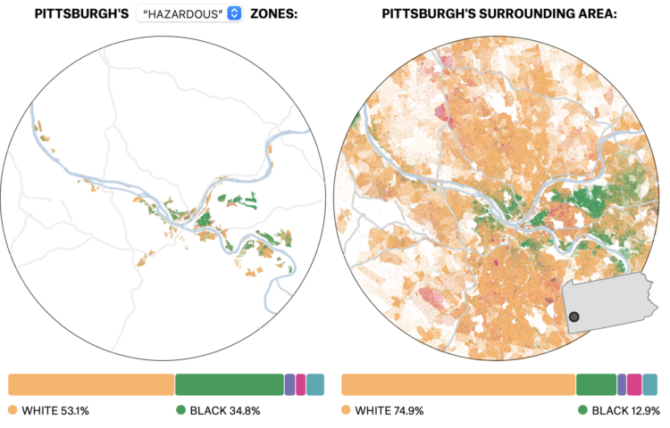
In the 1930s, a group called the Home Owners’ Loan Corporation went to cities classifying neighborhoods based on the “risk” of defaulting on loans. Areas deemed highest risk were marked with red ink on a map, and these areas tended to be non-white. The classification, redlining, was made illegal, but you can still see the effects today, as shown by Ryan Best and Elena Mejía with these interactive maps for FiveThirtyEight.

The maps are based on U.S. Census estimates and data from the University of Richmond’s Mapping Inequality project.

Tags: , ,

Accuracy of groundhog weather prediction

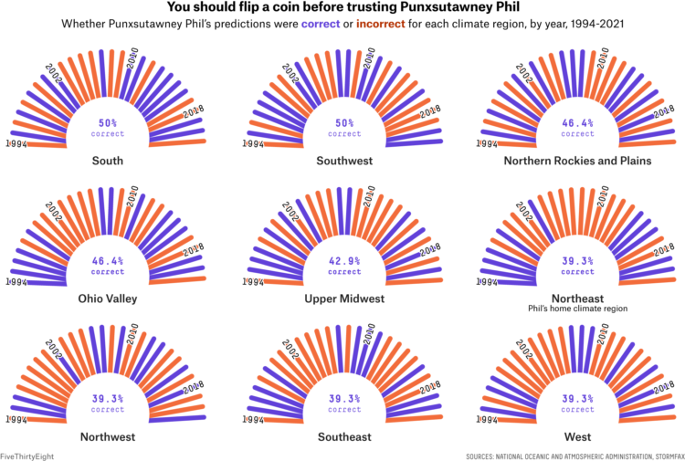
For FiveThirtyEight, Simran Parwani and Kaleigh Rogers compared Groundhog Day predictions against actual weather data from the National Oceanic and Atmospheric Administration:

After dozens of grueling hours of investigation, FiveThirtyEight can confirm that Punxsutawney Phil is a charlatan. A groundbreaking analysis has revealed the Pennsylvania-based groundhog who makes annual predictions about the arrival of spring is not nearly as reliable a prognosticator as those close to him claim. Phil, arguably the world’s most well-known rodent weather predictor, has been forecasting when spring will arrive annually on Groundhog Day since 1887. But when comparing his predictions to historical weather data, he’s only right about a third of the time.

I am outraged.

Tags: , ,

World Chess Championship in charts

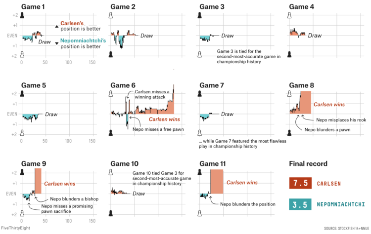
Magnus Carlsen continued to assert his dominance at the World Chess Championship. FiveThirtyEight broke down Carlsen’s dominance in the final match with Ian Nepomniachtchi with a series of difference charts. In the quick view, you see it was either a draw or a Carlsen win over 11 games.

Tags: , ,

Why small gatherings can be dangerous too

A small gathering of 10 people or fewer can seem like a low-risk activity, and at the individual level, it’s lower risk than going to a big birthday party. But when a lot of people everywhere are gathering, small or large, the collective risk goes up. For FiveThirtyEight, Maggie Koerth and Elena Mejía illustrate the reasoning.

The collective part is where many seem to get tripped up. “Flattening the curve” only works when everyone works together. Lower your risk, and you lower the collective risk. You’re helping others. You’re helping those you care about.

Then, collectively, we all get out of this mess.

Tags: , , , ,

Testing voting scenarios while we wait for the counts

As we wait for the votes to be counted in the remaining states, here are a couple of interactives to test the possibilities. The New York Times updated their graphic on all possible paths to the White House (the original from 2012).

FiveThirtyEight also has their thing:

Or, there’s this decision tree by Kerry Rodden:

Or, you could carry on with your day as if nothing is happening and not concern yourself with things that are outside of your control.

Nope. Not gonna do that.

Tags: , , ,