Carbon footprint in the city versus the suburbs

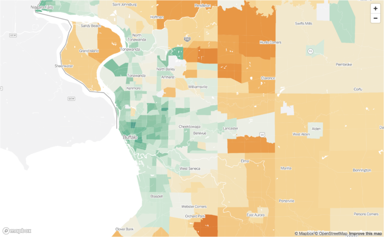
Bringing it down the Census tract level, Nadja Popovich, Mira Rojanasakul and Brad Plumer, for The New York Times, mapped emission estimates so you can see the impact of your neighborhood:

A map of emissions linked to the way people consume goods and services offers a different way to view what’s driving global warming. Usually, greenhouse gases are measured at the source: power plants burning natural gas or coal, cows belching methane or cars and trucks burning gasoline. But a consumption-based analysis assigns those emissions to the households that are ultimately responsible for them: the people who use electricity, drive cars, eat food and buy goods.

The estimates are based on research from the University of California, Berkeley.

We often think of big cities as dirtier and more pollution-heavy. By absolute counts, because there are more people, this is a correct statement, but from a per household point of view, the contrast is flipped.

Tags: , ,

Emissions from fires in the Arctic

Reuters reported on the fires in the Arctic and the relatively high levels of carbon emissions they release in the atmosphere. The map above shows carbon emissions from wildfire in 2021, and the chart on the right shows totals by latitude, which emphasizes the geography in the north.

The illustrations, which I appreciate and have become more of a norm in Reuters pieces, round out the maps and charts with more context:

Tags: , , ,

Imagining carbon food labels

By purchasing certain foods, we make decisions about the carbon footprint from the production of those foods. Most of us don’t have a good idea of how much difference our choices can make though. Financial Times reports on policymakers working to make the footprint more obvious through food labeling.

Based on estimates from CarbonCloud, a scale on the FT piece weighs the carbon footprint per kilogram of various foods. The scale metaphor threw me off at first, because the item with a lower carbon footprint appeared visually higher. Of course with a scale, something heavier pushes down more, but my brain was thinking in terms of x-y-coordinates. Maybe that’s just me staring at too many charts.

Tags: , ,

Maps of land required to get to net-zero emissions

Princeton University’s Net-Zero America project analyzes and models the infrastructure required to get to net-zero carbon emissions nationally. Dave Merrill for Bloomberg highlighted the group’s estimates for land usage to build things like wind and solar farms, which, as you might imagine, will require millions of acres.

Tags: , , , ,

Seeing CO2 is a playable data visualization

Seeing CO2, by design studio Extraordinary Facility, is a playable data visualization that imagines if carbon dioxide were visible. You drive a car around collecting bits of information about carbon dioxide in our environment, and along the way, you’ll see volumes of CO2 compared against well-known structures. Pretty great.

Tags: , , , ,

Electricity sources by state

With Joe Biden calling for 100% clean electricity, John Muyskens and Juliet Eilperin for The Washington Post looked at where states are at now in terms of electricity generation.

The variable width bar chart above uses a column for each state. Clean electricity stacks on the top and fossil fuels stack on the bottom, each representing a percentage of total generation. Column width represents total electricity for each state.

It reminds me of the spending graphic by Interactive Things in 2010. I think variable width is about to be a thing again.

Tags: , ,

Following the carbon dioxide

This animated visualization from NASA Goddard Space Flight Center shows a model of carbon dioxide swirl around the planet, “using observations from NASA’s Orbiting Carbon Observatory (OCO-2) satellite.”

Tags: , ,

“False data” forces retraction of Carbon paper co-authored by postdoc who led to PI’s suspension

carboncoverThere’s a new retraction in the journal Carbon.

The case didn’t involve a Carbon copy — say, plagiarism or duplication — but rather an instance of fraud in a Japanese university, part of a larger case we covered last August.

Here’s the retraction notice for the paper, “The role of Fe species in the pyrolysis of Fe phthalocyanine and phenolic resin for preparation of carbon-based cathode catalysts,” which appeared in August 2010:

This article has been retracted at the request of the authors.

This paper is retracted at the request of the authors because it has been discovered that L. Wu included false data in Fig. 7 in this paper. It is noted that a fact-finding commission of Tokyo Institute of Technology has found that the material preparation and characterisation were performed correctly.

The paper has been cited 44 times, according to Thomson Scientific’s Web of Knowledge.

Wu is Wu Libin, a former postdoc at Tokyo Tech whose falsifications have already led to a retraction in Applied Catalysis A: General. As we reported last year, the professor whose lab Libin worked in, Seizo Miyata,

faced three months without salary, retired from his research position and may have to return a portion of a grant worth $1 million US as punishment…

The university also suspended Libin’s direct supervisor, Masa-aki Kakimoto, for three months without pay. Kakimoto reported to Miyata.