
Microchips have gotten tiny. Like smaller than a red blood cell tiny. Financial Times goes Powers-of-Ten to show the scale and process of manufacturing itty-bitty microchips.
Tags: chip, Financial Times, manufacturing, scale
Adam's Blogroll: click through to the author's blog
Microchips have gotten tiny. Like smaller than a red blood cell tiny. Financial Times goes Powers-of-Ten to show the scale and process of manufacturing itty-bitty microchips.
Tags: chip, Financial Times, manufacturing, scale
Posted by in chip, Financial Times, Infographics, manufacturing, scale
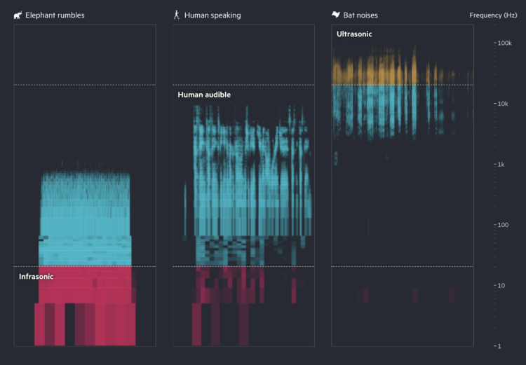
Financial Times highlights how researchers are using AI to try to learn what animal sounds mean and to communicate back. Turn on the sound for maximum effect.
Tags: AI, animals, Financial Times, sound
Posted by in AI, animals, Financial Times, sound, Statistical Visualization

Quantum computing promises a higher level of processing power over current computers, but it comes with its own challenges with implementation. When it comes to fruition, it’ll also break current privacy measures like your banking password. Financial Times explains how this works with a fine set of animations and illustrations.
Tags: Financial Times, quantum computing, security
Posted by in Financial Times, Infographics, quantum computing, security
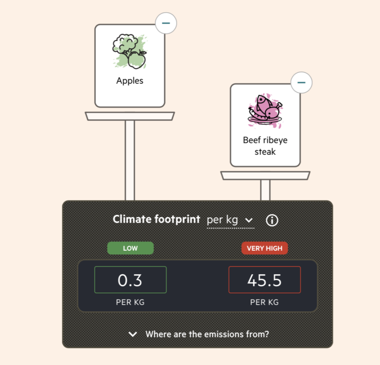
By purchasing certain foods, we make decisions about the carbon footprint from the production of those foods. Most of us don’t have a good idea of how much difference our choices can make though. Financial Times reports on policymakers working to make the footprint more obvious through food labeling.
Based on estimates from CarbonCloud, a scale on the FT piece weighs the carbon footprint per kilogram of various foods. The scale metaphor threw me off at first, because the item with a lower carbon footprint appeared visually higher. Of course with a scale, something heavier pushes down more, but my brain was thinking in terms of x-y-coordinates. Maybe that’s just me staring at too many charts.
Tags: carbon, Financial Times, food
Posted by in carbon, Financial Times, food, Infographics

There are thousands of satellites that orbit Earth, with about half of them launched in the past three years. Financial Times shows why that’s a problem in a scrolling piece through space debris:
In 1978, Nasa astrophysicist Donald J Kessler outlined a theory of what would happen if space traffic continues to grow and collisions occur. The debris created by those collisions would skitter off into the paths of other satellites, creating yet more debris.
Over time, Kessler argued, a chain reaction of cascading collisions could one day make low Earth orbit hard to access and even prevent manned spaceflight from leaving Earth: a phenomenon since labelled the “Kessler syndrome”.
Tags: Financial Times, garbage, space
Posted by in Financial Times, garbage, Infographics, Space
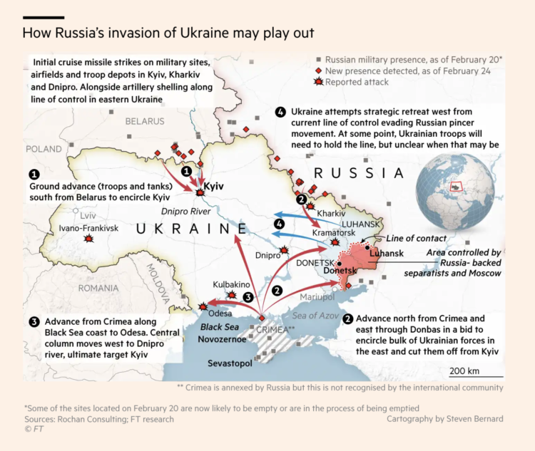
This map by Steven Bernard for Financial Times shows a timeline of Russian military presence. The gray squares represent a presence as of February 20, red diamonds represent a presence four days later, and bang symbols represent reported attacks.
Tags: Financial Times, Russia, Ukraine, war
We know what you did during lockdown is a short fiction film by Financial Times that demonstrates the challenges of using data for good at the sacrifice of privacy and the complexity of individual lives. Worth the watch.
I immediately wanted to unplug every single internet-connected device in the house. But of course I did not.
See also the short film Sight from 2012, which imagines a world where everyone’s reality is augmented with data through digitized contact lenses.
Tags: Financial Times, privacy, short film
Posted by in Data Sharing, Financial Times, privacy, short film

Steven Bernard for Financial Times, in a report by Claire Bushey and Steff Chavez, mapped net inflows (paywalled), based on property searches on home listing site Redfin. This shows a slightly different angle from NYT’s analysis, which showed less change year-over-year.
Tags: Financial Times, housing, migration
Posted by in Financial Times, housing, maps, migration

For the Financial Times, Alan Smith and Steven Bernard traced the history of railroad construction in America and mapped it over time. Literally. Bernard used digitized versions of old maps and traced each new segment by hand. Tedious, but the result is impressive.
Tags: animation, Financial Times, railroad
Posted by in animation, Financial Times, maps, railroad