Areas still controlled by Ukraine

For The New York Times, Josh Holder and Marco Hernandez show the areas still controlled by Ukraine and the areas captured by Russia. But instead of a single map, they split up the regions into multiples and arranged them by time.

Tags: , , ,

Using satellite imagery to assess the damage in Ukraine

The Economist combined two satellite imagery sources, one that estimates fire events and one that estimates building damage, to assess the extent of damage in Ukraine:

Both approaches have weaknesses. NASA’s firms cannot see through cloud cover, a particular problem in winter. sar can pick up damage even through clouds, but is much less sensitive to changes outside of urban areas. But by combining the two datasets, we can form a fuller picture of the war. Our study shows that rather than being limited to a few big offensives and grinding battles, the war has left a brutal mark on large swathes of Ukraine. Fighting has reached 14% of municipalities, and damaged nearly half the built-up area in the hardest-hit cities.

Tags: , , , ,

Trying to isolate Russia

The New York Times shows how the west tried to isolate Russia and how things haven’t gone as expected. A series of packed bubbles, cartograms, and flowcharts provide a visual timeline for each country’s reactions.

Tags: , , ,

One home’s blackouts in Kyiv

Volodymyr Agafonkin and his family live in Kyiv, Ukraine. He visualized when the power went out over the past two months:

As you can see, we spend 4–8 hours in blackout during a typical day. You can notice some stepping patterns in the data — this is our energy workers trying to stabilize the blackouts into some kind of schedule, although it’s often overridden due to emergency shutdowns. More blackouts happen in the evening time because of the increased load on the grid, with everyone getting home after work and cooking dinner. There’s usually no need for blackouts at night because people go to sleep, and the load falls sharply — that’s usually the time for us to charge devices, turn on the washing machine & dishwasher, and occasionally bake something nice in the oven.

Tags: , , ,

Untraced orphans in Ukraine since the war

Sarah Slobin and Joanna Plucinska, for Reuters, report on the challenges of counting and tracking thousands of orphans in Ukraine who were evacuated and relocated when Russia invaded:

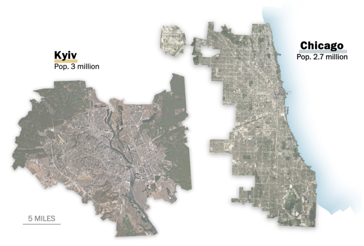
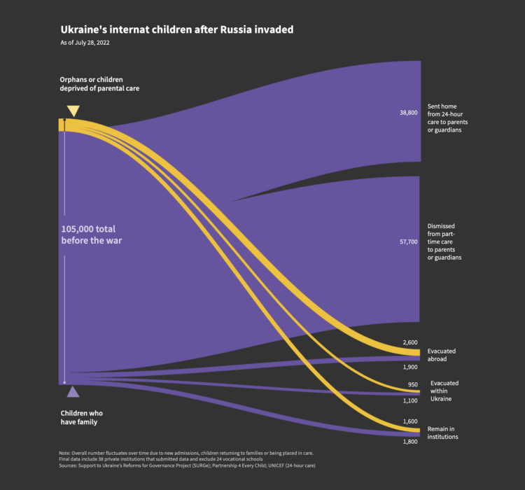
When Russia invaded on Feb. 24, there were more than 105,000 children in Ukraine’s network of more than 700 institutions – known as orphanages or ‘internats’ – either full-time or part-time. That’s just over 1% of the child population – the highest rate of institutionalization in Europe, according to data from the European Union and UNICEF.

Around half the children in Ukraine’s orphanages were disabled, according to UNICEF. But Ukraine’s state record-keeping system, known as UIAS “Children,” was not capable of tracking or tracing children sent home from institutions, according to the Support to Ukraine’s Reforms for Governance project (SURGe), a Canadian government-funded agency contracted by the NSS to help support it.

Tags: , , , ,

Shrinking war mapped

The war in Ukraine continues, but the scale and objects appear to have changed over time. Josh Holder, Marco Hernandez, and Jon Huang for The New York Times mapped the shrinking scope as Russia loses more soldiers and resources.

Tags: , ,

Ukraine’s defense in Kyiv

The New York Times shows how Russia has tried to take over and how Ukraine continues to stop the offensives. The mixed media piece pulls you in to how different strategies have worked and have not, at least the best you can through a screen.

Tags: , , , , ,

Total refugees from Ukraine, compared to other countries

Millions of Ukrainians (over three million as of this writing) have left their homes for other countries in a relatively short period of time. Sara Chodosh, Zach Levitt and Gus Wezerek for NYT Opinion put the total as of March 13 into perspective. Over just an 18-day period, Ukraine refugee counts have surpassed counts during those of other refugee crises over one-year periods, since 1975.

Tags: , , , ,

US spending on Ukraine

For NYT’s The Upshot, Bianca Pallaro and Alicia Parlapiano break down the United States’ $13.6 billion in emergency spending to help Ukraine against Russia.

They start with an overview treemap and then zoom in on each spending category with a new section. A thumbnail for each section keeps you oriented with each static image.

Over the years, the treemap has been NYT’s clear go-to for showing any kind of spending categories. You can see an evolution from interactive tool meant for exploration and the desktop to this most recent piece made to read and work on mobile. It seems like a pretty good indicator for visualization on the web as a whole.

Tags: , , ,

Scale of Ukrainian cities

When you look inside the cities around the world, you will often find familiarity to where you live. For The Washington Post, Bonnie Berkowitz, Dylan Moriarty and Hannah Dormido look for the familiarity in the attacked cities in Ukraine. With side-by-side comparisons to U.S. cities, Ukraine feels less distant.

See also Scale-a-Tron, which lets you compare the scale of anywhere in the world against anywhere else in the world.

Tags: , , ,