Mapping the crops with the most potential in a changing climate

The climate is changing, which means some crops will fair better or worse given new conditions. Stamen, in collaboration with Vision for Adapted Crops and Soils, mapped the potential shifts for a variety of crops.

Be sure to see Stamen’s process post on the design choices behind the visual explorer.

Tags: , , ,

Watercolor Maptiles by Stamen are now part of the Smithsonian’s permanent collection

In 2012, Stamen Design released watercolor map tiles based on OpenStreetMap data. It was amazing to see, especially for a time when most online maps looked about the same. Now these watercolor map tiles are part of Cooper Hewitt, the Smithsonian design museum:

“Interactive digital works by their very nature subvert traditional museum collecting practices,” said Andrea Lipps, associate curator of contemporary design at Cooper Hewitt. “Watercolor Maptiles is itself a dynamic, living web-based map that is placeless; it exists on a browser and its assets are distributed across servers. By creating a duplicate version of the Watercolor Maptiles site and hosting it on Smithsonian Institution servers and domain, Cooper Hewitt has established a new acquisition model for the museum sector.”

Amazing.

Tags: , ,

Compare the scale of any area in the world

Riffing on the Ever Given Ever Ywhere, which lets you place the Ever Given container ship anywhere on a map, Stamen built Scale-a-Tron, which lets you place anywhere on a map, well, anywhere on a map.

Just draw a polygon around an area and then pan to compare the scale of your selected area against anywhere in the world. It’s scale-rific.

Tags: ,

Posted by in maps, scale, Stamen

Tags: ,

Permalink

Recap of all the election maps and charts

Alan McConchie from Stamen recaps the wide array of maps and charts that came out before, during, and after election night:

This year we saw continued refinement of traditional election maps styles, and an exciting (and nerve-wracking) new frontier developed with the visualization of post-election ballot counting. Dataviz practitioners are struggling with challenges of how to show uncertainty and how much uncertainty can be shown while still making our visualizations clean and easy to understand. Election cartographers are dealing with their own dilemma of how much to show the polarization and inequality that currently exists in our electoral system (with the risk of reinforcing it) versus making counterfactual maps of systems that could or should be.

[via Co.Design]

Tags: ,

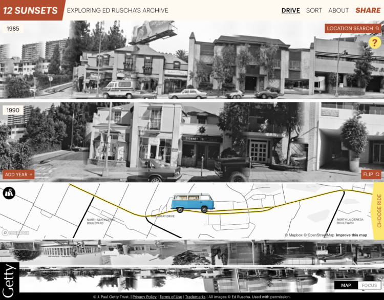
Exploration of 12 timelines along Sunset Boulevard

In 1966, artist Ed Ruscha published Every Building on the Sunset Strip, which was a stiched collection of photos taken while driving along Sunset Boulevard. Ruscha continued to take pictures over the years. Getty and Stamen made the multi-year work available online with a unique explorer that lets you drive the drive along 12 timelines.

Select your vehicle, the years, and move along the map.

See also Eric Rodenbeck’s process post on how the work came together.

Tags: , , , ,

Global terrain maps from Stamen

Global terrain map

Missed this one from last month. Stamen announced the release of a whole lot of new terrain map tiles for around the world. Four billion of them.

The original Terrain style only covered the United States. As part of a new Knight Foundation grant, we expanded Terrain to cover the entire world. The Knight grant also funded prototyping for some totally-different new terrain styles, so to avoid confusion we are calling the this reboot of the old style “Terrain Classic.”

I don’t know if I’ll get the chance to use these any time soon, but they sure are pretty to look at.

Tags: ,

Atlas of Emotions, a collaboration with the Dalai Lama

Atlas of emotion

Emotions are complex and only partially understood, yet such a force in how we live our lives. The Atlas of Emotions, produced by Stamen Design, shows what we know about these things, based on research and conversations between the Dalai Lama and psychologists Paul and Eve Ekman.

Using a geographic metaphor, the interactive starts with five universal emotions or “continents”: Anger, Fear, Sadness, Disgust, and Enjoyment. From there, you can see what states each puts you in and what actions come about.

But do I really have to say anything more than Dalai Lama? What.

See the project here and find more background on the atlas here.

Tags: , ,

Atlas of United States history

American Panorama

In a collaboration between the Digital Scholarship Lab at the University of Richmond and Stamen Design, American Panorama combines United States history, geographic mapping, and individual narratives to create a visual atlas of history.

They currently cover four topics — forced migration of enslaved people, overland trails, foreign-born population, and canals — with one map and chart interface for each. Each also uses a time component that lets you see changes by year. The first two are the most interesting though. They couple geographic data with personal stories that lend an important context, which tends to get lost as with time.

Tags: ,

Eric Rodenbeck on visualization and running a studio

Eric Rodenbeck is the founder and creative director for Stamen. No doubt you've seen their stuff over the years, ranging from client work, art pieces, to open source projects. At Eyeo 2014, Rodenbeck talked about some of that work, but more significantly, what it's like running such a studio in an environment where visualization needs and wants change often and quickly.

Love the honesty.

I don't run a studio (despite what my inbox might have you believe), and I'm just one guy, but Rodenbeck's sentiments felt familiar. If you want a career in any visualization-related field, you better keep up with the changes.

Tags: ,