
D3.js, a flexible JavaScript library useful for visualization, can feel intimidating at first. It does a lot. So Ian Johnson gave a talk on what the library provides, along with a tour of the essentials.
Tags: d3js, Ian Johnson, tour
Adam's Blogroll: click through to the author's blog
D3.js, a flexible JavaScript library useful for visualization, can feel intimidating at first. It does a lot. So Ian Johnson gave a talk on what the library provides, along with a tour of the essentials.
Tags: d3js, Ian Johnson, tour
Posted by in Coding, d3js, Ian Johnson, tour
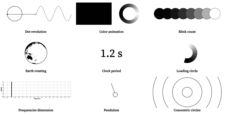
Pierre Ripoll provides several ways to visualize periodicity using animation. Moving dots, rotating spheres, concentric circles, oh my. He uses D3.js and it’s an Observable notebook, so you can see what’s going on under the hood.
Tags: animation, d3js, periodicity, Pierre Ripoll
Posted by in animation, d3js, design, periodicity, Pierre Ripoll

D3.js can do a lot of things, which provides valuable flexibility to construct the visualization that you want. However, that flexibility can also intimidate newcomers. Amelia Wattenberger provides a bird’s-eye view of the library to help make it easier to get started and gain a better understanding of what the library can do. Even if you’re already familiar with D3.js, it can serve as a useful reference.
Tags: Amelia Wattenberger, d3js, overview
Posted by in Amelia Wattenberger, Coding, d3js, overview

Ukranian band Obiymy Doschu released a new song Razom. “It’s a uplifting and tender song about being afraid of your own hapiness and holding your feelings inside, and that sometimes just a little step in the direction of a loved one will help you find yourself again.” Sounds good to me.
The lead singer is also an engineer at Mapbox, and he made a visualization to accompany a song. Each circle represents a musician, and they size based on the person’s prominence during the song.

Ian Johnson provides some good direction for those looking to get their feet wet with d3.js.
This guide is meant to prepare you mentally as well as give you some fruitful directions to pursue. There is a lot to learn besides the d3.js API, both technical knowledge around web standards like HTML, SVG, CSS and JavaScript as well as communication concepts and data visualization principles. Chances are you know something about some of those things, so this guide will attempt to give you good starting points for the things you want to learn more about.
Look at that map. I find that a big thing about learning visualization for the web is to set the right expectations. People coming from R or with little programming experience often expect to reach Mount Bostock really fast, but in reality, very few people are up there (if anyone). It’s not a plug-and-play situation. The good news is that you can still accomplish a lot at sea level, and d3.js creator Mike Bostock visits the villages often.
Tags: d3js

There are two main reasons annotation is often a challenge. The first is that writing copy that is succinct with the right amount of detail is tricky. The second is that implementation can be a pain, because you always have to muck around with placement in an ad hoc fashion. To help out with the second reason, Susie Lu developed d3-annotation. It takes away much of the main of adding labels and context to your charts with d3.js.
The whole writing part is still up to you, but at least you don’t have to think so much about implementation.
Tags: annotation, d3js
Posted by in annotation, Coding, d3js

D3.js, or Data-Driven Documents, version 4.0 was released a few months ago, so Jim Vallandingham updated his tutorial for categorized bubble charts to use the new version of the library. I’ve been slow getting to the new d3.js, but maybe this’ll move things along.

Choice of color scale can make a big difference in how the data reads. A careless choice might make the data appear skewed too far low or too far high, so you need to look at the data and decide what’s right for the context. But, sometimes you just gotta make a lot of charts or maps. Or, you just don’t feel like manually picking the colors.
David Schnurr describes a way to use clustering to pick the natural breaks in a more automatic fashion. The best part:
In an effort to make it easier for anyone to use this technique in data visualizations, I’ve ported this new algorithm to JavaScript and created a custom d3 scale called d3-scale-cluster. You can find d3-scale-cluster on Github and npm–give it a try and shoot me a tweet @dschnr with your thoughts!
And I await for someone to make an R package.
Posted by in color, d3js, statistics

For those who work with R and d3.js, the differences between the two are obvious. But for those who are brand new to this world, the names might as well be gibberish. This quick primer is for the latter group.
So R or d3.js for visualization? People ask me this fairly often, because I usually mention the two at the end of of my interactives.
Here’s the quick answer:
If you want to make non-interactive, static graphics or just need image files at the end of the day, R is a good place to start. If you want to make interactive or animated graphics that work in a browser, then go with d3.js.
With that said, the answer varies depending on your programming experience, what data you have, and specifically what you’re trying to make.
R is a statistical computing language that was developed by statisticians to analyze data. More recently, R has expanded its use cases as data spreads into other application areas. There are also a lot of R packages that let you do more with a lot less code than if you were to start from scratch.
Visualization is only a part of what R is typically used for. You can manipulate data, aggregate, summarize, analyze, and quickly comb through your dataset with a bunch of quickfire charts.
Data-Driven Documents, or d3.js, on the other hand is a “JavaScript library for manipulating documents based on data.” So if you learn how to use d3.js, you actually learn JavaScript. If you’re brand new to programming, this can prove to be an uphill battle at first. But as with anything, once you get it and understand what’s going on, the results feel like they were worth the initial effort.
R is more kind to beginner programmers, with a lot of one-liners, but you can’t quite do as much. There are packages that let you export graphics to JavaScript, but the results still feel a bit canned and not as flexible for my own taste. Then again, you get an interactive graphic without ever having to learn JavaScript.
I’m more tool-agnostic in my approach. It’s whatever gets me to where I want to go the fastest. I use R for analysis and quick charts to see what a dataset looks like. Then, if I want make the results interactive or animated, I shift to d3.js with the results I found in R in mind.
I guess it comes back to the original question of what you ultimately want out of your visualization. For static graphics, R is a good way to get quick results. For interactive and web-native graphics, check out d3.js.
If you have the time, it’s great to have both in your toolbox.

Missing data is everywhere. Or, I guess technically it’s nowhere. You know what I mean. Missing data is common, especially with temporal data over long periods of time. Just look at country-level estimates for anything over ten years, and you’ll understand. Peter Beshai for Bocoup provides five solutions for line charts with missing data, using d3.js.
Tags: d3js, missing data
Posted by in d3js, design, missing data