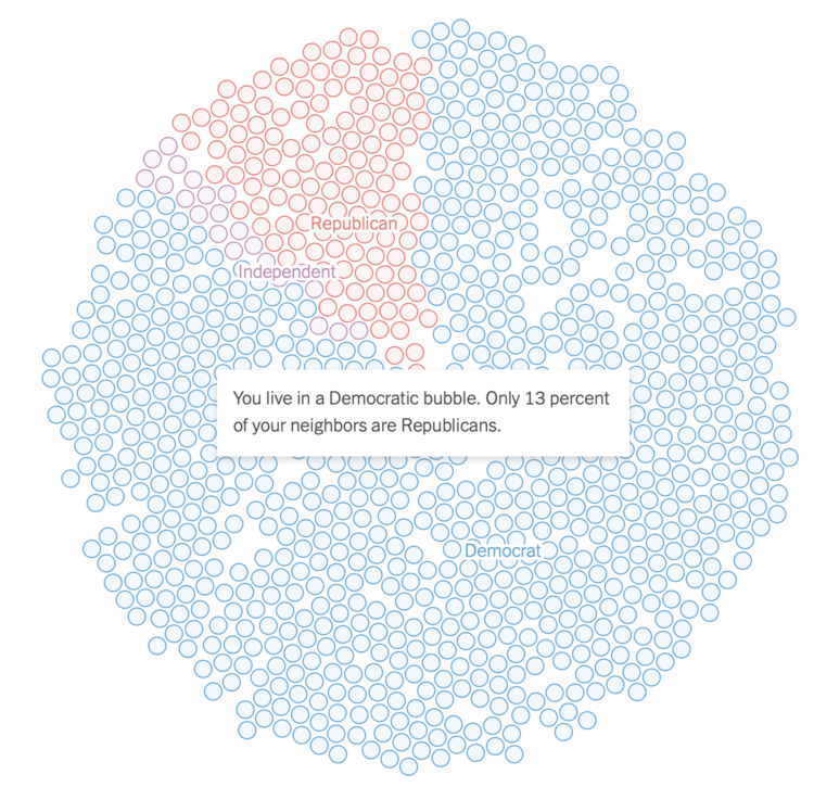
Gus Wezerek, Ryan D. Enos, and Jacob Brown for NYT Opinion use neighborhood-level data to show how those around you voted in the 2020 election. They ask: do you live in a political bubble? Enter an address to see.
This is riffing off of NYT’s similarly-themed map from 2018, which asked the same question but answered more geographically. This newer version, as is the current way of doing things these days, is more bubbly and mobile-focused with the scroll format.
Tags: bubbles, election, New York Times, politics
