Change in commute times in major cities

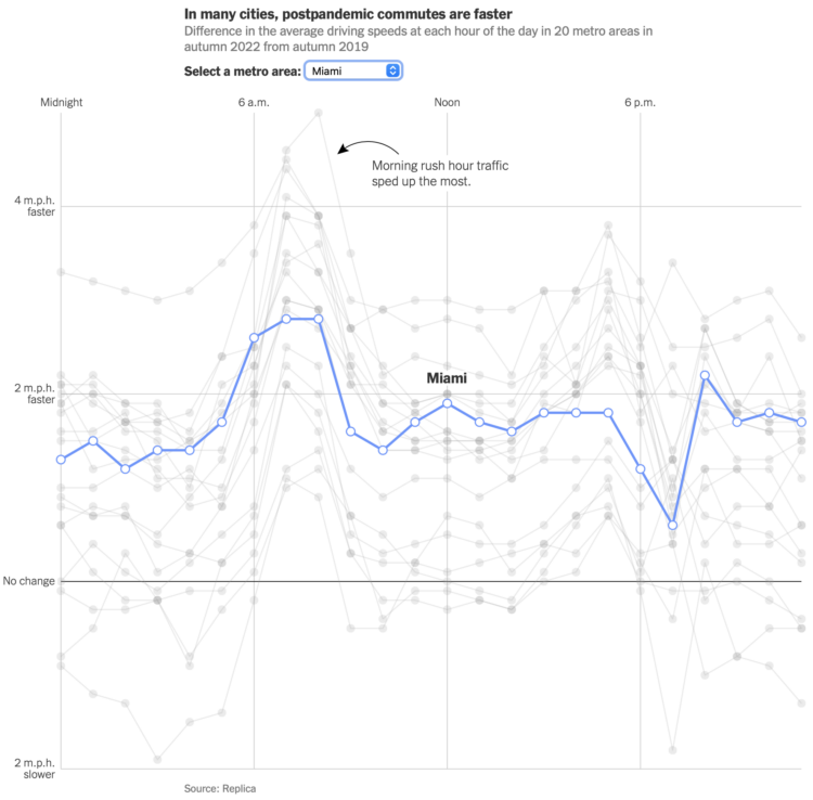
Using GPS data processed by Replica, Lydia DePillis, Emma Goldberg, and Ella Koeze, for The New York Times, show how commutes have changed post-pandemic. The roads in major cities are a little bit less congested and the traffic moves a bit faster.

The line chart above shows average speeds in 2022 relative to 2019. So you can see in most places people driving faster and more so during rush hour.

Tags: ,

A race to find the best route to the Jersey Shore

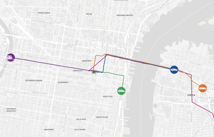
To find the fastest route from Philadelphia to the Jersey Shore, The Philadelphia Inquirer got five of their reporters to race via different routes and modes of transportation. Overlaid on a map of moving dots, the mix of text, video clips, and photos from the racers had me rooting for my pick all the way through even though I know little about the area and have never wondered about reaching the Jersey Shore.

Tags: , ,

Map of highway signs

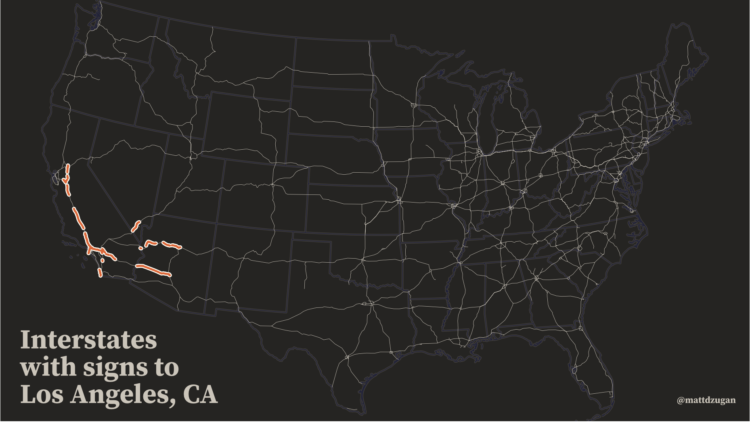
This is a fun map by Matt Dzugan. Search for a city, and see the segments of highway in the United States that are headed that way:

I set up thousands of queries to Google Maps, asking for directions from Point A to Point B and parsed its responses, looking for the text toward ___, signs for __, and ramp to ___.

This enabled me to build a database of all the segments of road that are listed as heading towards various cities.

Tags: , , ,

Commuting calculator

Sergio Peçanha and Yan Wu for The Washington Post made a calculator that shows how much time you spend commuting in a year and what you could do with that time instead. The input, interaction, and calculations are straightforward. Just use the slider to specify your roundtrip commute time, and the numbers update.

The easiest thing to do would be to just provide the total hours. You commute for an hour per day? That’s 250 hours in a year. That seems like a lot of time, but on its own it’s an abstract calculation. The interactive takes the natural next step with what you could do with that time, which makes the calculation more tangible.

I do the same thing when describing money saved. A few dollars here and there doesn’t seem like much, but extrapolate that to Jack in the Box tacos, and you’re getting somewhere.

Tags: , , ,

Rail delay scarf goes for $8,500 on eBay

Sarah Weber posted a picture of a scarf that her mom knit to represent rail delays. Weber’s mom knitted two rows per day and used color to indicate the delay. Grey was under 5 minutes, pink was 5 to 30 minutes, and red was over 30 minutes.

After getting some attention on the Twitters, the mom opted to put it up on eBay to benefit charity Bahnofs Mission. It went for $7,550 euros. Nice.

Tags: ,

When cycling is faster than driving

Deliveroo is a service that picks up and delivers food. Data from their delivery riders showed that it was faster to ride a bike than other modes of transportation in cities. Carlton Reid for Forbes:

Smartphone data from riders and drivers schlepping meals for restaurant-to-home courier service Deliveroo shows that bicycles are faster than cars. In towns and cities, bicyclists are also often faster than motorized two-wheelers. Deliveroo works with 30,000 riders and drivers in 13 countries.

That bicyclists are faster in cities will come as no surprise to bicycle advocates who have staged so-called “commuter races” for many years. However, these races – organized to highlight the swiftness of urban cycling – are usually staged in locations and at hours skewed towards bicycle riders. The Deliveroo stats are significant because they have been extracted from millions of actual journeys.

I used to play this game in graduate school often. The bus would get stuck in traffic. I would get off and walk home instead in the most thrilling races the world has ever seen. So for cities, these results make a lot of sense. Maybe not so much for the burbs though.

Tags: , , ,

How far you can drive out of the city in one hour

Using anonymized cell phone data from Here Technologies, Sahil Chinoy for The Washington Post mapped how far you can drive out of major cities during various times of the day. I used to do the kind of math — as I muttered in rage driving out of Los Angeles during rush hour, which by the way is four hours long.

Tags: ,

Compare your commute time to others

Commuting sucks. Here’s a straightforward map to compare how much or less your commute sucks compared to others in your area. Enter your ZIP code, and you get a simple comparison to the average, based on 2006-2011 U.S. Census American Community Survey.

Tags:

Posted by in commute, maps

Tags:

Permalink

New region boundaries based on commutes

Geographers Alasdair Rae and Garrett Nelson used commuting data from the American Community Survey to identify “megaregions” in the United States:

The emergence in the United States of large-scale “megaregions” centered on major metropolitan areas is a phenomenon often taken for granted in both scholarly studies and popular accounts of contemporary economic geography. This paper uses a data set of more than 4,000,000 commuter flows as the basis for an empirical approach to the identification of such megaregions.

Tags:

Posted by in commute, maps

Tags:

Permalink

Where people go to and from work

commute

With an animated take on the commute map, Mark Evans shows where people commute to work.

The resulting animations are somewhat hypnotic (even my dog seemed to go into a trance watching them leading to minutes of human amusement) but also provide a visual way of quickly seeing the distribution of workers into a given city. The points are sized based on the number of commuters, so a large dot indicates a higher relative number of commuters moving from the same tract to the same tract. The dots are also color coded to see which counties are most represented in the commuter sample.

Just select a county to see. [Thanks, @Mikey_Two]

Tags:

Posted by in commute, maps

Tags:

Permalink