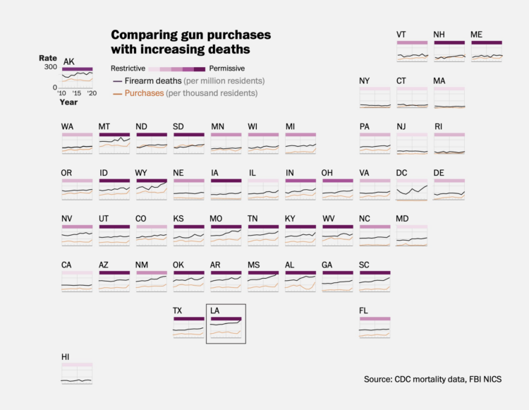
This is how the most common causes have changed over time for people aged 0 to 85.
Category Archives: mortality
Tree rings to compare life expectancy in your state
The Washington Post goes with a tree ring metaphor to compare life expectancy in your state. Enter your sex, age, and state. The inner white circles represent how old you are, the middle yellow circles represent how many expected years you have left, and the outer red circles represent the expected years of those with the same age and sex but in Japan.
The rings are a lead-in graphic to more statistical charts. I kind of wish they went all in with the rings, but that’d probably be limiting in the points they could get across.
Tags: mortality, Washington Post
Posted by Infographics, mortality, Washington Post
inHow Cause of Death Shifted with Age and Time in America
As we get older, our life expectancy declines. But when and how quickly the decline happens and how it happens has changed over the years.
Posted by Data Underload, mortality
inShifting causes of death over the decades
Saloni Dattani, for Our World in Data, used a set of heatmaps to show how causes of death changed by time (on the horizontal axis) and age (on the vertical axis) in France. Each panel represents a cause category.
The code is on GitHub, in case you want to make similar charts for your own country.
Tags: age, mortality, Our World in Data
Posted by age, mortality, Our World in Data, Statistical Visualization
inIncreasing alcohol-related deaths
Alcohol consumption, based on ethanol volume estimates, has been rising over the past couple of decades. The pandemic appears to have sped that up, leading to more deaths. For The Washington Post, Caitlin Gilbert, David Ovalle and Hanna Zakharenko report:
At the same time, the number of deaths caused by alcohol skyrocketed nationwide, rising more than 45 percent. In 2021, alcohol was the primary cause of death for more than 54,000 Americans, causing nearly 17,000 more deaths than just a few years before, in 2018, according to data from the Centers for Disease Control and Prevention.
Tags: alcohol, mortality, Washington Post
Posted by alcohol, maps, mortality, Washington Post
inFull scope of gun deaths in the U.S.
As I’m sure you know, mass shootings, which gain attention because the scale of their severity is so high, make up only a fraction of total gun deaths. Several tens of thousands of people die from gun shots every year in the U.S. The Washington Post describes the full scope, covering purchases, restrictions, race, and geography.
Tags: guns, law, mortality, Washington Post
Posted by guns, law, mortality, Statistical Visualization, Washington Post
inDeaths by Firearm, Compared Against Injury-Related Deaths
The Centers for Disease Control and Prevention track cause of death over time, under several classifications and groupings. Among 1- to 19-year-olds, regulations decreased motor vehicle deaths, but deaths by firearms increased and became the leading mechanism in 2018.
Posted by Data Underload, firearms, mortality
inLives cut short by Covid
Alyssa Fowers and Leslie Shapiro, for The Washington Post, used the stories of 114 individuals to show weekly Covid deaths. Each story is “cut short”, making the length of each fragment match counts for the corresponding week.
My brain was slightly confused by the metaphor at first. The lower the count, the more an individual’s story is cut short, but my intuition expected that more deaths would mean stories were cut short more.
That said, the sentiment is in the right place. Maybe the stories didn’t need to be tied to weekly counts? I’m imagining something closer to Periscopic’s piece from 2013 on lives cut short by guns.
Tags: coronavirus, mortality, Washington Post
Posted by coronavirus, Infographics, mortality, Washington Post
inBehind the million
Sergio PeƧanha and Yan Wu, for The Washington Post, used a combination unit chart with individual icons to represent the scale and weight of the near million Covid deaths in the United States.
Compare this with NYT’s particle-based charts and Axios’ scaled squares. It’s kind of in between the two in level of abstraction, but all three carry similar messages, with a focus on the one-million mark.
Tags: coronavirus, mortality, scale, Washington Post
Posted by coronavirus, Infographics, mortality, scale, Washington Post
inReaching 1 million deaths
The New York Times narrated the path to one million Covid deaths in the United States. They start with one million dots, each one representing a death. As you read, the dots arrange into trends and significant events over these past years.
As we have talked about before, it’s impossible to communicate the true weight of a single death, much less a million, but the individual dots provide a visual foundation to better understand abstract trends.
Tags: coronavirus, mortality, New York Times
Posted by coronavirus, Infographics, mortality, New York Times
in