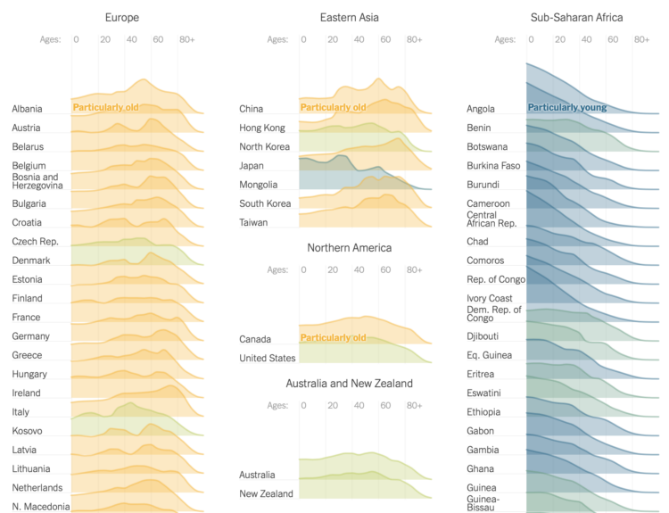
In our earlier years, we tend to date and marry others who are around our age. However, this is not true for everyone. Variation kicks in when you look at the later years, consider multiple marriages, divorce, separation, and opposite-sex versus same-sex relationships. This chart breaks it all down.
Category Archives: age
Posted by age, Data Underload, marriage, relationships
inWhen Your Vision and Hearing Decline with Age
If you want to feel like you’re getting old, visit an optometrist and have them tell you that in 6 to 12 months you won’t be able to read things up close and you’ll need bifocals. Here’s when your senses will decline.
Posted by age, Data Underload, hearing, Vision
inCommon Age Differences, Married Couples
Through pop culture, it sometimes seems like it’s common for there to be a wide age difference between spouses. How common are the age gaps, really? These are the age differences through the lens of the 2022 five-year American Community Survey.
Posted by age, Data Underload, marriage, relationships
inFeeling Rested with Age
How much you sleep each night matters, but more importantly, it’s about the quality and if you feel rested when you wake up. This seems to shift with age as responsibilities and sleep patterns change.
The following chart shows how rested people felt, based on answers to the American Time Use Survey.
Posted by age, Data Underload, rest, sleep, well-being
inHighest Education Level by Age
When you’re a kid, most (if not all) of the people you know who are your age are in the same grade as you. Education paths start to diverge towards the end of high school and after.
Posted by age, education, Statistical Atlas
inOldest and Youngest, by State
In some states there are more kids, such as Utah, which has the youngest median age at 31 years and 4 months. In others states there are more older adults, such as Maine, which has the oldest median age at 44 and 8 months. This is based on the 2021 American Community Survey.
Of course, we can see the age breakdowns in greater detail. States aren’t uniformly young and old.
Posted by age, Data Underload
inShifting causes of death over the decades
Saloni Dattani, for Our World in Data, used a set of heatmaps to show how causes of death changed by time (on the horizontal axis) and age (on the vertical axis) in France. Each panel represents a cause category.
The code is on GitHub, in case you want to make similar charts for your own country.
Tags: age, mortality, Our World in Data
Posted by age, mortality, Our World in Data, Statistical Visualization
inAge shifts around the world
The world is getting older overall. For The New York Times, Lauren Leatherby broke it down by country with a set of animated frequency trails, along with charts for more demographic shifts. I like it.
Tags: age, New York Times, population, world
Posted by age, New York Times, population, Statistical Visualization, world
inBest Possible Life More Common with Age
People scored their current life from 0 to 10, where 0 is their worst possible life and 10 is their best possible life. The older they were, the more likely they were to say they were living their best.
Posted by age, Data Underload, time use, well-being
in