Snowboarding composite photos

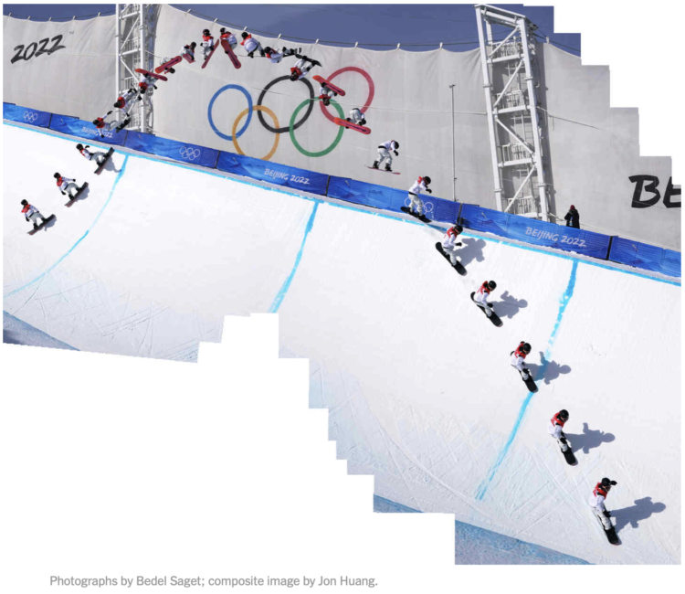
If you watched the men’s halfpipe in the Olympics, you were probably impressed by Ayumu Hirano’s tricks. But it can be hard to see what he actually does in real-time, other than flying high, spinning a lot, and landing cleanly. So The New York Times used composite photos to show Hirano’s trajectory. I especially like the zoom-in frame by frame composite showing a Cab Double Cork 1440.

Tags: , , , ,

Weighted Olympic medal counts

To decide who’s doing best at the Olympics you have to define what “best” means. Do you go by total medal count? Do you give more weight to gold medals over silver and bronze? Josh Katz, for NYT’s The Upshot, has been updating an interactive that ranks countries based on how you answer.

Each heatmap represents a country. The horizontal axis represents how much more a silver is worth over a bronze, and the vertical axis is how much a gold is worth over a silver. So the bottom left corner is all medals equal. Color represents possible ranking. The list of countries on the right updates as you move the cursor over spots.

Katz has been updating for each Olympics since PyeongChang 2018. It’s my favorite medal count tracker. I like the original best, which spaced countries in the list when there were ties.

Tags: , , , ,

Figure skating animated jumps

Figure skater Nathan Chen set a world record with his performance in the short program. The New York Times has these cute animations to show the completed jumps. Just spinning around four times in the air, no big deal.

Tags: , , ,

How countries ranked by Olympic medal counts

Ranking countries by medal count change depending on how much value you place on each medal. Should you just count number of medals straight up, or should you give more weight for gold than for silver or bronze? Josh Katz for The New York Times revamped his 2018 interactive for 2020 results, which lets you assign different weights to see how the overall rankings change.

The United States took first and China second, but there are many rank combinations among the rest.

Tags: , ,

Olympic champions versus past Olympians

With the 2020 Olympics wrapped up, The New York Times raced this year’s medal winners against previous medalists to provide context for the new records set in Tokyo. The simplified style of the animations gave me Sega Game Gear flashbacks.

NYT made similar comparisons in 2012 with videos for track and field events. The more static 2016 rendition, which focused on Usain Bolt and previous 100-meter winners, is still favorite.

Tags: , ,

Age range of Olympians

Bonnie Berkowitz and Artur Galocha go with the strip plot to show the distribution of age for different Olympic events. If it’s longevity you’re looking for, go for the equestrian, sailing, shooting, and archery events. There’s still time.

Tags: , ,

Science behind running fast vs. running far

From The New York Times, the combination of video, motion graphics, and charts, packaged tightly in a scrollytelling format, clearly shows the differences.

Tags: , ,

Olympic medal tracker

The Bloomberg medal tracker is fun to look at. I think the graphics desk was instructed to use as many new-ish chart types as they could without alienating readers: the streamgraph, force-directed clusters, an international map grid, line-based isotype, and plenty of bubbles. I’m into it.

Tags: , , ,

Calculating swim speeds

The New York Times charted speed ranks during the women’s 4×100 freestyle relay. My favorite part is how they got the data, which wasn’t available, so they estimated through photos and timestamps:

The Times annotated a sequence of several hundred photographs to determine the speed of each athlete throughout the race. Speeds were calculated by combining the positions of the athletes with timestamp information from the images.

If the data you’re looking for isn’t readily available, it might just be a few steps away.

Tags: , , ,

New Olympic sports explained

The 2020 Summer Olympics are here, so ’tis the season for experimental visual explainers. The Washington Post uses a combination of illustration, video, and augmented reality to show off three new Olympic sports: skateboarding, surfing, and sport climbing.

The skateboarding piece with Heimana Reynolds uses a left-right hover to move back and forth through a time-lapse. It lets you see each part of the trick, which can be a challenge to see in real-time. The climbing piece with Brooke Raboutou employs AR so that you can place a 3-D model of the 50-foot wall and Raboutou in your living room for scale. Neat.

Tags: ,