Weighted Olympic medal counts

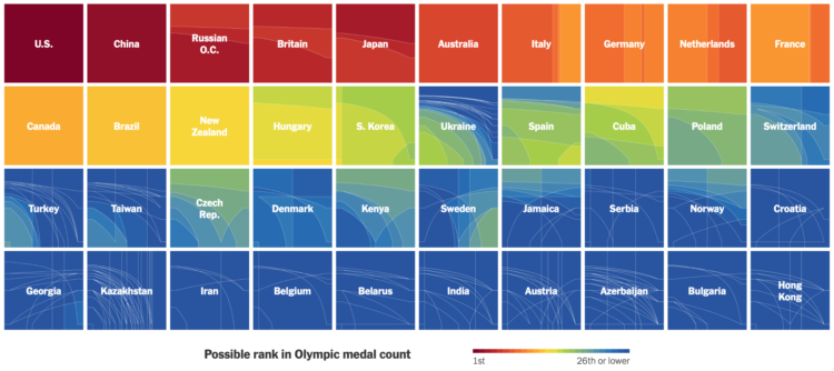
To decide who’s doing best at the Olympics you have to define what “best” means. Do you go by total medal count? Do you give more weight to gold medals over silver and bronze? Josh Katz, for NYT’s The Upshot, has been updating an interactive that ranks countries based on how you answer.

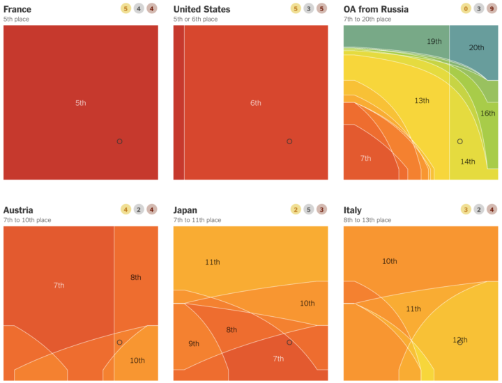
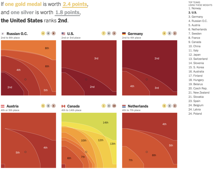
Each heatmap represents a country. The horizontal axis represents how much more a silver is worth over a bronze, and the vertical axis is how much a gold is worth over a silver. So the bottom left corner is all medals equal. Color represents possible ranking. The list of countries on the right updates as you move the cursor over spots.

Katz has been updating for each Olympics since PyeongChang 2018. It’s my favorite medal count tracker. I like the original best, which spaced countries in the list when there were ties.

Tags: , , , ,

How countries ranked by Olympic medal counts

Ranking countries by medal count change depending on how much value you place on each medal. Should you just count number of medals straight up, or should you give more weight for gold than for silver or bronze? Josh Katz for The New York Times revamped his 2018 interactive for 2020 results, which lets you assign different weights to see how the overall rankings change.

The United States took first and China second, but there are many rank combinations among the rest.

Tags: , ,

Who’s winning the medal race, depending on how you weight the medals

Every year, we look at the medal counts of each country. Who’s winning? It depends on how much value you place on each medal. Do you only count the golds and disregard silver and bronze? Do you just treat all medals the same? Josh Katz for The Upshot lets you test all the possibilities with this interactive.

Apply different values to each medal type by mousing over the x-y coordinate plane and see how the country rankings shift.

Tags: , ,