
Still waiting for those results? Bloomberg’s election page for each state shows the estimated range of votes counted so far. Really like the dual encoding with the shaded gradient and line. For example, here’s the page for Pennsylvania.
Adam's Blogroll: click through to the author's blog
Still waiting for those results? Bloomberg’s election page for each state shows the estimated range of votes counted so far. Really like the dual encoding with the shaded gradient and line. For example, here’s the page for Pennsylvania.
Posted by in Bloomberg, election, Statistical Visualization

As we wait for the votes to be counted in the remaining states, here are a couple of interactives to test the possibilities. The New York Times updated their graphic on all possible paths to the White House (the original from 2012).
FiveThirtyEight also has their thing:

Or, there’s this decision tree by Kerry Rodden:

Or, you could carry on with your day as if nothing is happening and not concern yourself with things that are outside of your control.
Nope. Not gonna do that.
Tags: election, FiveThirtyEight, New York Times, possibilities
Posted by in election, FiveThirtyEight, Infographics, New York Times, possibilities

The NYT election needles of uncertainty are back, and they’re about to go live (if they haven’t already). I’m not watching, but in case that’s your thing, there you go.
It’s a little different this time around, because of the pandemic and mail-in voting. There’s no national needle this time. Instead, there are three needles for Florida, Georgia, and North Carolina, because they’re battleground states and the necessary data to run the estimates is available.
Tags: election, needle, New York Times, uncertainty
Posted by in election, needle, New York Times, Statistical Visualization, uncertainty

If you want to color in your own electoral map at home, The Washington Post provides this blank, printable page. I hear coloring is soothing or something like that. [via @SethBlanchard]
Tags: coloring, election, Washington Post
Posted by in coloring, election, maps, Washington Post

It’s election day here in the United States, but millions of votes have already been mailed or dropped off. In some states, the number of early votes already surpassed the total in 2016. The New York Times provides a state-by-state breakdown.
Tags: election, New York Times, voting
Posted by in election, maps, New York Times, voting
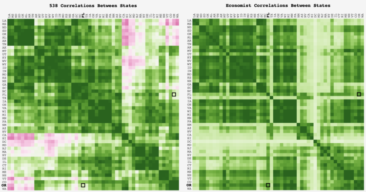
FiveThirtyEight and The Economist take similar inputs but output different forecasts. Adam Pearce was curious about how the state-by-state correlations differed between the two models:
Outside of the CA-DC-VT-WA and LA-MS-ND-KY clusters, where the 538 correlation dips below 0, the models are mostly aligned. Glancing over the outliers, it looks like the Economist might not have an equivalent to 538’s regional regression that groups states in the same geographic region together; the Economist has HI at 0.2 correlation with WA & OR while 538 has it around 0.7.
Tags: Adam Pearce, Economist, election, FiveThirtyEight
Posted by in Adam Pearce, Economist, election, FiveThirtyEight, Statistical Visualization
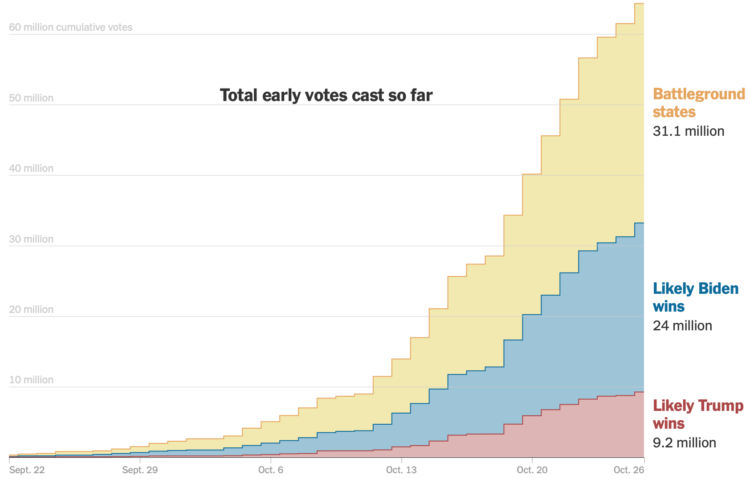
As you might expect, early voting volume is high across the country. In many states, one week until election day, the early voting count is already more than half of the total 2016 counts. For The New York Times, Denise Lu and Karen Yourish provide the breakdown with cumulative charts by state.
See also how long it might take to count all the votes.
And you can download the count data from the United States Election Project.
Tags: election, New York Times, voting
Posted by in election, New York Times, Statistical Visualization, voting
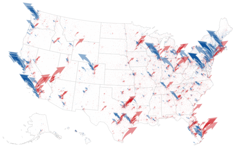
The New York Times analyzed campaign finance data from April to October, mapping and charting their results by different segments:
The findings paint a portrait of two candidates who are, in many ways, financing their campaigns from two different Americas.
It is not just that much of Mr. Biden’s strongest support comes overwhelmingly from the two coasts, which it does. Or that Mr. Trump’s financial base is in Texas, which it is. It is that across the country, down to the ZIP code level, some of the same cleavages that are driving the 2020 election — along class and education lines — are also fundamentally reshaping how the two parties pay for their campaigns.
Tags: election, fundraising, New York Times
Posted by in election, fundraising, maps, New York Times
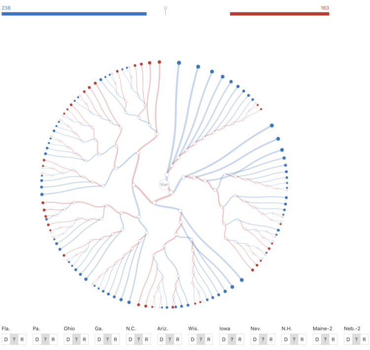
While we’re on the topic of election scenarios, Kerry Rodden provides a radial decision tree to show possible outcomes. Select paths or specify state wins to see what might happen.
It’s based on the New York Times piece by Mike Bostock and Shan Carter from 2012(!).
Tags: election, Kerry Rodden
Posted by in election, Kerry Rodden, Network Visualization
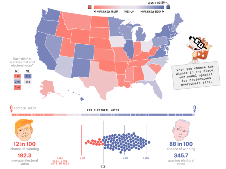
With each model update, FiveThirtyEight runs 40,000 simulations, or what-ifs, to calculate the odds for who will win the election. Their new interactive lets you experiment with all of the what-ifs to see how the odds shift when a candidate wins a state.
It answers the question, “If ______ wins in ______ and in ______, etc., what are the chances of him winning the whole thing?”
So if Trump wins a very red state or Biden wins a very blue state, the overall odds don’t change that much. But if a very red goes blue, or a very blue goes red, then the odds swing dramatically.
There’s a good lesson on conditional probability somewhere in there.
Tags: election, FiveThirtyEight, simulation
Posted by in election, FiveThirtyEight, simulation, statistics