Visualizing the statistical connections behind ChatGPT

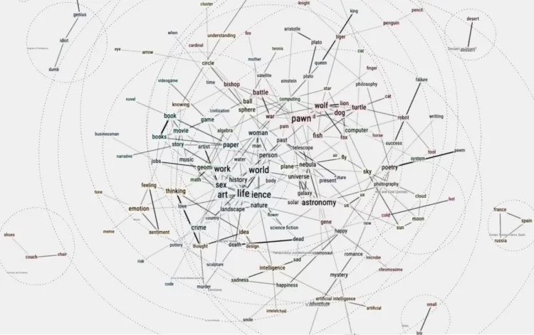
To gain a better understanding of how ChatGPT works under the hood, Santiago Ortiz repeatedly passed the prompt “Intelligence is” to the chatbot. Then he visualized the statistical paths to get to a response using a 3-D network. If you squint, the network kind of looks like a computer’s brain.

Tags: , ,

Infinite Craft with large language model

Start with water, fire, wind, and earth and see what you can craft by combining elements. Neal Agarwal made a game, Infinite Craft, that uses Llama 2, a large language model, to build just about anything.

It’s a LLM version of Little Alchemy. [Thanks, Charlotte]

Tags: , ,

Friend simulation system, with ChatGPT

Philippe Vandenbroeck and Santiago Ortiz were curious about a system that incorporated knowledge from a real person and ChatGPT, which is good for smushing text together in a coherent format. So they embedded text from Vandenbroeck into the ChatGPT model so that he could with himself. Ortiz describes the technical aspects of the system here.

See also the AI chatbot modeled on texts from a fiancee who passed. Looking back on our lives in a few decades is going to be weird.

Tags: , , ,

Big diagram of metabolic pathways

The contents of this diagram is not in my scope, but it is a very big, detailed diagram of metabolic pathways. Many steps, many arrows.

Tags: ,

Network for Marvel Cinematic Universe

With a fun view of the Marvel Cinematic Universe, Tristan Guillevin walks through a network of characters and movies from 2008 through 2012. Each white-filled circle represents a movie, and each black-filled circle represents a character, connected to the movie he or she appeared in.

See also the 3-D network by The Straits Times from a few years back that goes into more depth with interactions between characters.

Tags: ,

Bubble tea combinations, a visual breakdown

Walk into a boba shop and usually you’ll see a large menu that lists the options for your tea, milk, toppings, ice, and sweetness. With all the variations, you get a lot of combinations. Julia Janicki and Daisy Chung broke it down with an interactive that takes you through the steps.

Tags: , , ,

Visualizing 16th century letter correspondence of the Tudor government

Kim Albrecht, Ruth Ahnert, and Sebastian Ahnert visualized the network of communications over time and space:

The Tudor government maintained a communication network that criss-crossed the globe. This visualisation brings together 123,850 letters connecting 20,424 people from the United Kingdom’s State Papers archive, dating from the accession of Henry VIII to the death of Elizabeth I (1509-1603).

Tags: ,

Decision tree for the presidential election result

While we’re on the topic of election scenarios, Kerry Rodden provides a radial decision tree to show possible outcomes. Select paths or specify state wins to see what might happen.

It’s based on the New York Times piece by Mike Bostock and Shan Carter from 2012(!).

Tags: ,

Anatomy of an outbreak

For Reuters, Manas Sharma and Simon Scarr animated a coronavirus outbreak in Singapore between January and April, going with the force-directed bubble view. It starts small, then there’s the spread, and clusters form.

Tags: , , ,

UK government org charts

When I think government structure, I tend to think in general overviews where you have some branches that check and balance each other. But when you look closer, within organizations that make up the bureaucracy, you’ll find lots of variation. Peter Cook laid it out for the United Kingdom with org charts for each department.

And apparently org charts are also known as organograms? Where have I been on this one? [Thanks, Peter]

Tags: , ,