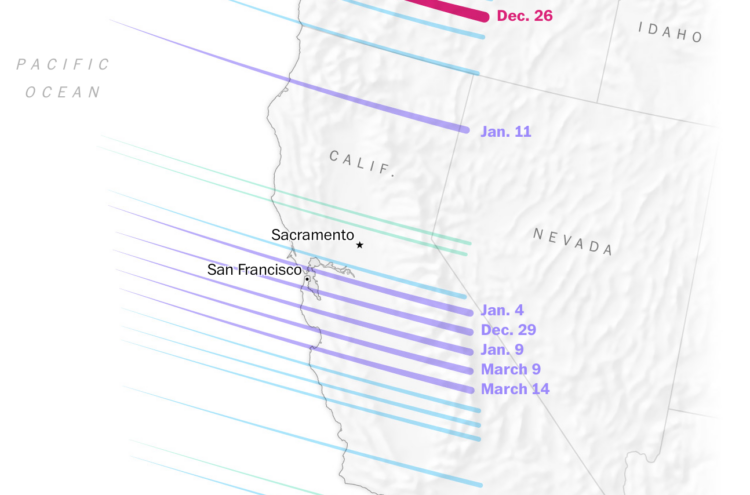
It rained a lot more than usual this winter in California. Diana Leonard and Dylan Moriarty, for The Washington Post, explain the science behind all the water falling from the sky.
Tags: rain, Washington Post, weather
Adam's Blogroll: click through to the author's blog
It rained a lot more than usual this winter in California. Diana Leonard and Dylan Moriarty, for The Washington Post, explain the science behind all the water falling from the sky.
Tags: rain, Washington Post, weather
Posted by in maps, rain, Washington Post, weather
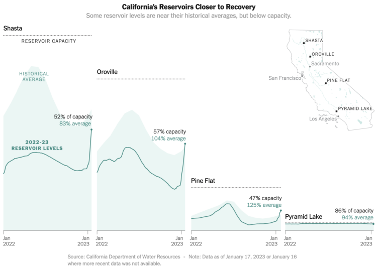
There’s been a lot of rain in California, which has been good to relieve some of the pressures from drought, at least in the short-term. For The New York Times, Elena Shao, Mira Rojanasakul, and Nadja Popovich show the sudden bump in water supply.
The areas to show historical averages in the background was a good choice. Very reservoir-ish.
Tags: California, drought, New York Times, rain
Posted by in California, drought, New York Times, rain, Statistical Visualization
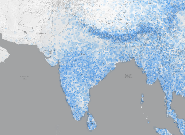
The monsoon season in South Asia brings water to the people and land, but signs point to more intense rain as overall temperatures go up. To show the change in rain, Zach Levitt and Jeremy White, for The New York Times, go with a rain drop aesthetic. The density of animated dots represents future rainfall and resembles drops of rain falling on the ground. Also wind maps with lines that resemble wind.
Tags: monsoon, New York Times, rain
Posted by in maps, monsoon, New York Times, rain
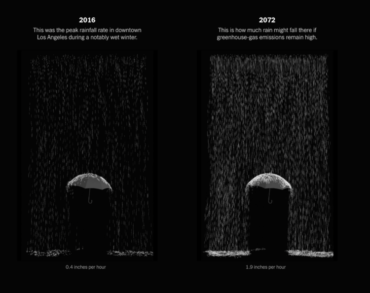
Highlighting research by Xingying Huang and Daniel L. Swain, who studied “plausible worst case scenario” extreme storm sequences, The New York Times provides a glimpse of what that might look like in California. There are maps, there are charts, and there is an augmented reality view to put rain in your living room.
Tags: California, climate, New York Times, rain, storm
Posted by in California, Climate, Infographics, New York Times, rain, STORM
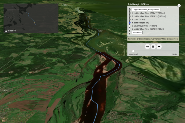
One of my favorites of the year, Sam Learner’s River Runner shows you a terrain map that lets you place a drop of rain anywhere in the contiguous United States. You’re then taken on a river tour that shows where the drop ends up. Learner just expanded the project to let you drop water anywhere in the world.
Tags: rain, river, Sam Learner, water
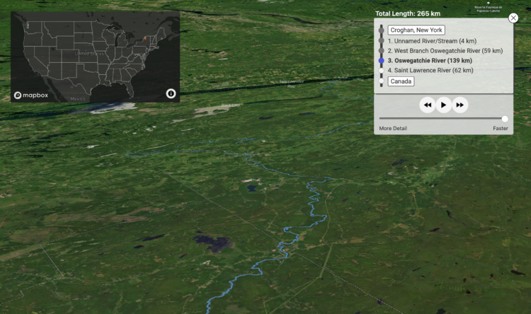
River Runner is a fun interactive map by Sam Learner. Click anywhere in the contiguous United States to drop some rain and, based on data from the U.S. Geological Survey, the map shows you where the rain ends up and the path it takes to get there.
This uses USGS NHDPlus data and their NLDI API to visualize the path of a rain droplet from any point in the contiguous United States to its end point (usually the ocean, sometimes the Great Lakes, Canada/Mexico, or another inland water feature). It’ll find the closest river/stream flowline coordinate to a click/search and then animate along that flowline’s downstream path.
When you think about it, it’s kind of nutty that something like this is even possible. [via Waxy]
Tags: rain, Sam Learner, water
Posted by in maps, rain, Sam Learner, water

Tim Meko and Aaron Steckelberg for The Washington Post compared this summer’s rains with the average. The combination of mapping as terrain and color-encoding provides an interesting foam-looking aesthetic.
Tags: rain, Washington Post, weather
Posted by in maps, rain, Washington Post, weather

In some areas of the United States it poured down rain, which caused historic floods, and in other areas there was a lack of rain, which caused historic drought. The Washington Post has a map for that. Purple means less rain than usual, and green means more.
Tags: rain, Washington Post, weather
Posted by in maps, rain, Washington Post, weather