Teenage adversity that carries into adulthood

The National Longitudinal Surveys from the Bureau of Labor Statistics are unique in that they run long-term to survey the lives of individuals for decades. For The Pudding, Alvin Chang visualized survey responses to show how adversity as a teenager carries into adulthood.

Each person icon represents a respondent and the collective bar chart stacks track through the years. The icons run across the screen on each time segment and demographic shift.

There’s a video version, shown below, and while I enjoy Alvin’s dulcet voice, I prefer the scrolling version.

Tags: , , ,

Where America is expanding in developed areas

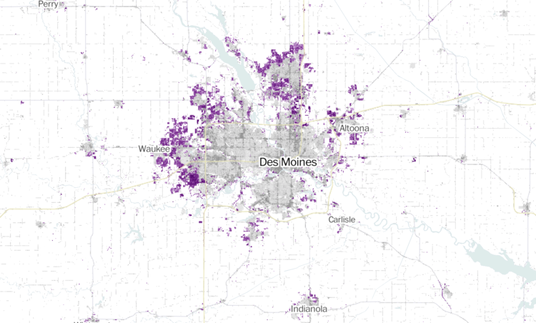
Zach Levitt and Jess Eng for The Washington Post mapped newly developed areas in the contiguous United States, between 2001 and 2019:

Between 2001 and 2019, the built-up landscape of America — buildings, roads and other structures — has expanded into previously undeveloped areas, adding more than 14,000 square miles of new development across the contiguous United States — an area over five times the size of Delaware.

My favorite part is the interactive map, which lets you see development in your area. The purple indicating newly developed areas against the grayscale provides a quick reference.

The maps are based on data from the United States Geological Survey, which you can grab here.

Tags: , , ,

An atlas for the world’s development indicators

The World Bank tracks global development through a number of indicators. (You can see and download much of the data through their catalog.) With a story-based approach, they published an atlas for 2020 that focuses on 17 development goals, such as end poverty, end hunger, and stop global warming. There’s one story per goal, charting out multiple indicators in each story.

There’s a lot to look at, but one thing you’ll probably notice across all of the topics is progress. It’s not all spikes and waves out there.

Tags: , , ,