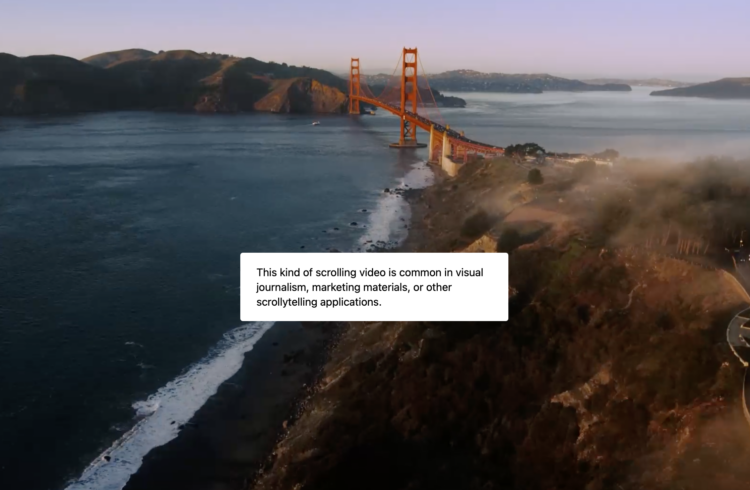
ScrollyVideo.js is a JavaScript library that makes it easier to incorporate videos in a scrollytelling layout. The examples look really straightforward, which means I’m saving this for later.
Tags: JavaScript, scrollytelling, video
Adam's Blogroll: click through to the author's blog
ScrollyVideo.js is a JavaScript library that makes it easier to incorporate videos in a scrollytelling layout. The examples look really straightforward, which means I’m saving this for later.
Tags: JavaScript, scrollytelling, video
Posted by in Coding, javascript, scrollytelling, video
The Powers of Ten by Charles and Ray Eames from 1977 shows the size of the universe by starting at human scale and then zooming out further and further. Then it comes back down to Earth and zooms in closer and closer.
I’ve linked to this iconic film a few times but just wanted to put up an actual post here for reference. You should definitely check it out if you haven’t seen it before.
Posted by in Eames, Infographics, scale, video
Jon Schwabish has a new book coming out: Better Data Visualizations. To kick things off, he’s running a video series on the many different chart types. There will be 50 videos released daily, each with an invited practitioner to briefly talk about what the chart is and how it’s used. They’re already 10 videos into it.
Should be informative.
Tags: chart types, Jon Schwabish, video
Posted by in chart types, Jon Schwabish, Statistical Visualization, video

As you probably know, there was a big Parler data scrape before the app and site went down. ProPublica spliced Parler video posts, sorting them by time and location. The result is basically a TikTok-style video feed of what happened.
Tags: Parler, ProPublica, video
Posted by in Infographics, Parler, ProPublica, video
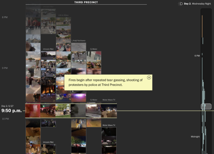
From a distance, it’s difficult to build an understanding of the scale and nature of protests. A soundbite here. A video clip there. So, to show the Minneapolis protests more completely, The Washington Post and The Pudding stitched together 149 livestreams with timestamps and location:
Videos were collected by searching Youtube, Facebook, Twitter, Twitch and other sources and then limited to live streams to ensure accuracy of time, location and remove reposted clips. Each video was reviewed and tagged to a location by hand to remove any videos that were replays as live streams. Thumbnails were then extracted using FFMPEG and links to the original videos were provided. Interesting quotes and context setting annotations were called out to provide a deep experience while allowing for quick scanning. Finally links and inline play of the original videos is provided for those wishing to see the videos as streamed.
With so much footage, it’s easy to imagine any sense of narrative getting lost in a bunch of moving pictures. But the layout and structure of this story, organized as a timeline and categorized by area, really help you see what happened over a week.
Tags: George Floyd, Minneapolis, protest, Pudding, video, Washington Post
Posted by in George Floyd, Infographics, Minneapolis, protest, Pudding, video, Washington Post
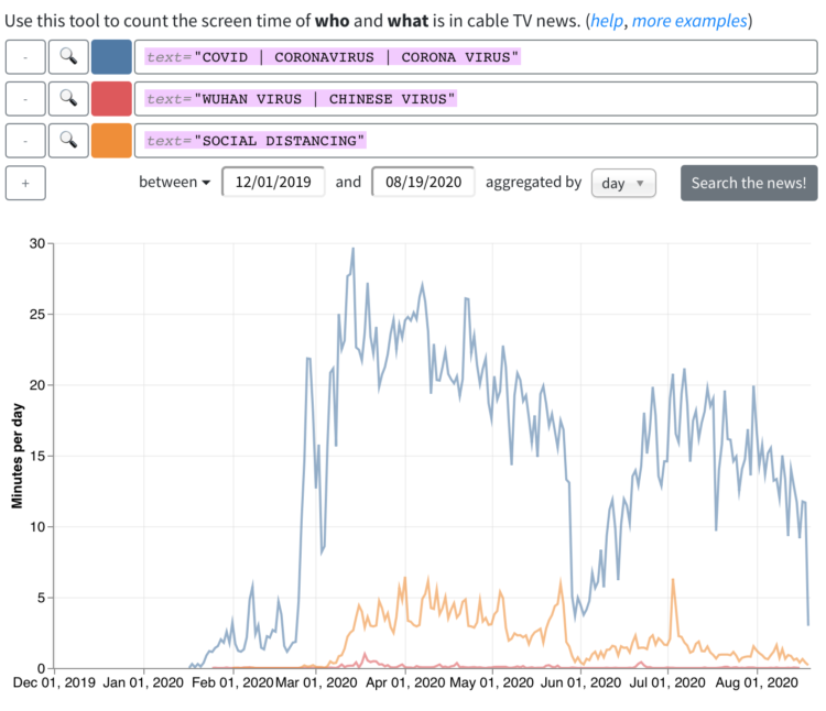
From the Computer Graphics Lab at Stanford University, the results from an analysis of a decade of cable news:
The Stanford TV News Analyzer has applied deep-learning-based image and audio analysis processing techniques to nearly a decade of 24–7 broadcasts from Fox News, CNN, and MSNBC going back to January 1, 2010. That’s over 270,000 hours of video updated daily. Computer vision is used to detect faces, identify public figures, and estimate characteristics such as gender to examine news coverage patterns. To facilitate topic analysis the transcripts are time-aligned with video content, and compared across dates, times of day and programs.
You can search for topics or people, combine queries, and set time ranges. Then you get a time series for how much someone’s face showed up or the number of times a word was used.
Tags: cable news, deep learning, Stanford, video
Posted by in cable news, Deep Learning, Stanford, Statistical Visualization, video
3Blue1Brown explains exponential growth and epidemics and answers the question of when the curve levels off:
Tags: 3Blue1Brown, math, video
Posted by in 3Blue1Brown, Infographics, Math, video

I have a feeling we’re in for a lot of manipulated videos as we get closer to the election. The Washington Post provides a guide for the different types. I hope they keep building on this with a guide on how to spot the fakes, but as they say, knowing is half the battle.
Tags: fake, video, Washington Post
Posted by in fake, Infographics, video, Washington Post
Posted by in Learning, statistics, video