
ScrollyVideo.js is a JavaScript library that makes it easier to incorporate videos in a scrollytelling layout. The examples look really straightforward, which means I’m saving this for later.
Tags: JavaScript, scrollytelling, video
Adam's Blogroll: click through to the author's blog
ScrollyVideo.js is a JavaScript library that makes it easier to incorporate videos in a scrollytelling layout. The examples look really straightforward, which means I’m saving this for later.
Tags: JavaScript, scrollytelling, video
Posted by in Coding, javascript, scrollytelling, video

Atomic Agents is a JavaScript library by Graham McNeill that can help simulate the interactions between people, places, and things in a two-dimensional space. Saving for later. Looks fun.
Tags: agent, Graham McNeill, JavaScript, modeling
Posted by in agent, Graham McNeill, javascript, Modeling, software
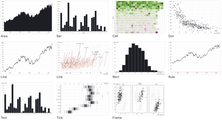
If you’re into the notebook workflow, Observable Plot is a JavaScript library built for you:
We created Plot to better support exploratory data analysis in reactive, JavaScript notebooks like Observable. We continue to support D3 for bespoke explanatory visualization and recommend Vega-Lite for imperative, polyglot environments such as Jupyter. Plot lets you see your ideas quickly, supports interaction with minimal fuss, is flexible with respect to data, and can be readily extended by the community. We believe people will be more successful finding and sharing insight if there’s less wrestling with the intricacies of programming and more “using vision to think.”
In case you’re curious how Plot compares to D3, which was used to build Plot, you can find that information here.
Tags: JavaScript, Observable
Posted by in javascript, Observable, software

Amelia Wattenberger wrote a guide on how you can use the JavaScript library React with D3.js. I know next to nothing about the former, but probably should, so this was useful.
Tags: Amelia Wattenberger, D3, JavaScript, React
Posted by in Amelia Wattenberger, Coding, D3, javascript, React

Twitter released a small JavaScript library to make density plots — for when you have a lot of overlapping points and could use some granular binning. Feed a method an array of thousands of x-y coordinates, and the library takes care of the rest.
Tags: JavaScript, Twitter
Posted by in Coding, javascript, twitter
An often painful yet necessary step in visualization is to get your data in the right format. Arquero, from the University of Washington Interactive Data Lab, aims to make this part of the process easier:
Arquero is a JavaScript library for query processing and transformation of array-backed data tables. Following the relational algebra and inspired by the design of dplyr, Arquero provides a fluent API for manipulating column-oriented data frames. Arquero supports a range of data transformation tasks, including filter, sample, aggregation, window, join, and reshaping operations.
Before working with JavaScript, I almost always end up in R or Python to get the data where it needs to be. I’m curious if this’ll help streamline the process, if just by a bit.
Tags: formatting, JavaScript
Posted by in formatting, javascript, software
“Two.js is deeply inspired by flat motion graphics. As a result, two.js aims to make the creation and animation of flat shapes easier and more concise.” It also renders in webgl, canvas2d, and svg, with not much change in your code. Two.js is definitely going on my list of things to try.
Tags: animation, JavaScript
Posted by in animation, javascript, software

Michael Keller released a new version of Layer Cake:
Layer Cake is a graphics framework built on top of Svelte. It measures your target div and your data and creates scales that stay synced on layout changes. Use these scales to organize multiple, mostly-reusable Svelte components, whether they be SVG, HTML, Canvas or WebGL. Since they all share the same coordinate space, you can build your graphic one layer at a time.
I’m intrigued. (And I feel like I need to learn more about this Svelte.)
Tags: JavaScript, Layer Cake, Michael Keller, Svelte
Posted by in Coding, javascript, Layer Cake, Michael Keller, Svelte

Layering time series data or distributions with this method can change the feel and aesthetic versus a multi-line chart or small multiples. In some cases, frequency trails let you show more in less space. Read More
Posted by in d3js, javascript, Tutorials

For xkcd fans, here’s a JavaScript library by Tim Qian that lets you style your charts like xkcd.
There’s something about sketchy, comic-style charts that makes the data feel more approachable. Maybe just because it’s different or looks more casual? I mean, I would use the style sparingly and maybe not in your next business meeting, but it’s kind of fun to mess with. You can also do this in R and Python of course.
Tags: JavaScript, xkcd
Posted by in Coding, javascript, xkcd