Steps for getting started with data visualization

Getting started with data visualization can be tricky because of all the resources and tools available these days. Approaches also change with what you want to visualize data for. For Datawrapper, Lisa Chartlotte Muth outlines how to take your first steps.

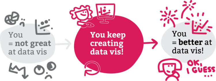
The main theme is to make more charts.

See also: getting started with visualization after getting started with visualization.

Tags: , , ,

Choosing fonts for your charts

Changing the fonts you use for labels and annotation is one of the easiest ways to make charts more readable and less messy, which makes a chart more inviting to examine. For Datawrapper, Lisa Charlotte Muth discusses font choices and what to look for.

Can’t go wrong with another one of Muth’s clear and practical guides.

Tags: ,

Defining color palettes for all your charts

Selecting a color palette for a single chart can be tricky, which is why we see so many charts that just go with defaults. Selecting a color palette for all your charts is a bigger challenge. For Datawrapper, Lisa Charlotte Muth has you covered with a detailed guide that describes the important bits, existing color palettes in the wild, and consideration for your readers.

You’ll want to save this for later. It just stops short of picking the colors for you.

Tags: , , ,

Many Ukraine maps

There are many maps trying to show what is happening in Ukraine right now. Lisa Charlotte Muth is keeping a running thread.

Tags: , , ,