Steps for getting started with data visualization

Getting started with data visualization can be tricky because of all the resources and tools available these days. Approaches also change with what you want to visualize data for. For Datawrapper, Lisa Chartlotte Muth outlines how to take your first steps.

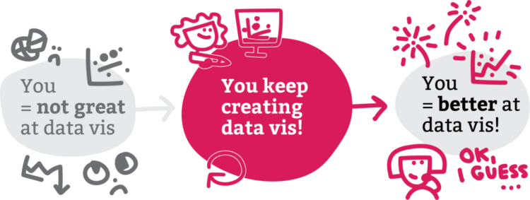
The main theme is to make more charts.

See also: getting started with visualization after getting started with visualization.

Tags: , , ,

Choosing fonts for your charts

Changing the fonts you use for labels and annotation is one of the easiest ways to make charts more readable and less messy, which makes a chart more inviting to examine. For Datawrapper, Lisa Charlotte Muth discusses font choices and what to look for.

Can’t go wrong with another one of Muth’s clear and practical guides.

Tags: ,

Defining color palettes for all your charts

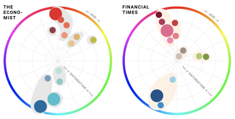
Selecting a color palette for a single chart can be tricky, which is why we see so many charts that just go with defaults. Selecting a color palette for all your charts is a bigger challenge. For Datawrapper, Lisa Charlotte Muth has you covered with a detailed guide that describes the important bits, existing color palettes in the wild, and consideration for your readers.

You’ll want to save this for later. It just stops short of picking the colors for you.

Tags: , , ,

Which color scale to use for your charts

On a superficial level, color scale selection seems like a straightforward task. Pick a sequence of colors that looks like it goes from light to dark. Done. But right when you get into it, you might find the process isn’t so straightforward. Different color scales can represent different aspects of your data, and poor selection can lead to poor communication. So, Lisa Charlotte Rost for Datawrapper wrote a four-part practical guide to help you figure it out.

See also Rost’s equally useful guide on what colors to pick for your scales.

Tags: , ,

Picking the right colors for your charts

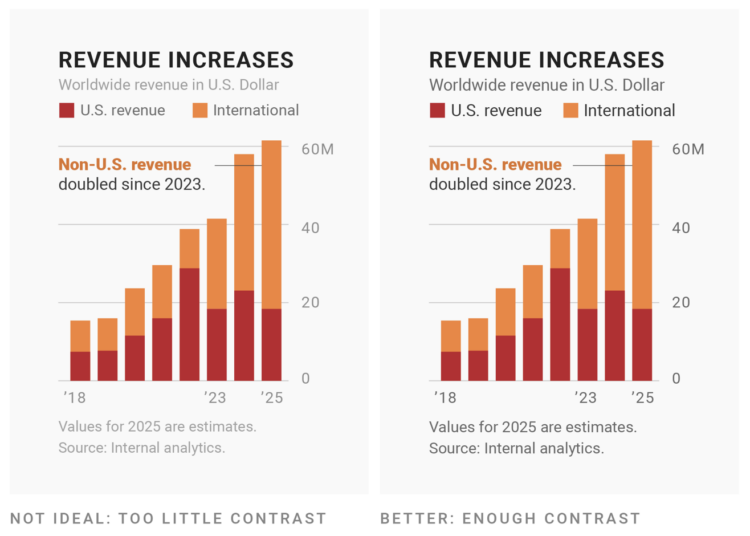
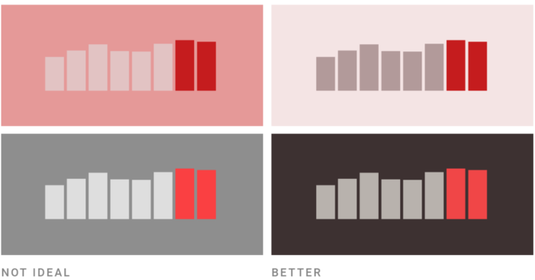
Picking colors for your charts can be tricky, especially when you’re starting a palette from scratch. For Datawrapper, Lisa Charlotte Rost has been writing guides on color as it pertains to political parties, gender, and more recently, colorblindness. Rost put the pieces together for a single, more comprehensive guide on the subject.

Be sure to check out Rost’s other guides on making better charts. She has a knack for explaining visualization methods in a practical and concrete way.

Tags: , ,

Responsible coronavirus charts

Speaking of responsible visualization, Datawrapper provides 17 charts and maps you can use in your stories, without causing unnecessary panic.

Below is an embedded example:

You can easily edit the charts, download the data, or export as an image file. Datawrapper also describes the sources behind the charts and tips on using them in your stories, making for a solid resource.

Tags: ,

Datawrapper updates pricing structure, do more for free

Datawrapper, a focused web tool that makes online charts easier to put together and share, changed their pricing structure. There used to be a couple of paid tiers for individuals and small teams, but now you get more for free. And even though it’s free:

  • We won’t sell your data. Some companies make the user into the product, but this is not our business model. All data you upload to Datawrapper is treated as confidential and only belongs to your account.
  • We won’t track your readers. Your embedded charts will not contain any code that tracks you or your readers. We’ve never done that, and will continue to not do that, regardless of your plan.
  • Your charts are private. You decide when it’s time to share your charts with the world. Until you hit “Publish”, your charts are visible only to you and your team.
  • Published charts will stay online indefinitely. We will never delete or disable any of your Datawrapper visualizations that you embedded somewhere. We stand by our pledge to keep all our users’ charts online.

They continue to impress.

It wasn’t that long ago when online charting tools felt buggy and overly limited. But Datawrapper is laying some strong groundwork (and Flourish continues to build up their offerings). Instead of a one-size-fits-all, we’re seeing an application focus, which allows for more specific tools.

Tags:

Datawrapper updates pricing structure, do more for free
Datawrapper, a focused web tool that makes online charts easier to put together and share, changed their pricing structure. There used to be a couple of paid tiers for individuals and small teams, but now you get more for free. And even though it’s free:

  • We won’t sell your data. Some companies make the user into the product, but this is not our business model. All data you upload to Datawrapper is treated as confidential and only belongs to your account.
  • We won’t track your readers. Your embedded charts will not contain any code that tracks you or your readers. We’ve never done that, and will continue to not do that, regardless of your plan.
  • Your charts are private. You decide when it’s time to share your charts with the world. Until you hit “Publish”, your charts are visible only to you and your team.
  • Published charts will stay online indefinitely. We will never delete or disable any of your Datawrapper visualizations that you embedded somewhere. We stand by our pledge to keep all our users’ charts online.

They continue to impress.

It wasn’t that long ago when online charting tools felt buggy and overly limited. But Datawrapper is laying some strong groundwork (and Flourish continues to build up their offerings). Instead of a one-size-fits-all, we’re seeing an application focus, which allows for more specific tools.

Tags: