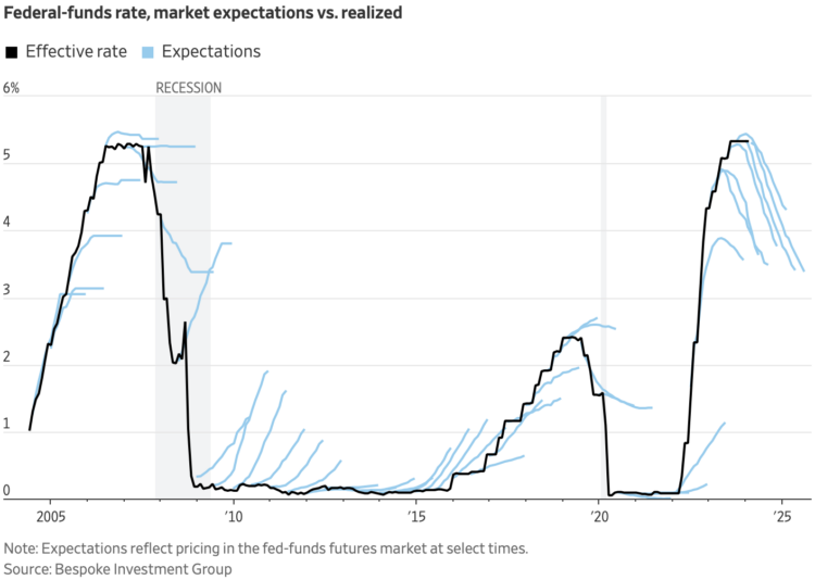
This chart by Eric Wallerstein for the Wall Street Journal shows expectations against reality. They often don’t match up.
See also: how rate projections change over time.
Tags: invest, rate, Wall Street Journal
Adam's Blogroll: click through to the author's blog
This chart by Eric Wallerstein for the Wall Street Journal shows expectations against reality. They often don’t match up.
See also: how rate projections change over time.
Tags: invest, rate, Wall Street Journal
Posted by in invest, rate, Statistical Visualization, Wall Street Journal
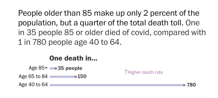
With millions of Covid-19 deaths worldwide, and hundreds of thousands in the US, the absolute counts have been a challenge to relate to for a while. The Washington Post leaned into rates to communicate scale at the individual level. 1 in 500 Americans died from Covid-19 so far.
Tags: coronavirus, rate, scale, Washington Post
Posted by in coronavirus, rate, scale, Statistical Visualization, Washington Post