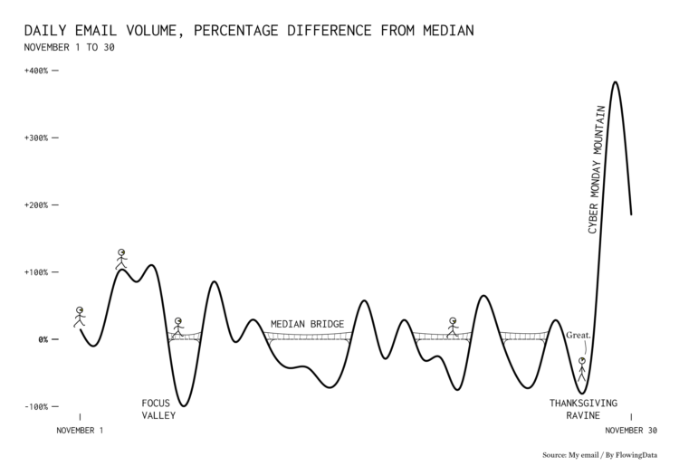
That’s a lot of email.
Tags: email, Thanksgiving
Adam's Blogroll: click through to the author's blog
Posted by in Chart Everything, email, Thanksgiving

A small gathering of 10 people or fewer can seem like a low-risk activity, and at the individual level, it’s lower risk than going to a big birthday party. But when a lot of people everywhere are gathering, small or large, the collective risk goes up. For FiveThirtyEight, Maggie Koerth and Elena Mejía illustrate the reasoning.
The collective part is where many seem to get tripped up. “Flattening the curve” only works when everyone works together. Lower your risk, and you lower the collective risk. You’re helping others. You’re helping those you care about.
Then, collectively, we all get out of this mess.
Tags: coronavirus, exponential growth, FiveThirtyEight, risk, Thanksgiving
Posted by in coronavirus, exponential growth, FiveThirtyEight, Infographics, Risk, Thanksgiving

Millions of Americans will fly home this Thanksgiving weekend. (Based on my morning commute, the holiday already started a couple of days early.) Josh Katz and Quoctrung Bui for the New York Times mapped the difference in flight volume for this weekend against the norm, based on Google Flights search data.
Color from red to turquoise provides direction from origin to destination, respectively, and the thickness of the lines represent the change in volume. Then to double up on the representation, dots move along the paths to also show direction and volume. Mouse over airports to focus.
Good stuff.
By the way, the dots on the national view were kind of choppy for me in Safari but moved smoother when there were fewer dots on the screen and in Chrome.
Tags: flights, New York Times, Thanksgiving
Posted by in flights, maps, New York Times, Thanksgiving