More friendships between rich and poor might mean less poverty

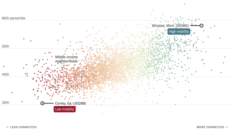
Recently published in Nature, research by Chetty, R., Jackson, M.O., Kuchler, T. et al. suggests that economic connectedness, or friendships between rich and poor, could improve economic mobility. The researchers used Facebook connection data from 70.3 million users, along with demographic and income data. NYT’s The Upshot explains the relationships with a collection of maps and charts.

You can find an anonymized, aggregated version of the data through the Social Capital Atlas. Also, I am very much into this socially-focused use of social media data.

Tags: , , , ,

Exploding nation of poverty

Nation of Poverty

Poverty is on the rise. Justin Palmer mapped it for major cities in the United States.

Concentrated poverty in the neighborhoods of the nation's largest urban cores has exploded since the 1970s. The number of high poverty neighborhoods has tripled and the number of poor people in those neighborhoods has doubled according to a report released by City Observatory.

Instead of going with a choropleth map and filled polygons, Palmer went with sloped lines to show the change between 1970 and 2010. Longer lines mean greater absolute value, where red lines pointing up represent increased poverty and green lines pointed down represent decreased poverty.

I like it.

Tags:

Where the poor live, a decade comparison

Poverty and race in America

To better understand race and poverty, MetroTrends maps where people live whose income is below the poverty line.

The history, geography, and politics of individual metro regions all matter profoundly, and any serious policy strategy must be tailored to local realities.

To help take the policy conversation from the general to the specific, we offer a new mapping tool. It lets you explore changes from 1980 to 2010 in where poor people of different races and ethnicities lived, for every metropolitan region nationwide.

Each dot, color-coded by race, represents 20 people. So when you slide between views for 1980 and 2010, you see how areas have grown more or less diverse, increased or decreased in covered areas, and perhaps areas in need of more attention.

Tags: ,