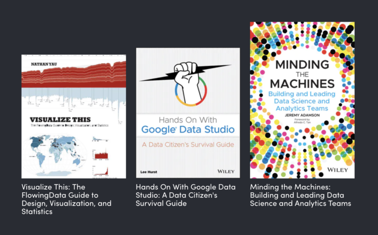
There’s a data visualization book bundle on Humble Bundle this month. Get twenty-two books for eighteen dollars — with a portion of the proceeds going to Girls Who Code. Seems like a pretty good deal.
Adam's Blogroll: click through to the author's blog
There’s a data visualization book bundle on Humble Bundle this month. Get twenty-two books for eighteen dollars — with a portion of the proceeds going to Girls Who Code. Seems like a pretty good deal.
Posted by in books, Bundle, Statistical Visualization
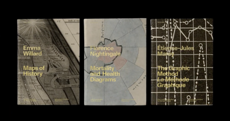
The Information Graphic Visionaries book series just launched on Kickstarter. Emma Willard, Florence Nightingale, and Étienne-Jules Marey are the subjects of three books, each including high-resolution images of the creators’ works and essays that provide historical context.
Whenever I’m feeling uninspired, I like to flip through old works. It always amazes me what past visualization practitioners were able to make without a computer. Oftentimes the detail and creativity surpass what we see these days. So Visionaries should be a fine addition to the library.
Just one day in and the Kickstarter is about halfway to the goal.
Posted by in books, history, Infographics

When it comes to reading lists, we usually look for what’s popular, because if a lot of people read something, then there must be something good about it. Russell Goldenberg and Amber Thomas for The Pudding took it the other direction. Using checkout data from the Seattle Public Library, they looked for books that haven’t been checked out in decades.
Also: How cool is it that there’s an API to access library checkout data?
Tags: books, hipster, library, The Pudding
Posted by in books, hipster, Infographics, library, The Pudding

I think I started watching Game of Thrones around the fourth season (my wife gave me the cliffs notes), so I’ve missed a bunch, but I’ve seen enough now where I have to know what happens from here on out. For those deeper into it, here’s a comparison between the books and the television series by Alyssa Karla Mungcal, Jocelyn Tan, and Pooja Sharma.
The above is an overview, but they also break it down by scene, marking each as matching with the book or not.
Tags: books, Game of Thrones, television
Posted by in books, Game of Thrones, Statistical Visualization, television
I don't read visualization books nearly as much as I wish I did, but there are a handful I keep on the shelf for a rainy day, which until recently was basically never here in California. I updated the books page to show some of my favorites.
I also added a few books in my queue that I hope to get to one day. Two are new visualization books that I heard good things about, one is an introduction to statistics (mostly for teaching reasons), and the last is a not-so-new one on design.


By the way, the statistics textbook is available for free as a PDF download.
Tags: books
Since my son was born, it's been a challenge to focus on a single book for any prolonged amount of time. He's in perpetual motion, as my mom often likes to say. Data Fluency is the only book I've read cover-to-cover in the past year (and you should too). So casual visualization reads — books that you can randomly thumb through at bite-sized rates — have piqued my interest more than usual.
Here are five recent books worth a gander.
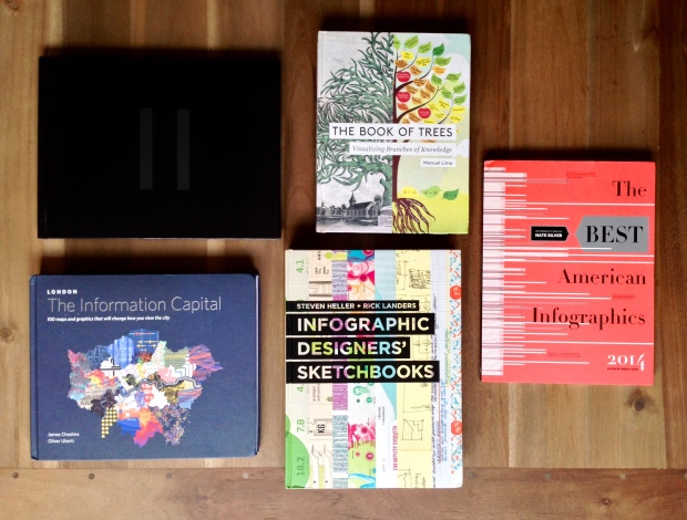
I enjoyed the first volume of the Atlas of Design, so I was happy to see a second volume come out. Published by the North American Cartographic Information Society, the book offers fine examples of cartography that have perhaps grown more rare or difficult to find because of the popularity of online mapping. The maps show a hand-drawn quality and a close attention to detail of various landscapes.
Each map is accompanied by a description from the cartographers themselves, which provides context to what the map is and how it came about.
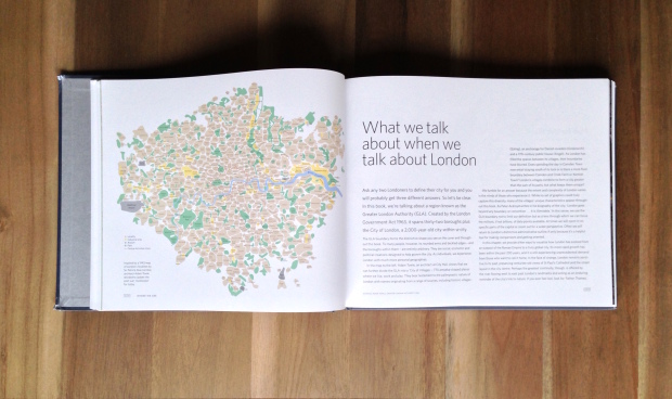
The Information Capital by geographer James Cheshire and designer Oliver Uberti is all about London. I've never been to London and know little about the city, but it was fun to flip through the 100 maps and charts. (It also led to my own curiosities.) The book is split into five main parts — where we are, who we are, where we go, how we're doing, and what we like — so you can see many aspects of the city in data. As a bonus, many of the graphics started in R.
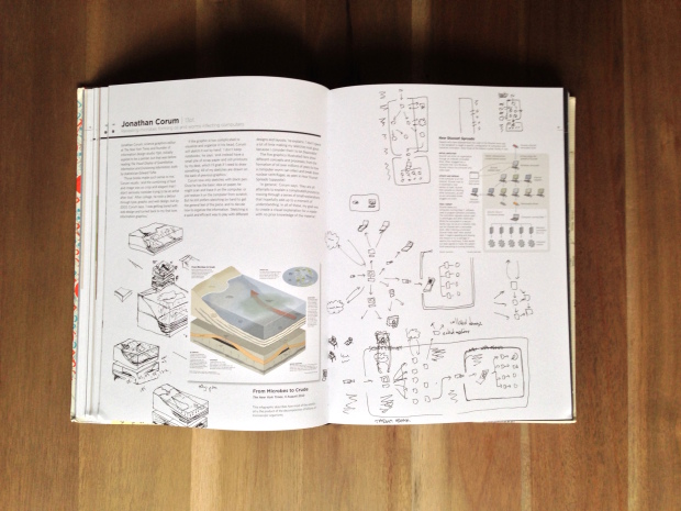
This is exactly what it sounds like. Infographic Designers' Sketchbooks is a catalog of information graphics, with sketches from the designers' notebooks that show part of the process. The premise is that you always see the finished product but often miss the work that goes into it.
I wish the editors went into more of the process. In particular, it's interesting to hear about what didn't work, and all the initial ideas that were rejected. However, most of the short lead-ins just talk about a general process, which gets monotonous after a while: talk to client, develop idea, draw on paper or produce rough sketches, and then finito.
So I had to get over that. Then it was more fun to flip through the rough sketches and illustrations.
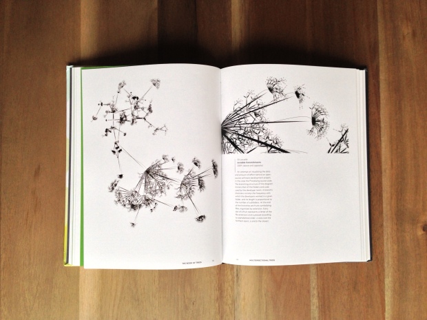
I feel like I've had this book forever and just now have had a chance to look at it. The Book of Trees, by Manuel Lima, explores visualization that shows networks and connections. There's also a foreword by Ben Shneiderman, which is nice. While there's certainly a bit of narrative about the different types of networks, the bulk of the book is examples with short descriptions, starting from the old originals up to the present.
If you like Lima's site Visual Complexity, you'll like this book.
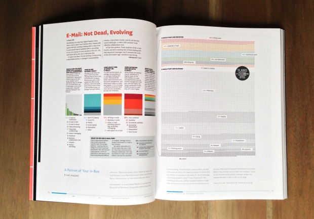
Even though I know what the book publishing process is like, it's still weird that a book cataloging the best of 2014 came out in mid-October of this year. But there you go. The Best American Infographics 2014 showcases favorites from the first part of the year, as chosen by a group mostly made up of practitioners. (My name is in the credits somewhere, but I think I got too distracted this year to actually contribute my two cents.)
Like the 2013 edition, this book, with a foreword from Nate Silver, has lots of fine examples from various genres. Although mostly are journalistic in nature. My favorite part of the layout is that all the graphics are given enough space so that you can read the sometimes small text. The ones that require more than two pages get a fold-out page.
Posted by in books, casual, Visualization

