Heatmap of average IMDb ratings for all the shows

Inspired by a graphic on Reddit, Jim Vallandingham expanded the format for all the shows. Search for a show and get a heatmap for average ratings by season and episode. See how your favorite show went into the dumpster at the end or withstood the test of time. Nice.

The data comes from IMDb Datasets, which seems like a fun time series dataset to poke at.

Tags: , , ,

Visualizing the Friends sitcom

Marion Rouayroux, a graphic designer and a big fan of the show Friends, collated a bunch of data about the sitcom. Then she visualized the data with a series of information graphics.

Tags: ,

Game of Thrones books versus television series

I think I started watching Game of Thrones around the fourth season (my wife gave me the cliffs notes), so I’ve missed a bunch, but I’ve seen enough now where I have to know what happens from here on out. For those deeper into it, here’s a comparison between the books and the television series by Alyssa Karla Mungcal, Jocelyn Tan, and Pooja Sharma.

The above is an overview, but they also break it down by scene, marking each as matching with the book or not.

Tags: , ,

Millions of internet-connected TVs track viewing habits

Sapna Maheshwari for The New York Times on Samba TV software running on smart televisions:

Once enabled, Samba TV can track nearly everything that appears on the TV on a second-by-second basis, essentially reading pixels to identify network shows and ads, as well as programs on HBO and even video games played on the TV. Samba TV has even offered advertisers the ability to base their targeting on whether people watch conservative or liberal media outlets and which party’s presidential debate they watched.

I feel like this is something most people don’t want.

Tags: ,

U.S. culture through TV show geography

Map who “likes” television shows on Facebook, by ZIP code, and you get a good idea of cultural boundaries. This is what Josh Katz for the Upshot did for 50 of the most liked shows in the United States, finding three distinct regions: “cities and their suburbs; rural areas; and what we’re calling the extended Black Belt.”

Tags: , ,

An analysis of The Simpsons

simpsons-word-count

The Simpsons is in its 27th season. That’s a lot of d’ohs. Todd W. Schneider had a look at the dialogue over the years, prominent characters, and declining ratings.

Did I mention 27 seasons? How is that even possible?

Tags: ,

Search for word usage in movies and television over time

Data usage

Movies and television shows often reflect cultural trends of the time they are made in. Even movies that take place during the past or future can say something about the present through metadata or production style. Benjamin Schmidt, an assistant professor of history at Northeastern University, provides a tool that lets you see trends in movie and television dialogue.

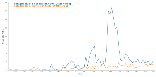
Made with the Bookworm platform, developed by Schmidt and a team at the Cultural Observatory, the tool lets you search for terms and it spits out relative usage over time. For example, above is word usage of "data" which saw a spike in the 1990s thanks to Star Trek: The Next Generation.

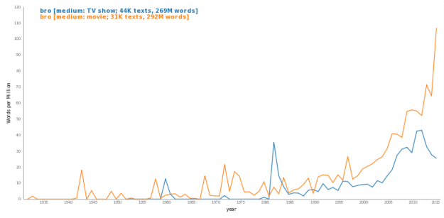
Here's the use of "bro."

Bro

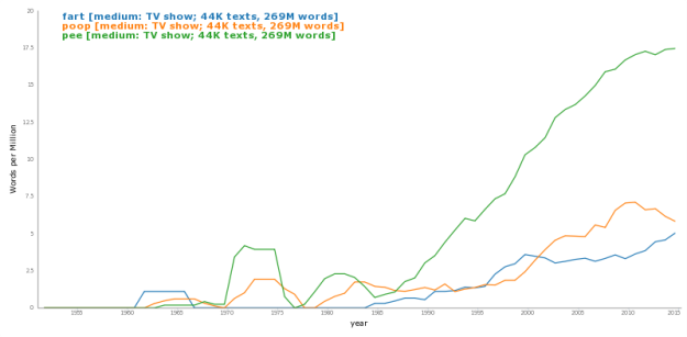
And because I'm mature, here is the usage of "pee", "poop", and "fart", which like the above, appears to be on the rise.

Fart, poop, and pee usage

The nice thing about the tool is that you can search by a lot of conditions. You can choose specific shows, genre, primary country, and other things. You can also change additional settings through the gear icon in the top right, such as time span and smoothing level. So there's lots of fun stuff to play with.

Have a search.

Tags: , ,